simpplot: Stata module creating a plot describing p-values from a simulation by comparing nominal significance levels with the coverages
Author: Maarten L. Buis
simpplot describes the results of a simulation that inspects the coverage of a statistical test. simpplot displays by default the deviations from the nominal significance level against the entire range of possible nominal significance levels. It also displays the range (Monte Carlo region of acceptance) within which one can reasonably expect these deviations to remain if the test is well behaved.
This package can be installed by typing in Stata: ssc install simpplot
Example
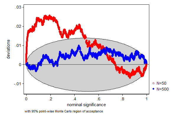
In this example we test how well a t-test performs when the data is from a non-Gaussian (some prefer to say non-normal) distribution, in this case a Chi-square distribution with 2 degrees of freedom. We know that the mean of that distribution is 2, so a t-test whether the mean equals 2 is a test of a true null-hypothesis. We also look at how well this test performs in different sample sizes. In a sample size of 50 the test does not perform too well, the true null-hypothesis is too often rejected, but a sample size of a 500 seems already big enough for this test to work.
. program drop _all
. program define sim, rclas 1. drop _all 2. set obs 500 3. gen x = rchi2(2) 4. ttest x=2 in 1/50 5. return scalar p50 = r(p) 6. ttest x=2 7. return scalar p500 = r(p) 8. end
. . set seed 12345
. simulate p50=r(p50) p500=r(p500), /// > reps(5000) nodots : sim
command: sim p50: r(p50) p500: r(p500)
. . label var p50 "N=50"
. label var p500 "N=500"
. . simpplot p50 p500, main1opt(mcolor(red)) /// > main2opt(mcolor(blue))
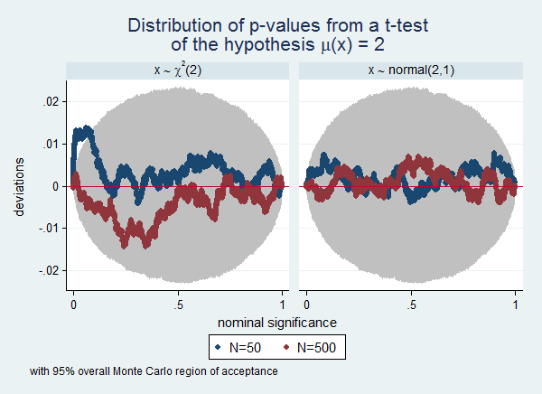
Often a simulation experiment will involve many scenarios, and plotting them all in one graph will make the graph too cluttered to be readable. In that case the by() option can be useful. To continue the previous example, we now also want to know the influence of the distribution of the variable. We extended the example by also drawing from a normal(2,1) distribution. I also use this example to illustrate how use Stata's capability of including symbols in graphs as documented in help graph text. Finally, this example illustrates the use of overall Monte Carlo regions of acceptance instead of point-wise Monte Carlo regions of acceptance. Notice that the regions are wider in this example than in the previous example. This is the to be expected difference between overall and point-wise regions.
. program drop _all
. program define sim, rclas 1. drop _all 2. set obs 500 3. gen x = rchi2(2) 4. gen y = rnormal(2,1) 5. ttest x=2 in 1/50 6. return scalar p50c = r(p) 7. ttest x=2 8. return scalar p500c = r(p) 9. ttest y=2 in 1/50 10. return scalar p50n = r(p) 11. ttest y=2 12. return scalar p500n = r(p) 13. end
. . set seed 1234567
. simulate p50c=r(p50c) p500c=r(p500c) /// > p50n=r(p50n) p500n=r(p500n), /// > reps(5000) nodots : sim
command: sim p50c: r(p50c) p500c: r(p500c) p50n: r(p50n) p500n: r(p500n)
. . // prepare for use with the -by()- option . gen id = _n
. reshape long p50 p500, i(id) j(dist) string (note: j = c n)
Data wide -> long ----------------------------------------------------------------------------- Number of obs. 5000 -> 10000 Number of variables 5 -> 4 j variable (2 values) -> dist xij variables: p50c p50n -> p50 p500c p500n -> p500 -----------------------------------------------------------------------------
. encode dist, gen(distr)
. . // these labels will be used to label . // the sub-graphs . label define distr 1 "x {&sim} {&chi}{sup:2}(2)" /// > 2 "x {&sim} normal(2,1)", replace
. label value distr distr
. . // these labels will be used to label . // the data points . label var p50 "N=50"
. label var p500 "N=500"
. . simpplot p50 p500, scheme(s2color) legend(cols(2)) /// > ylab(,angle(horizontal)) /// > by(distr, title("Distribution of p-values from a t-test" /// > "of the hypothesis {&mu}(x) = 2") ) /// > overall reps(50000)