-------------------------------------------------------------------------------
Main graph types
-------------------------------------------------------------------------------
Two main types
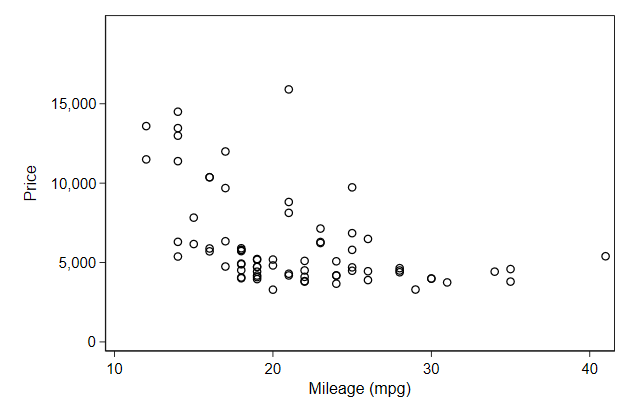
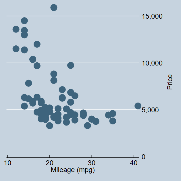
A scatter plot:
. sysuse auto, clear
(1978 Automobile Data)

. twoway scatter price mpg
Notice that the axes are labeled. Where did these labels come from?
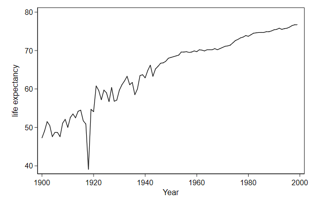
A line plot
. sysuse uslifeexp, clear
(U.S. life expectancy, 1900-1999)

. twoway line le year
-------------------------------------------------------------------------------
index >>
-------------------------------------------------------------------------------
-------------------------------------------------------------------------------
Main graph types
-------------------------------------------------------------------------------

            By default graphs are overwritten, can we change that?
. sysuse auto, clear
(1978 Automobile Data)

. twoway scatter price mpg, name(scatter, replace)

. sysuse uslifeexp, clear
(U.S. life expectancy, 1900-1999)

. twoway line le year, name(line, replace)

-------------------------------------------------------------------------------
<< index >>
-------------------------------------------------------------------------------
-------------------------------------------------------------------------------
Main graph types
-------------------------------------------------------------------------------
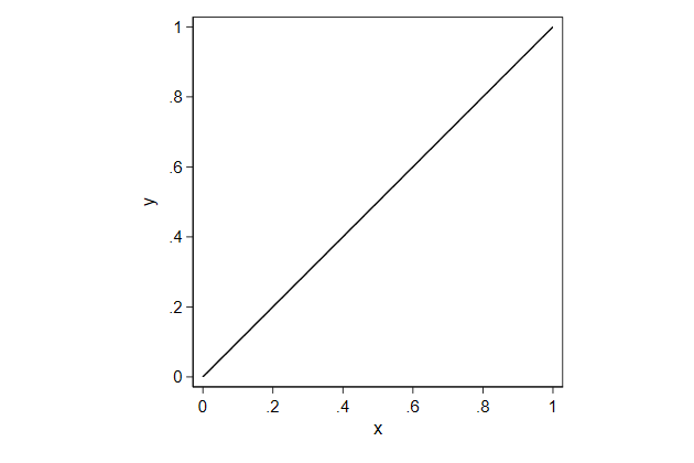
twoway function
With twoway function we can draw a function, so we don't need any data
for it
.         graph drop _all

.         twoway function y = x,       ///
>             aspect(1)                ///
>             name(function1, replace)
.         twoway function y = x^2,     ///
>             name(function2, replace)
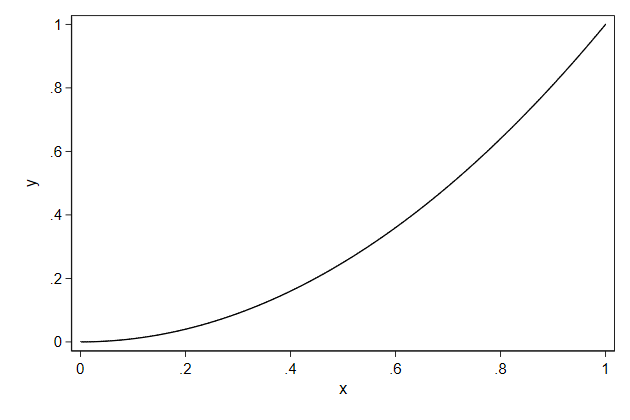
    By default the range for x that is plotted is [0, 1], but this can be
    changed with the range() option.
.         twoway function y = x^2,     ///
>             range(-10 10)            ///
>             name(function3, replace)
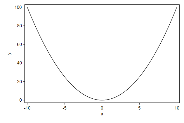
    The option range() expects numbers, but sometimes we want to give it the
    result of calculations.

    You can include such computation between .
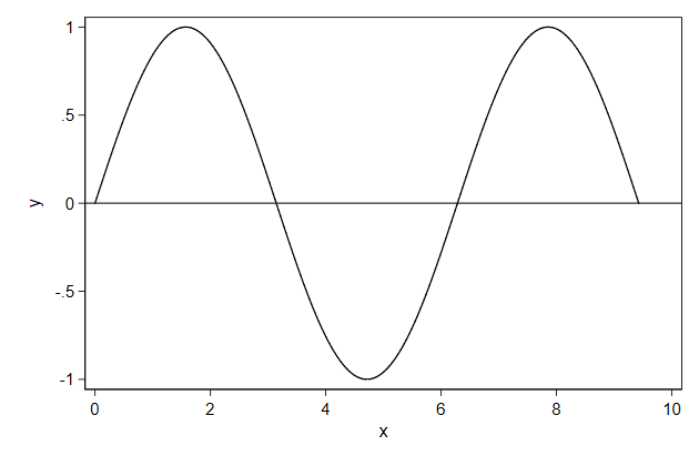
.         twoway function y = sin(x),   ///
>             range(0 `=3*_pi')         ///
>             yline(0)                  ///
>             name(function4, replace)
                                Try it yourself

    You are working with a indicator (dummy) variable and you vaguely
    remembered that the variance of such a variable is p*(1-p), where p is
    the proportion of successes (which also happens to be the mean). You are
    curious how the variance changes when the mean of a dummy variable
    changes, so you decide to use twoway function to show you the graph.
function_sol.do
-------------------------------------------------------------------------------
<< index >>
-------------------------------------------------------------------------------
-------------------------------------------------------------------------------
Main graph types
-------------------------------------------------------------------------------
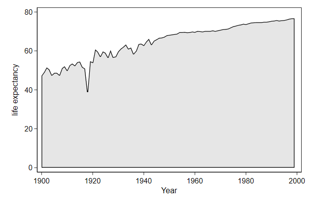
Area graphs
twoway area draws an area from the bottom of the graph till the first
variable named.
.         graph drop _all

.         sysuse uslifeexp, clear
(U.S. life expectancy, 1900-1999)

.         twoway area le year, ylab(0(20)80) ///
>             name(area, replace)
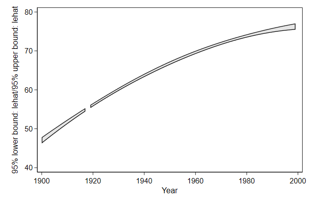
    twoway rarea draws an area from the first variable named till the second
    variable named.

    It is useful for drawing confidence intervals
.         sysuse uslifeexp, clear
(U.S. life expectancy, 1900-1999)

.         fp <year> : reg le <year> if year != 1918
(fitting 44 models)
(....10%....20%....30%....40%....50%....60%....70%....80%....90%....100%)

Fractional polynomial comparisons:
-------------------------------------------------------------------------------
        year |   df    Deviance  Res. s.d.   Dev. dif.   P(*)   Powers
-------------+-----------------------------------------------------------------
     omitted |    0    711.149      8.827    371.955    0.000
      linear |    1    423.262      2.073     84.068    0.000   1
       m = 1 |    2    410.720      1.946     71.527    0.000   -2
       m = 2 |    3    339.194      1.363      0.000       --   3 3
-------------------------------------------------------------------------------
(*) P = sig. level of model with m = 2 based on F with 95 denominator
    dof.

      Source |       SS           df       MS      Number of obs   =        99
-------------+----------------------------------   F(2, 96)        =   2007.60
       Model |  7457.20202         2  3728.60101   Prob > F        =    0.0000
    Residual |  178.295462        96   1.8572444   R-squared       =    0.9766
-------------+----------------------------------   Adj R-squared   =    0.9762
       Total |  7635.49749        98  77.9132396   Root MSE        =    1.3628

------------------------------------------------------------------------------
          le |      Coef.   Std. Err.      t    P>|t|     [95% Conf. Interval]
-------------+----------------------------------------------------------------
      year_1 |   6.04e-06   4.95e-07    12.21   0.000     5.06e-06    7.03e-06
      year_2 |  -7.61e-07   6.26e-08   -12.16   0.000    -8.85e-07   -6.37e-07
       _cons |  -2006.432   154.5701   -12.98   0.000    -2313.251   -1699.613
------------------------------------------------------------------------------

.         predictnl lehat = xb(), ci(lb ub)
(1 missing value generated)
note: confidence intervals calculated using Z critical values

.         twoway rarea lb ub year, ///
>             name(rarea1, replace)

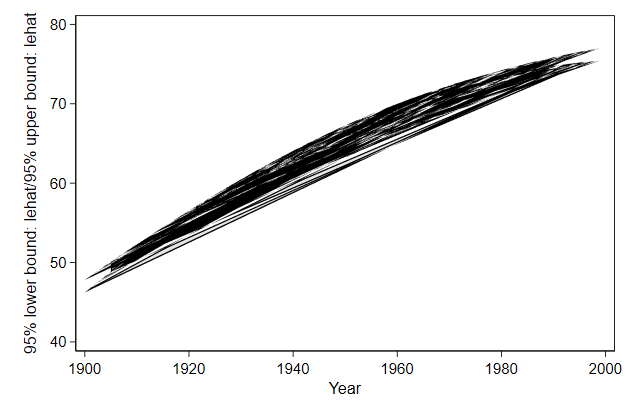
    It to has the cmissing() option to let you decide how to deal with
    missing values
.         twoway rarea lb ub year, ///
>             cmissing(n)          ///
>             name(rarea2, replace)
    The sort order in the data is important. If you mess that up you get
    modern art
.         gen u = runiform()

.         sort u

.         twoway rarea lb ub year, ///
>             name(rarea3, replace)
You can fix that with the sort option.
.         twoway rarea lb ub year, ///
>             sort                 ///
>             name(rarea4, replace)

-------------------------------------------------------------------------------
<< index >>
-------------------------------------------------------------------------------
-------------------------------------------------------------------------------
Main graph types
-------------------------------------------------------------------------------

                       Bar graphs and variations thereof

    twoway bar is a low level way of making bar graphs

    Low level means that you need to do more data preparation, but in return
    get a lot of freedom

    The easier but less flexible alternative would be graph bar
.         graph drop _all

.         sysuse auto, clear
(1978 Automobile Data)

.         contract rep78

.         list

     +---------------+
     | rep78   _freq |
     |---------------|
  1. |     1       2 |
  2. |     2       8 |
  3. |     3      30 |
  4. |     4      18 |
  5. |     5      11 |
     |---------------|
  6. |     .       5 |
     +---------------+

.         twoway bar _freq rep78, ///
>             name(bar1, replace)
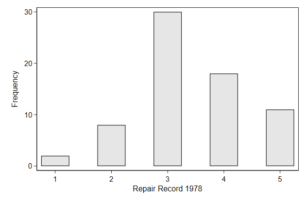
.         twoway bar _freq rep78, ///
>             barw(.5)            ///
>             name(bar2, replace)
    What if we want to look at the distribution of repair status for foreign
    and domestic cars?
. sysuse auto, clear
(1978 Automobile Data)

. contract rep78 foreign

. list

     +--------------------------+
     | rep78    foreign   _freq |
     |--------------------------|
  1. |     1   Domestic       2 |
  2. |     2   Domestic       8 |
  3. |     3   Domestic      27 |
  4. |     3    Foreign       3 |
  5. |     4   Domestic       9 |
     |--------------------------|
  6. |     4    Foreign       9 |
  7. |     5   Domestic       2 |
  8. |     5    Foreign       9 |
  9. |     .   Domestic       4 |
 10. |     .    Foreign       1 |
     +--------------------------+

. separate _freq , by(foreign) veryshortlabel

              storage   display    value
variable name   type    format     label      variable label
-------------------------------------------------------------------------------
_freq0          byte    %12.0g                Domestic
_freq1          byte    %12.0g                Foreign

. twoway bar _freq? rep78, name(bar3a, replace)
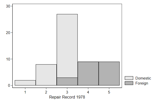
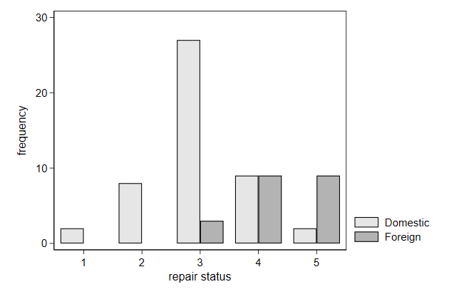
    Close, but not quite. Lets nudge the foreign cars a bit to the right and
    the domestic cars a bit to the left.
. gen x = cond(foreign==1,rep78 + .2, rep78 - .2)
(2 missing values generated)

. twoway bar _freq? x, barw(.4 .4) ///
>     xtitle(repair status)        ///
>     ytitle(frequency)            ///
>     name(bar3b, replace)
Instead of bars you plot spikes.
.         twoway spike _freq x, ///
>             name(spike, replace)
    Or draw a symbol on the top of the spikes

    This is a nice graph to display summary statistics for a set of
    variables.
.         twoway dropline _freq x, ///
>             name(dropline1, replace)
Particulary in horizontal mode.
.         twoway dropline _freq x,     ///
>             horizontal               ///
>             name(dropline2, replace)
                                Try it yourself


    Below we make a dataset containing for each industry the mean wage. Graph
    this as horizontal droplines.
. sysuse nlsw88, clear
(NLSW, 1988 extract)

. collapse (mean) wage, by(industry)

. egen Industry = axis(wage) if industry < ., label(industry)
(1 missing value generated)

. list

     +--------------------------------------------------------------+
     |                industry       wage                  Industry |
     |--------------------------------------------------------------|
  1. |   Ag/Forestry/Fisheries   5.621121     Ag/Forestry/Fisheries |
  2. |                  Mining   15.34959                    Mining |
  3. |            Construction   7.564934              Construction |
  4. |           Manufacturing   7.501578             Manufacturing |
  5. |  Transport/Comm/Utility   11.44335    Transport/Comm/Utility |
     |--------------------------------------------------------------|
  6. |  Wholesale/Retail Trade   6.125896    Wholesale/Retail Trade |
  7. | Finance/Ins/Real Estate   9.843174   Finance/Ins/Real Estate |
  8. |     Business/Repair Svc    7.51579       Business/Repair Svc |
  9. |       Personal Services   4.401093         Personal Services |
 10. |   Entertainment/Rec Svc   6.724409     Entertainment/Rec Svc |
     |--------------------------------------------------------------|
 11. |   Professional Services   7.871186     Professional Services |
 12. |   Public Administration   9.148407     Public Administration |
 13. |                       .    5.13411                         . |
     +--------------------------------------------------------------+

. list, nolabel

     +--------------------------------+
     | industry       wage   Industry |
     |--------------------------------|
  1. |        1   5.621121          2 |
  2. |        2   15.34959         12 |
  3. |        3   7.564934          7 |
  4. |        4   7.501578          5 |
  5. |        5   11.44335         11 |
     |--------------------------------|
  6. |        6   6.125896          3 |
  7. |        7   9.843174         10 |
  8. |        8    7.51579          6 |
  9. |        9   4.401093          1 |
 10. |       10   6.724409          4 |
     |--------------------------------|
 11. |       11   7.871186          8 |
 12. |       12   9.148407          9 |
 13. |        .    5.13411          . |
     +--------------------------------+
dropline_sol.do
-------------------------------------------------------------------------------
<< index >>
-------------------------------------------------------------------------------
-------------------------------------------------------------------------------
Main graph types
-------------------------------------------------------------------------------
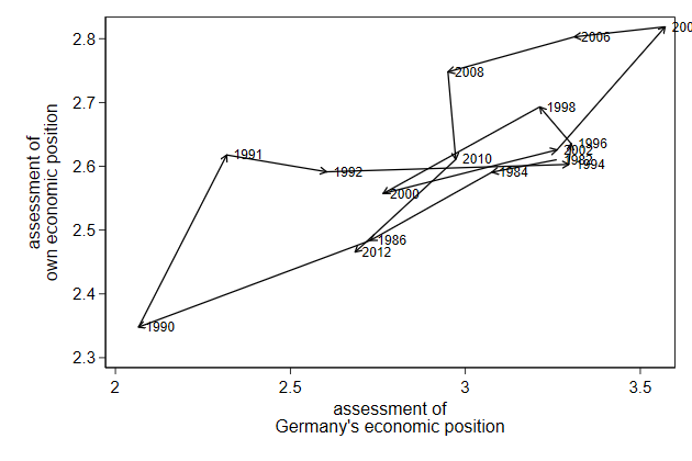
Arrows
You can also draw arrows.
This needs a y and x coordinate for the starting point and a y and x
coordinate for the end point (arrow head).
.         graph drop _all

.         use ecassess, clear
(ALLBUS 1980-2012)

.         gen sort = _n

.         tsset sort
        time variable:  sort, 1 to 16
                delta:  1 unit

.         twoway pcarrow L.own L.brd own brd,                     ///
>             ytitle("assessment of own economic position")       ///
>             xtitle("assessment of Germany's economic position") ///
>             name(pcarrow1, replace)
-------------------------------------------------------------------------------
<< index >>
-------------------------------------------------------------------------------
-------------------------------------------------------------------------------
Main graph types
-------------------------------------------------------------------------------

                                 Contour plots

    We can plot 3D graphs as a contour plot

    If there is no data for a part of the graph, then it will use
    interpolation

    This can be slow

    Since we are plotting the results from a regression model, we can much
    more quickly do the interpolation ourselves

    This is what I am doing in the lines between drop _all and predict
. graph drop _all
. sysuse nlsw88, clear
(NLSW, 1988 extract)
. reg wage c.ttl_exp##c.ttl_exp##c.tenure##c.tenure
Source | SS df MS Number of obs = 2,231
-------------+---------------------------------- F(8, 2222) = 22.72
Model | 5602.23303 8 700.279129 Prob > F = 0.0000
Residual | 68499.5946 2,222 30.8279004 R-squared = 0.0756
-------------+---------------------------------- Adj R-squared = 0.0723
Total | 74101.8276 2,230 33.2295191 Root MSE = 5.5523
------------------------------------------------------------------------------
wage | Coef. Std. Err. t P>|t| [95% Conf. Interval]
-------------+----------------------------------------------------------------
ttl_exp | .5151949 .1917126 2.69 0.007 .1392403 .8911495
|
c.ttl_exp#|
c.ttl_exp | -.0105392 .0088431 -1.19 0.233 -.0278808 .0068023
|
tenure | .0366325 .4801103 0.08 0.939 -.9048793 .9781442
|
c.ttl_exp#|
c.tenure | .0400039 .0680121 0.59 0.556 -.09337 .1733779
|
c.ttl_exp#|
c.ttl_exp#|
c.tenure | -.0014586 .0025993 -0.56 0.575 -.006556 .0036387
|
c.tenure#|
c.tenure | -.014302 .0445745 -0.32 0.748 -.101714 .07311
|
c.ttl_exp#|
c.tenure#|
c.tenure | -.001373 .0043596 -0.31 0.753 -.0099223 .0071764
|
c.ttl_exp#|
c.ttl_exp#|
c.tenure#|
c.tenure | .0000807 .0001224 0.66 0.510 -.0001594 .0003208
|
_cons | 2.426311 .9707341 2.50 0.013 .5226704 4.329952
------------------------------------------------------------------------------
. drop _all
. set obs 30
number of observations (_N) was 0, now 30
. gen ttl_exp = _n - 1
. gen tenure = _n - 1 if _n < 27
(4 missing values generated)
. fillin ttl_exp tenure
. drop if tenure == .
(30 observations deleted)
. predict wagehat
(option xb assumed; fitted values)
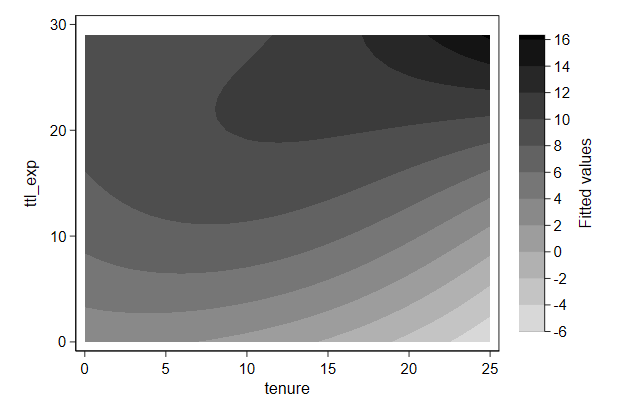
. twoway contour wagehat ttl_exp tenure, ///
> name(contour1, replace)
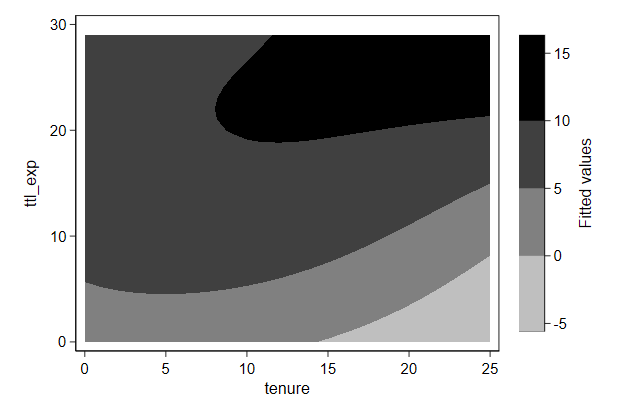
We can see finer details when we increase the number of contourlines
.         twoway contour wagehat ttl_exp tenure, ///
>             name(contour2, replace )           ///
>             ccuts(-6(2)16)
-------------------------------------------------------------------------------
<< index >>
-------------------------------------------------------------------------------
-------------------------------------------------------------------------------
The main elements of a graph -- titles
-------------------------------------------------------------------------------

                                  Main title

    We can add a title to our graph with the title() option
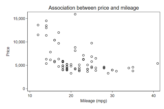
. graph drop _all
. sysuse auto, clear
(1978 Automobile Data)
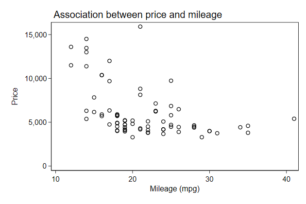
. scatter price mpg, name(price, replace) ///
> title("Association between price and mileage")
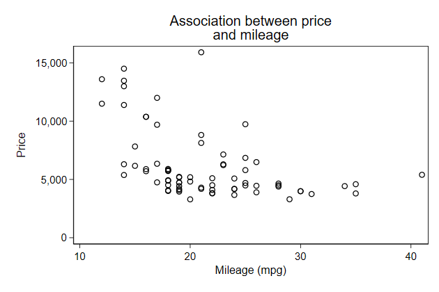
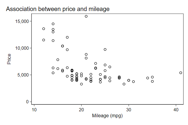
If the title is too long we can add line breaks
. scatter price mpg, name(price2, replace) ///
>         title("Association between price" "and mileage")
You can change the position of the title with the pos() sub-option.
. scatter price mpg, name(price3, replace) ///
>         title("Association between price and mileage", ///
>               pos(11))
    Notice that title is centered on the graph area, you can change that with
    the span sub-option
. scatter price mpg, name(price4, replace) ///
>         title("Association between price and mileage", ///
>               pos(11) span)
Much of what is possible with graph titles is discussed in title options
-------------------------------------------------------------------------------
<< index >>
-------------------------------------------------------------------------------
-------------------------------------------------------------------------------
The main elements of a graph -- titles
-------------------------------------------------------------------------------
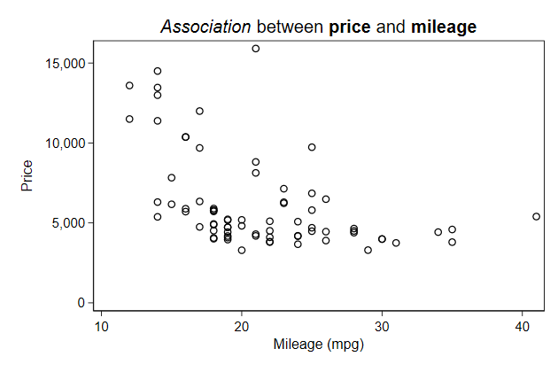
Fonts and symbols
We can also use different fonts
This is discussed in graph text
. graph drop _all

. scatter price mpg, name(fonts, replace) ///
>         title("{it:Association} between {bf:price} and {bf:mileage}")
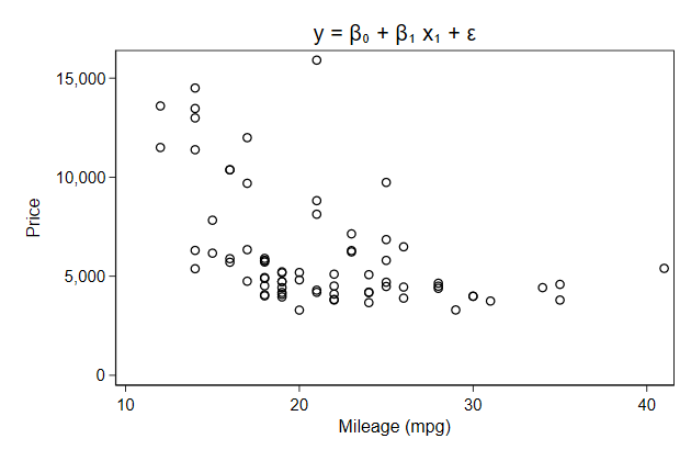
You can also add symbols
. scatter price mpg, name(symbols, replace) ///
>         title("y = {&beta}{sub:0} + {&beta}{sub:1} x{sub:1} + {&epsilon}")
                                Try it yourself

    Use uni.dta and recreate this graph.
title_sol.do
-------------------------------------------------------------------------------
<< index >>
-------------------------------------------------------------------------------
-------------------------------------------------------------------------------
The main elements of a graph -- titles
-------------------------------------------------------------------------------
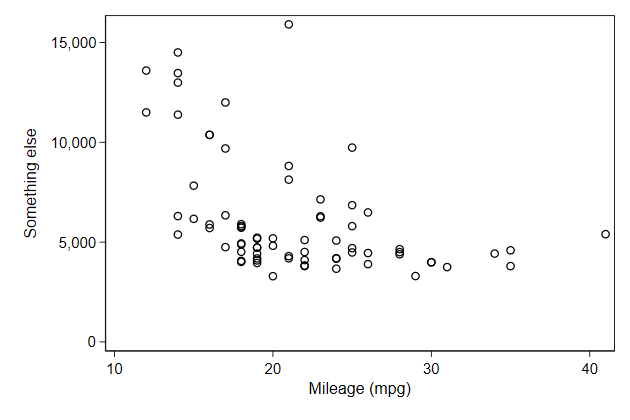
Axis titles
By default the axis titles are the variable labels
If there is no variable label the variable name is chosen
You can change those defaults using the xtitle() and ytitle() options.
. graph drop _all

. sysuse auto, clear
(1978 Automobile Data)

. scatter price mpg, name(ytitle, replace) ///
>         ytitle("Something else")
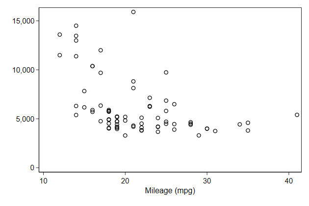
    Line breaking, fonts and symbols work just as in the main title.

    You can also suppres the disply of title
. scatter price mpg, name(noytitle, replace) ///
>         ytitle("")
-------------------------------------------------------------------------------
<< index >>
-------------------------------------------------------------------------------
-------------------------------------------------------------------------------
The main elements of a graph -- titles
-------------------------------------------------------------------------------
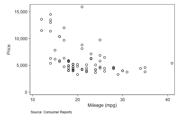
Notes
You can add a note underneath the graph using the note() option
. sysuse auto, clear
(1978 Automobile Data)

. scatter price mpg, name(note1, replace) ///
>         note("Source: Consumer Reports")
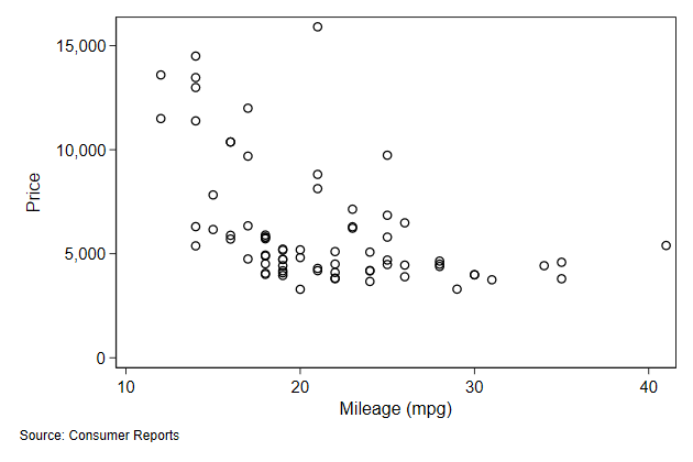
    Line breaking, fonts, symbols, and suppressing a note work just as
    before.

    By default the note is alligned on the plot area, you can override that
    using the span sub-option.
. sysuse auto, clear
(1978 Automobile Data)

. scatter price mpg, name(note2, replace) ///
>         note("Source: Consumer Reports", span)
-------------------------------------------------------------------------------
<< index >>
-------------------------------------------------------------------------------
-------------------------------------------------------------------------------
The main elements of a graph -- axis
-------------------------------------------------------------------------------

                                  axis labels

    You can add change the axis label using the xlab() and ylab() options

    This is doucmenten in axis label options
. graph drop _all
. sysuse auto, clear
(1978 Automobile Data)
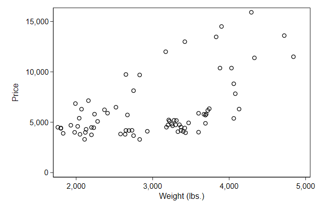
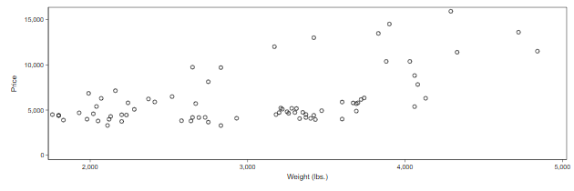
. scatter price weight, name(ylab1, replace)
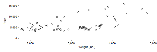
. scatter price weight, name(ylab2, replace) ///
> ylab(5000(5000)15000)
-------------------------------------------------------------------------------
<< index >>
-------------------------------------------------------------------------------
-------------------------------------------------------------------------------
The main elements of a graph -- axis
-------------------------------------------------------------------------------

                     Using value labels to label the axes

    For categorical variables it often makes sense to use the value labels as
    axis labels instead of the numerical values

    You can do this with the valuelabel suboption within ylab or {xlab}

    This is doucmenten in axis label options
. sysuse pop2000

. twoway scatter agegrp femtotal, ///
>      ylab(1/17, valuelabel)     ///
>      xlab(0(2e6)10e6)           ///
>      name(axlab1, replace)
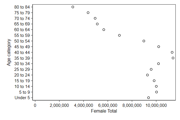
    2e6 is 2,000,000. I find that notation convenient for large numbers as it
    prevents me from adding a 0 too many or too few.
-------------------------------------------------------------------------------
<< index >>
-------------------------------------------------------------------------------
-------------------------------------------------------------------------------
The main elements of a graph -- axis
-------------------------------------------------------------------------------
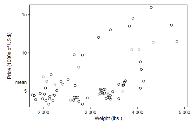
Make your own axis labels
You can give some or all axis label their own label.
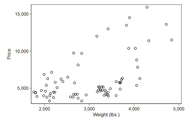
. graph drop _all

. sysuse auto, clear
(1978 Automobile Data)

. sum price if weight < ., meanonly

. local m = r(mean)

. twoway scatter price weight,               ///
>     ylab( 5000 `m' "mean" 10000 15000 )    ///
>     ytitle("Price (US {c S|})")            ///
>      name(axlab2, replace)
    The 000 in each label is a bit double, so use this trick to move those
    into the ytitle
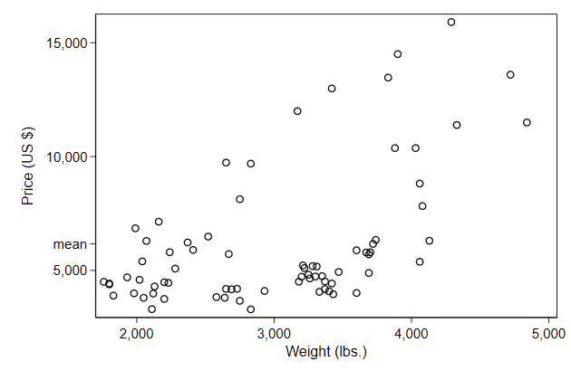
. sum price if weight < ., meanonly

. local m = r(mean)

. twoway scatter price weight, ///
>     ylab( 5000 "5"           ///
>          `m'   "mean"        ///
>          10000 "10"          ///
>          15000 "15" )        ///
>      name(axlab3, replace)   ///
>      ytitle("Price (1000s of US {c S|})")
-------------------------------------------------------------------------------
<< index >>
-------------------------------------------------------------------------------
-------------------------------------------------------------------------------
The main elements of a graph -- axis
-------------------------------------------------------------------------------

                               logarithmic scale

    Sometimes variables have a range that cover multiple orders of magnitude.

    In those cases the action at the lower orders of magnitude tend to get
    hiden by the range.
. graph drop _all

. use infmort, clear
(East-Asia & Pacific infant mortality)

. scatter infmort gdppc, ///
>     name(log1, replace)
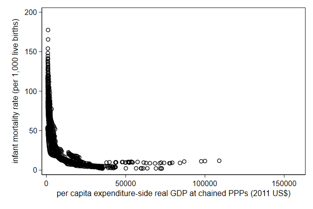
    Logarithmic scale are a way to solve that

    You can do that by adding the xscale(log) or yscale(log) option.

    This is documented in help axis scale option
. scatter infmort gdppc,      ///
>     yscale(log) xscale(log) ///
>     name(log2, replace)
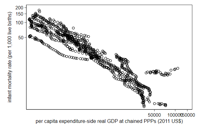
    We typically need to change the axis labels after that.

    1e3 is 1000. I often use that notation in this circumstance because this
    way I find it easy to avoid miscounting the number of zeros.
. scatter infmort gdppc,      ///
>     yscale(log) xscale(log) ///
>     name(log3, replace)     ///
>     ylab( 2 5 10 20 50 100 200) ///
>     xlab(1e3 1e4 1e5)
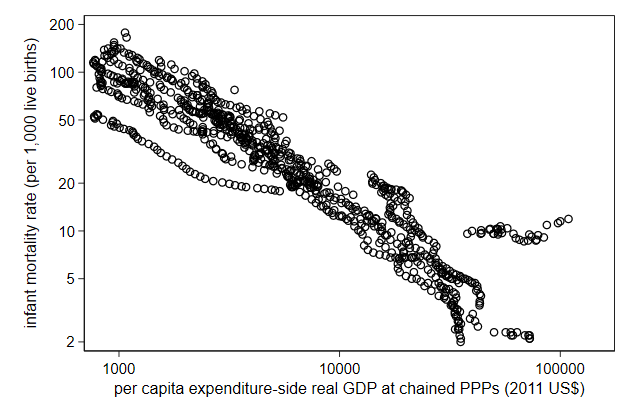
    10,000 is often easier to read than 10000. You can do that by displaying
    a number in Stata with the format %9.0gc (c for comma)

    Axis labels allow for the format() option with which you can choose the
    format.
. scatter infmort gdppc,                ///
>     yscale(log) xscale(log)           ///
>     name(log4, replace)               ///
>     ylab( 2 5 10 20 50 100 200)       ///
>     xlab(1e3 1e4 1e5, format(%9.0gc))

Alternatively, you can display them as powers of 10.
. scatter infmort gdppc,          ///
>     yscale(log) xscale(log)     ///
>     name(log5, replace)         ///
>     ylab( 2 5 10 20 50 100 200) ///
>     xlab(1e3 "10{sup:3}"        ///
>          1e4 "10{sup:4}"        ///
>          1e5 "10{sup:5}" )

-------------------------------------------------------------------------------
<< index >>
-------------------------------------------------------------------------------
-------------------------------------------------------------------------------
The main elements of a graph -- axis
-------------------------------------------------------------------------------

                                  axis range

    You can increase the range of the axis using the yscale(range()) and
    xscale(range()) options

    This is doucmenten in axis scale options
.         graph drop _all

.         sysuse auto, clear
(1978 Automobile Data)

.         scatter price mpg, name(yrange1, replace)

.         scatter price mpg, name(yrange2, replace) ///
>                 yscale(range(0 20000))

    Notice that you cannot decrease the range of the axis to be be less than
    the range of the data

    To cut off a part of the data you need to use an if condition
. scatter price mpg if price < 10000, name(yrange3, replace)
                                Try it yourself

    We have made a graph using uni.dta in the previous Do it yourself. Now it
    is to change the axes. The y-axis would be better off as a log scale. It
    would also help to have a comma seperate 1000s. The x-scale ranges till
    2050, and we really don't have data that far in the future.
axis_sol.do
-------------------------------------------------------------------------------
<< index >>
-------------------------------------------------------------------------------
-------------------------------------------------------------------------------
The main elements of a graph -- legend
-------------------------------------------------------------------------------
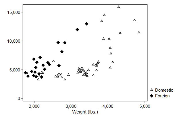
using separate
There is something funny going on in the graph below. We might want to
check whether there are different groups of cars.
.         graph drop _all

.         sysuse auto, clear
(1978 Automobile Data)

.         scatter price weight, name(noseparate, replace)

    With separate we create two price variables:

    price0 contains the price if the car is domestic and otherwise it
    contains a missing value.
    price1 contains the price if the car is foreign and otherwise it contains
    a missing value.
. separate price, by(foreign)
storage display value
variable name type format label variable label
-------------------------------------------------------------------------------
price0 int %8.0gc price, foreign == Domestic
price1 int %8.0gc price, foreign == Foreign
. list foreign price price0 price1 in 45/55
+------------------------------------+
| foreign price price0 price1 |
|------------------------------------|
45. | Domestic 6,486 6,486 . |
46. | Domestic 4,060 4,060 . |
47. | Domestic 5,798 5,798 . |
48. | Domestic 4,934 4,934 . |
49. | Domestic 5,222 5,222 . |
|------------------------------------|
50. | Domestic 4,723 4,723 . |
51. | Domestic 4,424 4,424 . |
52. | Domestic 4,172 4,172 . |
53. | Foreign 9,690 . 9,690 |
54. | Foreign 6,295 . 6,295 |
|------------------------------------|
55. | Foreign 9,735 . 9,735 |
+------------------------------------+
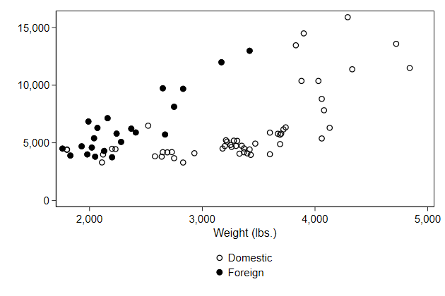
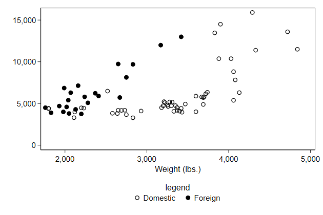
. scatter price0 price1 weight, name(separate, replace)
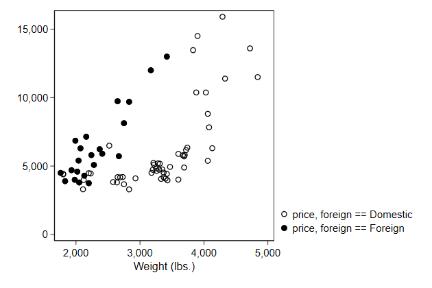
    Notice that by default the legend uses the variable labels, and that the
    default variable labels are not quite suitable for this purpose

    The easiest solution is to add the veryshortlabel option to separate, but
    here we will ignore that to show how you can change the legend yourself.
-------------------------------------------------------------------------------
<< index >>
-------------------------------------------------------------------------------
-------------------------------------------------------------------------------
The main elements of a graph -- legend
-------------------------------------------------------------------------------
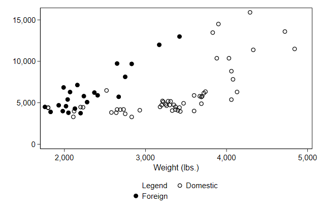
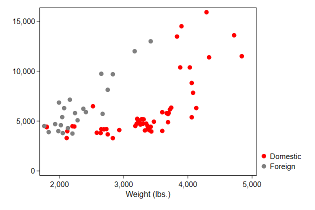
Changing the content of the legend
In this case, the variable labels are not very pretty, so we may want to
change those
The easiest way is to do that with the order() option
This is documented in legend options
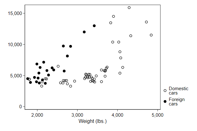
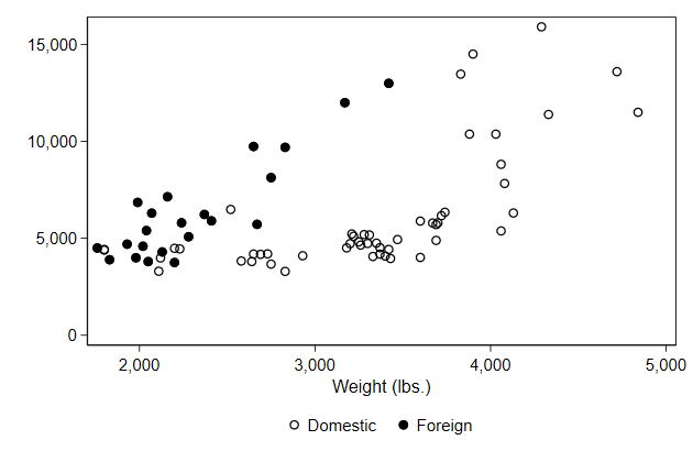
.         graph drop _all

.         scatter price0 price1 weight,   ///
>             legend(order(1 "Domestic"   ///
>                          2 "Foreign" )) ///
>             name(legend1, replace)

We can break longer lines in the same way as we did with titles.
.         scatter price0 price1 weight,          ///
>             legend(order(1 "Domestic" "cars"   ///
>                          2 "Foreign" "cars" )) ///
>             name(legend2, replace)
-------------------------------------------------------------------------------
<< index >>
-------------------------------------------------------------------------------
-------------------------------------------------------------------------------
The main elements of a graph -- legend
-------------------------------------------------------------------------------
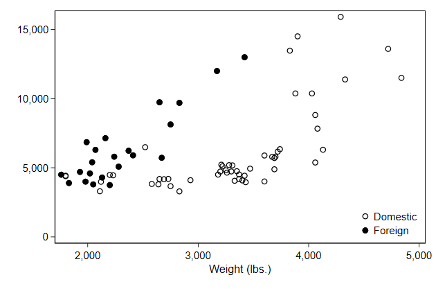
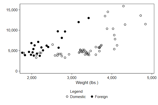
Position of the legend
In the lean1 style the legend is put in the bottom right corner outside
the graph.
We can change this using the pos() option.
.         scatter price0 price1 weight,   ///
>             legend(order(1 "Domestic"   ///
>                          2 "Foreign" )  ///
>                    pos(6) )             /// <-- new
>             name(legend3, replace)
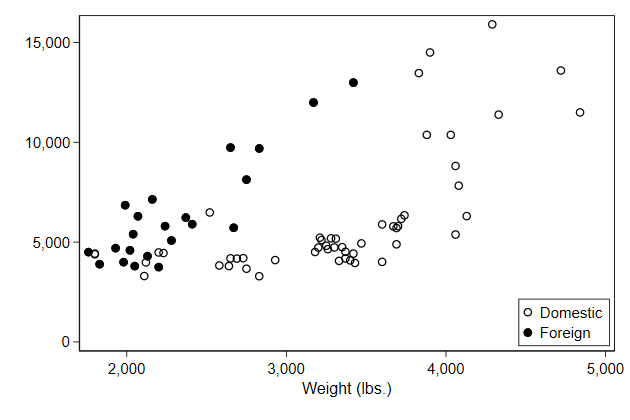
    If we put the legend at the bottom, then it makes sense to spread the
    legend over two columns.

    This can be achieved with the cols() option.
.         scatter price0 price1 weight,   ///
>             legend(order(1 "Domestic"   ///
>                          2 "Foreign" )  ///
>                    pos(6) cols(2))      /// <-- new
>             name(legend4, replace)
We can put the legend inside the plotregion using the ring(0) option
.         scatter price0 price1 weight,   ///
>             legend(order(1 "Domestic"   ///
>                          2 "Foreign" )  ///
>                    pos(5) ring(0) )     /// <-- new
>             name(legend5, replace)
It now makes sense to put an outline around the legend.
.         scatter price0 price1 weight,      ///
>             legend(order(1 "Domestic"      ///
>                          2 "Foreign" )     ///
>                    pos(5) ring(0)          ///
>                    region(style(outline))) /// <-- new
>             name(legend6, replace)
-------------------------------------------------------------------------------
<< index >>
-------------------------------------------------------------------------------
-------------------------------------------------------------------------------
The main elements of a graph -- legend
-------------------------------------------------------------------------------

                           Titles within the legend

    We can add a title to the legend.

    There is a title() sub-option for legend(), but that is typically too
    large.

    It is usually better to use the subtitle() sub-option.
.         graph drop _all

.         scatter price0 price1 weight,   ///
>             legend(order(1 "Domestic"   ///
>                          2 "Foreign" )  ///
>                    subtitle("legend")   ///
>                    pos(6) cols(2))      ///
>             name(legendtitle1, replace)
Alternatively, you can add text in the order() sub-option.
.         graph drop _all

.         scatter price0 price1 weight,   ///
>             legend(order(- "Legend"     ///
>                          1 "Domestic"   ///
>                          2 "Foreign" )  ///
>                    pos(6) cols(2))      ///
>             name(legendtitle2, replace)
We can let the "title" have its own line by adding an empty text.
.         scatter price0 price1 weight,   ///
>             legend(order(- "Legend"     ///
>                          - " "          ///
>                          1 "Domestic"   ///
>                          2 "Foreign" )  ///
>                    pos(6) cols(2))      ///
>             name(legendtitle3, replace)
    If we have the legend in one column, we can add a bit of space after the
    title in the following way:
.         scatter price0 price1 weight,   ///
>             legend(order(- "Legend" " " ///
>                          1 "Domestic"   ///
>                          2 "Foreign" )) ///
>             name(legendtitle4, replace)

                                Try it yourself

    The uni.dta used in the previous Do it yourselfs contains two aditional
    variables: drs and ba. These represent the pre-Bologna degree and the
    post-Bologna degrees repsepctively. Create a line graph of these two and
    change the legend to make it work.
legend_sol.do
-------------------------------------------------------------------------------
<< index >>
-------------------------------------------------------------------------------
-------------------------------------------------------------------------------
The main elements of a graph -- symbol
-------------------------------------------------------------------------------
Choose your symbol
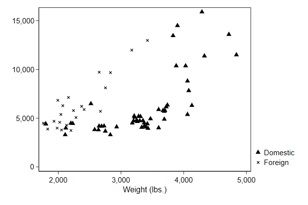
In a scatter graph you can choose the symbol with the msymbol() option
This is documented in scatter
.         graph drop _all

.         sysuse auto, clear
(1978 Automobile Data)

.         separate price, by(foreign)

              storage   display    value
variable name   type    format     label      variable label
-------------------------------------------------------------------------------
price0          int     %8.0gc                price, foreign == Domestic
price1          int     %8.0gc                price, foreign == Foreign

.         scatter price0 price1 weight ,  ///
>             legend(order(1 "Domestic"   ///
>                          2 "Foreign"))  ///
>             msymbol(T X)                ///
>             name(symbol1, replace)
Many symbols have a hollow version, which you get by adding an h
.         scatter price0 price1 weight ,  ///
>             legend(order(1 "Domestic"   ///
>                          2 "Foreign"))  ///
>             msymbol(Th D)               ///
>             name(symbol2, replace)
-------------------------------------------------------------------------------
<< index >>
-------------------------------------------------------------------------------
-------------------------------------------------------------------------------
The main elements of a graph -- symbol
-------------------------------------------------------------------------------

                                 Symbol color

    You can change the color of the symbols using the mcolor() option

    This is documenten in scatter
.         scatter price0 price1 weight ,  ///
>             legend(order(1 "Domestic"   ///
>                          2 "Foreign"))  ///
>             msymbol(O O)                ///
>             mcolor(red gs8)             ///
>             name(symbol3, replace)
-------------------------------------------------------------------------------
<< index >>
-------------------------------------------------------------------------------
-------------------------------------------------------------------------------
The main elements of a graph -- symbol
-------------------------------------------------------------------------------
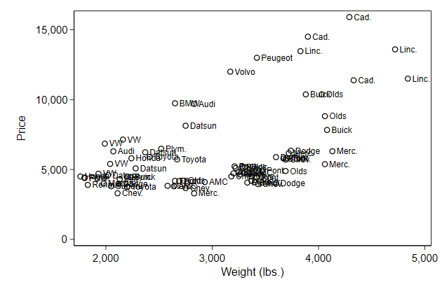
Labeling points
You can also add labels to the points with the mlabel() option
This is documented in scatter
.         gen str man = word(make, 1)

.         scatter price weight,           ///
>             mlabel(man)                 ///
>             name(symbol4, replace)
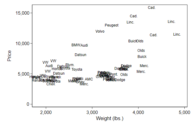
You can also fully replace the symbol with the marker label
.         scatter price weight,           ///
>             mlabel(man) mlabpos(0)      ///
>             msymbol(i)                  ///
>             name(symbol5, replace)
-------------------------------------------------------------------------------
<< index >>
-------------------------------------------------------------------------------
-------------------------------------------------------------------------------
The main elements of a graph -- line
-------------------------------------------------------------------------------
Line pattern
You can change the pattern using the lpattern() option
This is documented in connect options
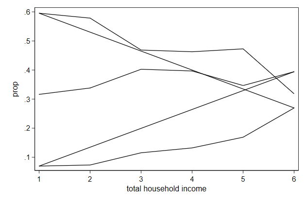
With ... you say that all subsequent graphs have the same pattern
. graph drop _all
. use voter, clear
. separate prop, by(candidate) veryshortlabel
storage display value
variable name type format label variable label
-------------------------------------------------------------------------------
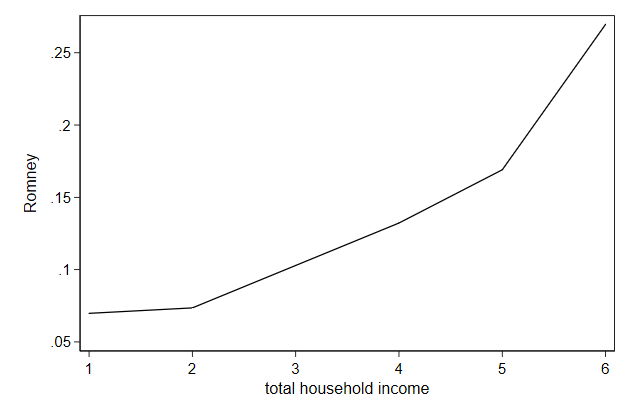
prop1 float %9.0g Obama
prop2 float %9.0g Romney
prop3 float %9.0g did not vote
. twoway line prop1 prop2 prop3 hhinc, ///
> xlabel(1/6, valuelabel angle(30)) ///
> ytitle(proportion) ///
> lcolor(green gs3 purple) ///
> lpattern(solid ...) ///
> name(pattern1, replace)
Here is another illustration of how ... works.
.         twoway line prop1 prop2 prop3 hhinc,    ///
>             xlabel(1/6, valuelabel angle(30))   ///
>             ytitle(proportion)                  ///
>             lcolor(black ...)                   ///
>             lpattern(dash solid ...)            ///
>             name(pattern2, replace)
-------------------------------------------------------------------------------
<< index >>
-------------------------------------------------------------------------------
-------------------------------------------------------------------------------
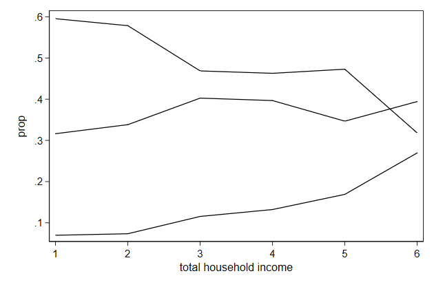
The main elements of a graph -- line
-------------------------------------------------------------------------------
Line color
You can change the collor of a line in a line graph using the lcolor()
option
This is documented in connect options
.         twoway line prop1 prop2 prop3 hhinc,  ///
>             xlabel(1/6, valuelabel angle(30)) ///
>             ytitle(proportion)                ///
>             lcolor(green gs3 purple)          ///
>             name(color1, replace)
-------------------------------------------------------------------------------
<< index >>
-------------------------------------------------------------------------------
-------------------------------------------------------------------------------
The main elements of a graph -- line
-------------------------------------------------------------------------------

                                     Width

    The width of the lines is governed by the lwidth() option.

    This is documented in connect options
.         twoway line prop1 prop2 prop3 hhinc,  ///
>             xlabel(1/6, valuelabel angle(30)) ///
>             ytitle(proportion)                ///
>             lpattern(solid ...)               ///
>             lwidth(vthin medthick vvthick)    ///
>             name(width, replace)
-------------------------------------------------------------------------------
<< index >>
-------------------------------------------------------------------------------
-------------------------------------------------------------------------------
The main elements of a graph -- line
-------------------------------------------------------------------------------
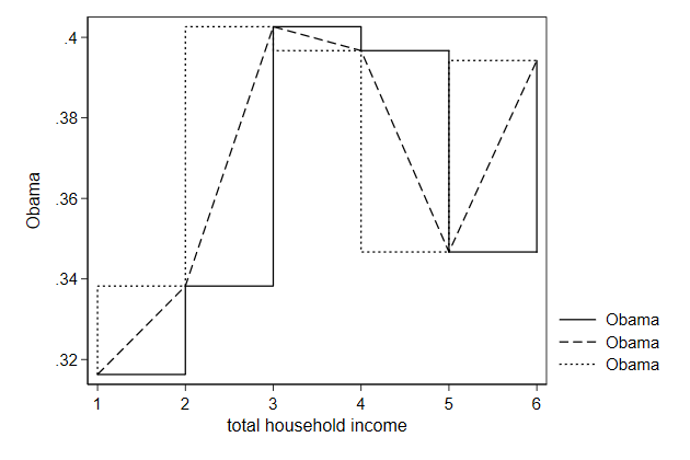
Connect styles
Normally, the sort order in the data determine which points are connected
Sometimes that is not what we want
.         graph drop _all

.         sort candidat hhinc

.         list candidat hhinc prop

     +-------------------------------------------+
     |    candidate             hhinc       prop |
     |-------------------------------------------|
  1. |        Obama          lt 5,000   .3162791 |
  2. |        Obama    5,000 - 10,000   .3382353 |
  3. |        Obama   10,000 - 15,000   .4026403 |
  4. |        Obama   15,000 - 20,000   .3966942 |
  5. |        Obama   20,000 - 25,000   .3467049 |
     |-------------------------------------------|
  6. |        Obama    25,000 or more    .394248 |
  7. |       Romney          lt 5,000   .0697674 |
  8. |       Romney    5,000 - 10,000   .0735294 |
  9. |       Romney   10,000 - 15,000   .1155116 |
 10. |       Romney   15,000 - 20,000   .1322314 |
     |-------------------------------------------|
 11. |       Romney   20,000 - 25,000   .1690544 |
 12. |       Romney    25,000 or more   .2696225 |
 13. | did not vote          lt 5,000   .5953488 |
 14. | did not vote    5,000 - 10,000   .5784314 |
 15. | did not vote   10,000 - 15,000   .4686469 |
     |-------------------------------------------|
 16. | did not vote   15,000 - 20,000   .4628099 |
 17. | did not vote   20,000 - 25,000   .4727794 |
 18. | did not vote    25,000 or more   .3181546 |
     +-------------------------------------------+

.         twoway line prop hhinc,          ///
>             name(connect1, replace)
Sometimes we only want to connect lines when its x-value has increased
.         twoway line prop hhinc,          ///
>             connect(L)                 ///
>             name(connect2, replace)
    Normaly the point are connected directly, but you can also first move
    horizontally to the new x-position and than vertically to the new y
    position, or vice versa.
.         twoway line prop1 prop1 prop1 hhinc, ///
>             connect(J l stepstair)         ///
>             name(connect3, replace)
    Normally missing values are simply ignored and no break will appear in
    the line.
.         replace prop2 = . in 9
(1 real change made, 1 to missing)

.         twoway line prop2 hhinc,              ///
>             name(connect4, replace)
You can add breaks at missing values using the cmissing(n) option
.         twoway line prop2 hhinc,              ///
>             cmissing(n)                     ///
>             name(connect5, replace)
    All this is documented in connect options

                                Try it yourself

    Continue work on the graph made in the previous Do it yourself. Add a
    line representing the total number of diploma, and make sure all three
    lines are visible. For 1943 and 1944 there is no data on the number of
    diplomas. Change the line to represent that.
linestyle_sol.do
-------------------------------------------------------------------------------
<< index >>
-------------------------------------------------------------------------------
-------------------------------------------------------------------------------
The main elements of a graph -- area
-------------------------------------------------------------------------------

                           the area around the graph

    You can determine whether your plot has a border around it or not with
    the plotregion() option

    This is documented in region options
.         graph drop _all

.         sysuse auto, clear
(1978 Automobile Data)

.         scatter price weight,         ///
>             plotregion(lstyle(none))  ///
>             name(border, replace)
    The default scheme has a blueish background shade that some people like
    and others don't

    You can get rid of them using the graphregion() option
.         scatter price weight,         ///
>             scheme(s2color)           ///
>             name(shaded, replace)

.
.         scatter price weight,         ///
>             scheme(s2color)           ///
>             graphregion(color(white)) /// <-- new
>             name(noshade, replace)
-------------------------------------------------------------------------------
<< index >>
-------------------------------------------------------------------------------
-------------------------------------------------------------------------------
The main elements of a graph -- area
-------------------------------------------------------------------------------

                             The size of the graph

    You can change the height of the graph using the ysize() option.

    You can change the width of the graph using the xsize() option.

    This is documenten in region options
.         graph drop _all

.         sysuse auto, clear
(1978 Automobile Data)

.         scatter price weight, ///
>            ysize(2) name(size)
    Doing this can sometimes lead to labels and titles that are too small or
    too large.

    You can use the scale() option to correct this.

    This is documented in scale option.
.         scatter price weight,   ///
>             ysize(2) scale(1.5) ///
>             name(size2)
    You can also change the relative height of the plotregion instead of the
    height of the graph.

    This can make sense if you are plotting two variables with the same scale
    against one another, for example own education versus partner's
    education.
.         scatter price weight,  ///
>             aspect(1) name(size3)
-------------------------------------------------------------------------------
<< index >>
-------------------------------------------------------------------------------
-------------------------------------------------------------------------------
The main elements of a graph -- schemes
-------------------------------------------------------------------------------

                                    Schemes

    With schemes you set the overall look of the graph
. sysuse auto, clear
(1978 Automobile Data)
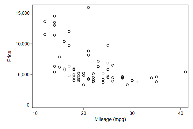
. scatter price mpg, scheme(s2color) name(s2color, replace)
. scatter price mpg, scheme(s1mono) name(s1mono, replace)
. scatter price mpg, scheme(s1rcolor) name(s1rcolor, replace)
. scatter price mpg, scheme(economist) name(economist, replace)


-------------------------------------------------------------------------------
<< index >>
-------------------------------------------------------------------------------
-------------------------------------------------------------------------------
The main elements of a graph -- schemes
-------------------------------------------------------------------------------

                                  Set scheme

    If you have a favorite scheme, you can use set scheme to set it as your
    default.

    That way you don't have to use the scheme() option each time you create a
    graph
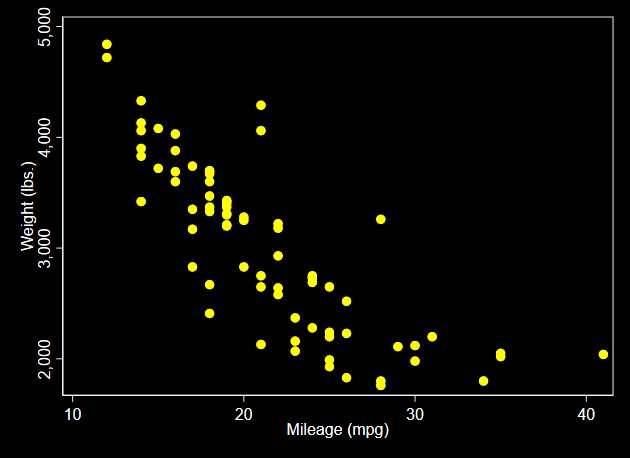
.         set scheme s1rcolor

.         sysuse auto, clear
(1978 Automobile Data)

.         scatter price mpg, name(price5, replace)

.         scatter weight mpg, name(weight2, replace)
    set scheme only sets the scheme for this session of Stata.

    When you restart Stata you'll return to the default scheme.

    If you want to set the scheme for all futur session, then you add the
    permanently option to set scheme.
-------------------------------------------------------------------------------
<< index >>
-------------------------------------------------------------------------------
-------------------------------------------------------------------------------
The main elements of a graph -- schemes
-------------------------------------------------------------------------------
User scheme
User's can write their own schemes
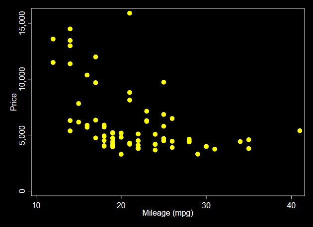
A very useful one, and my default, is the lean1 scheme from Svend Juul.
To find it type in Stata search lean
.         set scheme lean1, permanently
(set scheme preference recorded)

.         sysuse auto, clear
(1978 Automobile Data)

.         scatter price mpg, name(price6, replace)

.         scatter weight mpg, name(weight3, replace)
-------------------------------------------------------------------------------
<< index >>
-------------------------------------------------------------------------------
-------------------------------------------------------------------------------
building a graph
-------------------------------------------------------------------------------

                                   Work flow

    A lot of work involves getting the data in the right shape before you
    start graphing

    I work in a .do file

    I may experiment using the command window, but the result immediatly ends
    up in the .do file

    I usually start very simple with the main graph without any options

    I add options one at the time, and correct any mistakes (those are many)
    as they occur.

    I consult the help files often

    I don't know the exact names of all the help files. I usually start with
    scatter or line, and click my way through the links.
-------------------------------------------------------------------------------
<< index >>
-------------------------------------------------------------------------------
-------------------------------------------------------------------------------
building a graph -- stacking graphs
-------------------------------------------------------------------------------

                                Stacking graphs

    A very powerful trick is that you can stack twoway graphs on top of one
    another.
.         sysuse auto, clear
(1978 Automobile Data)

.         graph drop _all

.         reg price mpg

      Source |       SS           df       MS      Number of obs   =        74
-------------+----------------------------------   F(1, 72)        =     20.26
       Model |   139449474         1   139449474   Prob > F        =    0.0000
    Residual |   495615923        72  6883554.48   R-squared       =    0.2196
-------------+----------------------------------   Adj R-squared   =    0.2087
       Total |   635065396        73  8699525.97   Root MSE        =    2623.7

------------------------------------------------------------------------------
       price |      Coef.   Std. Err.      t    P>|t|     [95% Conf. Interval]
-------------+----------------------------------------------------------------
         mpg |  -238.8943   53.07669    -4.50   0.000    -344.7008   -133.0879
       _cons |   11253.06   1170.813     9.61   0.000     8919.088    13587.03
------------------------------------------------------------------------------

.         predict pricehat
(option xb assumed; fitted values)

.         predict se , stdp

.         gen lb = pricehat - invttail(e(df_r), .025)*se

.         gen ub = pricehat + invttail(e(df_r), .025)*se

.         twoway                         ///
>           rarea lb ub mpg,             ///
>             sort astyle(ci)         || ///
>           line pricehat mpg,           ///
>             sort lpattern(solid)    || ///
>           scatter price mpg,           ///
>             msymbol(oh)                ///
>             legend(off)                ///
>             ytitle(price)              ///
>             name(stack1, replace)
    The order in which you mention graphs will be the order in which they are
    drawn.

    So if you draw an area graph, then it will cover anything drawn before it
.         twoway                         ///
>           scatter price mpg,           ///
>             msymbol(oh)             || ///
>           rarea lb ub mpg,             ///
>             sort astyle(ci)         || ///
>           line pricehat mpg,           ///
>             sort lpattern(solid)       ///
>             legend(off)                ///
>             ytitle(price)              ///
>             name(stack2, replace)
You can overcome that by changing the opacity of the object
.         twoway                         ///
>           scatter price mpg,           ///
>             msymbol(oh)             || ///
>           rarea lb ub mpg,             ///
>             sort astyle(ci)            ///
>             acolor(%50)             || ///
>           line pricehat mpg,           ///
>             sort lpattern(solid)       ///
>             legend(off)                ///
>             ytitle(price)              ///
>             name(stack3, replace)
-------------------------------------------------------------------------------
<< index >>
-------------------------------------------------------------------------------
-------------------------------------------------------------------------------
building a graph -- stacking graphs
-------------------------------------------------------------------------------
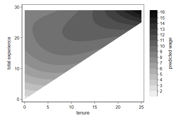
Hiding parts of a graph
We looked previously at the joint effect of total experience and tenure.
But not all combinations of these two variables are possible:
If you have been two years at a company, you cannot have less than two
years total experience.
.         graph drop _all

.         sysuse nlsw88, clear
(NLSW, 1988 extract)

.         scatter ttl_exp tenure, name(impossible, replace)
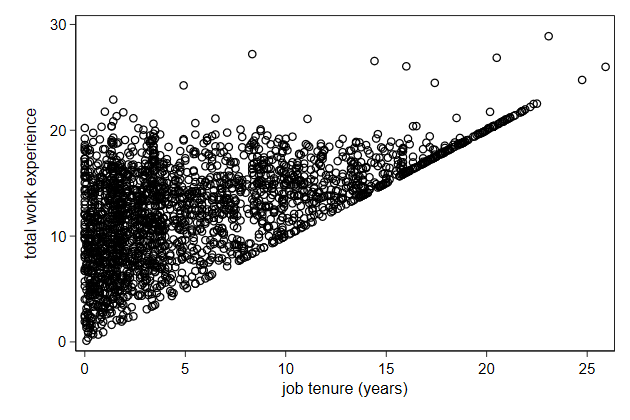
So there is a triangle in the plot below that makes no sense.
.         reg wage c.ttl_exp##c.ttl_exp##c.tenure##c.tenure

      Source |       SS           df       MS      Number of obs   =     2,231
-------------+----------------------------------   F(8, 2222)      =     22.72
       Model |  5602.23303         8  700.279129   Prob > F        =    0.0000
    Residual |  68499.5946     2,222  30.8279004   R-squared       =    0.0756
-------------+----------------------------------   Adj R-squared   =    0.0723
       Total |  74101.8276     2,230  33.2295191   Root MSE        =    5.5523

------------------------------------------------------------------------------
        wage |      Coef.   Std. Err.      t    P>|t|     [95% Conf. Interval]
-------------+----------------------------------------------------------------
     ttl_exp |   .5151949   .1917126     2.69   0.007     .1392403    .8911495
             |
   c.ttl_exp#|
   c.ttl_exp |  -.0105392   .0088431    -1.19   0.233    -.0278808    .0068023
             |
      tenure |   .0366325   .4801103     0.08   0.939    -.9048793    .9781442
             |
   c.ttl_exp#|
    c.tenure |   .0400039   .0680121     0.59   0.556      -.09337    .1733779
             |
   c.ttl_exp#|
   c.ttl_exp#|
    c.tenure |  -.0014586   .0025993    -0.56   0.575     -.006556    .0036387
             |
    c.tenure#|
    c.tenure |   -.014302   .0445745    -0.32   0.748     -.101714      .07311
             |
   c.ttl_exp#|
    c.tenure#|
    c.tenure |   -.001373   .0043596    -0.31   0.753    -.0099223    .0071764
             |
   c.ttl_exp#|
   c.ttl_exp#|
    c.tenure#|
    c.tenure |   .0000807   .0001224     0.66   0.510    -.0001594    .0003208
             |
       _cons |   2.426311   .9707341     2.50   0.013     .5226704    4.329952
------------------------------------------------------------------------------

.         drop _all

.         set obs 30
number of observations (_N) was 0, now 30

.         gen ttl_exp = _n - 1

.         gen tenure  = _n - 1 if _n < 27
(4 missing values generated)

.         fillin ttl_exp tenure

.         drop if tenure == .
(30 observations deleted)

.         predict wagehat
(option xb assumed; fitted values)

.
.         twoway contour wagehat ttl_exp tenure , ///
>             ccuts(2(1)16)                       ///
>             name(triangle1, replace)
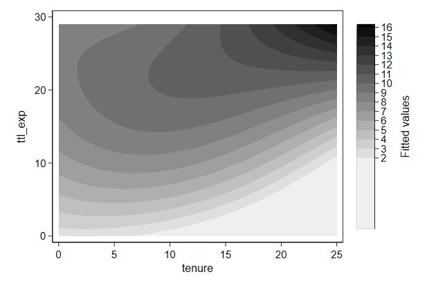
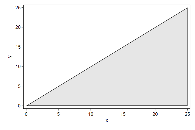
We can draw such a triangle as follows
.         twoway function y=x, range(0 25) recast(area) ///
>         name(triangle2, replace)
We can cover the non-sensical part as so:
.         twoway contour wagehat ttl_exp tenure ,   ///
>             ccuts(2(1)16) ||                      ///
>                function y=x,                      ///
>             range(0 25) recast(area) color(white) ///
>             xtitle(tenure)                        ///
>             ytitle(total experience)              ///
>             ztitle(predicted wage)                ///
>             name(triangle3, replace)
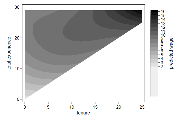
    The lowest category in the legend still looks too long, which we can fix
    with the if condition
.         twoway contour wagehat ttl_exp tenure if wagehat > 1, ///
>             ccuts(2(1)16) ||                                  ///
>                function y=x,                                  ///
>             range(0 25) recast(area) color(white)             ///
>             xtitle(tenure)                                    ///
>             ytitle(total experience)                          ///
>             ztitle(predicted wage)                            ///
>             name(triangle4, replace)
-------------------------------------------------------------------------------
<< index >>
-------------------------------------------------------------------------------
-------------------------------------------------------------------------------
building a graph -- stacking graphs
-------------------------------------------------------------------------------
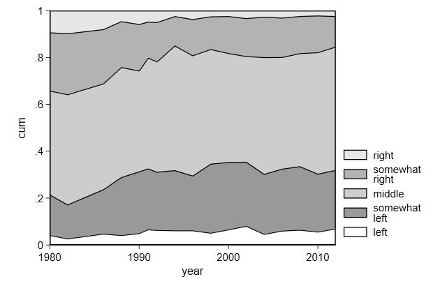
Stacking area graphs and using the other y-axis
We can use stacked area plots to show a change in the composition of a
population over time.
.         use ZA4578_v1-0-0.dta, clear

.         graph drop _all

.         gen year = V2

.         gen pol = ceil(V24/2) if !inlist(V24,0,97, 98, 99)
(5,671 missing values generated)

.         bys year pol : gen n = _N if _n == 1 & pol != .
(57,638 missing values generated)

.         bys year : egen N = total(n)

.         bys year (pol) : gen cum = sum(n)

.         replace cum = cum / N
(57,723 real changes made, 3,004 to missing)

.         twoway area cum year if pol == 5 || ///
>                area cum year if pol == 4 || ///
>                area cum year if pol == 3 || ///
>                area cum year if pol == 2 || ///
>                area cum year if pol == 1 ,  ///
>             name(comp1, replace)
    We want to change the legend, and the margins around the graph is also
    something we may want to remove.
.         twoway area cum year if pol == 5 ||   ///
>                area cum year if pol == 4 ||   ///
>                area cum year if pol == 3 ||   ///
>                area cum year if pol == 2 ||   ///
>                area cum year if pol == 1 ,    ///
>             plotregion(margin(zero))          ///
>             legend(order(1 "right"            ///
>                          2 "somewhat" "right" ///
>                          3 "middle"           ///
>                          4 "somewhat" "left"  ///
>                          5 "left"))           ///
>             name(comp2, replace)
We can also use a second y-axis to label each area
.         sum cum if pol == 5 & year == 2012, meanonly

.         local pos = r(mean)

.         sum cum if pol == 4 & year == 2012, meanonly

.         local pos = r(mean) + (`pos' - r(mean))/2

.         local yscale `"`pos' "right""'

.
.         sum cum if pol == 4 & year == 2012, meanonly

.         local pos = r(mean)

.         sum cum if pol == 3 & year == 2012, meanonly

.         local pos = r(mean) + (`pos' - r(mean))/2

.         local yscale `"`yscale' `pos' `""somewhat" "right""'"'

.
.         sum cum if pol == 3 & year == 2012, meanonly

.         local pos = r(mean)

.         sum cum if pol == 2 & year == 2012, meanonly

.         local pos = r(mean) + (`pos' - r(mean))/2

.         local yscale `"`yscale' `pos' "middle" "'

.
.         sum cum if pol == 2 & year == 2012, meanonly

.         local pos = r(mean)

.         sum cum if pol == 1 & year == 2012, meanonly

.         local pos = r(mean) + (`pos' - r(mean))/2

.         local yscale `"`yscale' `pos' `""somewhat" "left""'"'

.
.         local pos = 0 + (0+r(mean))/2

.         local yscale `"`yscale' `pos' "left""'

.
.         twoway area cum year if pol == 5 ||          ///
>                area cum year if pol == 4 ||          ///
>                area cum year if pol == 3 ||          ///
>                area cum year if pol == 2 ||          ///
>                area cum year if pol == 1,            ///
>             yscale(range(0 1)) ||                    ///
>                scatteri .5 2010, msymbol(i)          ///
>             yaxis(2) yscale(range(0 1) axis(2))      ///
>             ylab(`yscale', axis(2)) legend(off)      ///
>             plotregion(margin(zero))                 ///
>             ytitle("cumulative proportion", axis(1)) ///
>             ytitle("", axis(2))                      ///
>             xtitle(year)                             ///
>             name(comp3, replace)
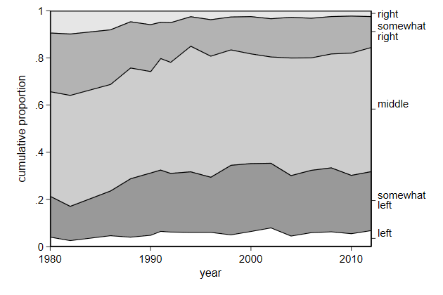
    Notice that the labels left and middle are misalligned.

    This is a bug in Stata, and we can fix it as follows:
.         sum cum if pol == 5 & year == 2012, meanonly

.         local pos = r(mean)

.         sum cum if pol == 4 & year == 2012, meanonly

.         local pos = r(mean) + (`pos' - r(mean))/2

.         local yscale `"`pos' "right""'

.
.         sum cum if pol == 4 & year == 2012, meanonly

.         local pos = r(mean)

.         sum cum if pol == 3 & year == 2012, meanonly

.         local pos = r(mean) + (`pos' - r(mean))/2

.         local yscale `"`yscale' `pos' `""somewhat" "right""'"'

.
.         sum cum if pol == 3 & year == 2012, meanonly

.         local pos = r(mean)

.         sum cum if pol == 2 & year == 2012, meanonly

.         local pos = r(mean) + (`pos' - r(mean))/2

.         local yscale `"`yscale' `pos' `"" " "middle" " ""'"'

.
.         sum cum if pol == 2 & year == 2012, meanonly

.         local pos = r(mean)

.         sum cum if pol == 1 & year == 2012, meanonly

.         local pos = r(mean) + (`pos' - r(mean))/2

.         local yscale `"`yscale' `pos' `""somewhat" "left""'"'

.
.         local pos = 0 + (0+r(mean))/2

.         local yscale `"`yscale' `pos' `"" " "left" " ""'"'

.
.         twoway area cum year if pol == 5 ||          ///
>                area cum year if pol == 4 ||          ///
>                area cum year if pol == 3 ||          ///
>                area cum year if pol == 2 ||          ///
>                area cum year if pol == 1,            ///
>             yscale(range(0 1)) ||                    ///
>                scatteri .5 2010, msymbol(i)          ///
>             yaxis(2) yscale(range(0 1) axis(2))      ///
>             ylab(`yscale', axis(2)) legend(off)      ///
>             plotregion(margin(zero))                 ///
>             ytitle("cumulative proportion", axis(1)) ///
>             ytitle("", axis(2))                      ///
>             xtitle(year)                             ///
>             name(comp4, replace)

-------------------------------------------------------------------------------
<< index >>
-------------------------------------------------------------------------------
-------------------------------------------------------------------------------
building a graph -- stacking graphs
-------------------------------------------------------------------------------
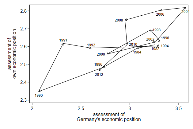
Labeling points
We can improve our arrow plot by adding labels telling use at which year
each point occured
.         use ecassess, clear
(ALLBUS 1980-2012)

.         gen sort = _n

.         tsset sort
        time variable:  sort, 1 to 16
                delta:  1 unit

.         twoway pcarrow L.own L.brd own brd,       ///
>             ytitle("assessment of"                ///
>                    "own economic position")       ///
>             xtitle("assessment of"                ///
>                    "Germany's economic position") ///
>             name(pcarrow2, replace)           ||  ///
>         scatter own brd, msymbol(i) mlabel(year) legend(off)
    The label overlap. We can tell Stata where to put the label relative to
    the point using the mlabvpos() option.

    This requires that we create a new variable that tells where the label
    should be.

    This new variable contains a  clock position, so 12 is above the point, 3
    is to the right, etc.
.         gen byte labpos =  6 if year == 1982
(15 missing values generated)

.         replace  labpos =  6 if year == 1984
(1 real change made)

.         replace  labpos = 11 if year == 1986
(1 real change made)

.         replace  labpos =  6 if year == 1990
(1 real change made)

.         replace  labpos = 12 if year == 1991
(1 real change made)

.         replace  labpos = 12 if year == 1992
(1 real change made)

.         replace  labpos =  3 if year == 1994
(1 real change made)

.         replace  labpos =  2 if year == 1996
(1 real change made)

.         replace  labpos =  3 if year == 1998
(1 real change made)

.         replace  labpos =  9 if year == 2000
(1 real change made)

.         replace  labpos = 11 if year == 2002
(1 real change made)

.         replace  labpos =  6 if year == 2004
(1 real change made)

.         replace  labpos =  6 if year == 2006
(1 real change made)

.         replace  labpos =  9 if year == 2008
(1 real change made)

.         replace  labpos =  3 if year == 2010
(1 real change made)

.         replace  labpos =  6 if year == 2012
(1 real change made)

.
.         twoway pcarrow L.own L.brd own brd,       ///
>             ytitle("assessment of"                ///
>                    "own economic position")       ///
>             xtitle("assessment of"                ///
>                    "Germany's economic position") ///
>             name(pcarrow3, replace)           ||  ///
>         scatter own brd, msymbol(i) mlabel(year)  ///
>         legend(off) mlabvpos(labpos)
                                Try it yourself

    Below we use predictnl to create predicted wage for different values of
    ttl_exp, while keeping race, grade, and union constant, and the 95%
    confidence interval around it. Use these variables to create a graph
. sysuse nlsw88, clear
(NLSW, 1988 extract)

. poisson wage c.ttl_exp##c.ttl_exp i.race grade i.union, vce(robust) irr
note: you are responsible for interpretation of noncount dep. variable

Iteration 0:   log pseudolikelihood = -4770.3616
Iteration 1:   log pseudolikelihood = -4770.3504
Iteration 2:   log pseudolikelihood = -4770.3504

Poisson regression                              Number of obs     =      1,876
                                                Wald chi2(6)      =    1050.65
                                                Prob > chi2       =     0.0000
Log pseudolikelihood = -4770.3504               Pseudo R2         =     0.1196

------------------------------------------------------------------------------
             |               Robust
        wage |        IRR   Std. Err.      z    P>|z|     [95% Conf. Interval]
-------------+----------------------------------------------------------------
     ttl_exp |   1.078365   .0105077     7.74   0.000     1.057966    1.099158
             |
   c.ttl_exp#|
   c.ttl_exp |   .9985742   .0003766    -3.78   0.000     .9978364    .9993125
             |
        race |
      black  |   .8986486   .0216837    -4.43   0.000     .8571386    .9421688
      other  |   1.099973   .0981455     1.07   0.286     .9234919    1.310179
             |
       grade |   1.079068   .0047658    17.23   0.000     1.069767    1.088449
             |
       union |
      union  |   1.135983   .0277442     5.22   0.000     1.082886    1.191683
       _cons |   1.307377    .097865     3.58   0.000     1.128972    1.513974
------------------------------------------------------------------------------
Note: _cons estimates baseline incidence rate.

. replace race = 1 if race < .
(609 real changes made)

. replace grade = 12 if grade < .
(1,301 real changes made)

. replace union = 0 if union < .
(461 real changes made)

.
. predictnl wagehat = exp(xb()), ci(lb ub)
(370 missing values generated)
note: confidence intervals calculated using Z critical values
stack_sol.do
-------------------------------------------------------------------------------
<< index >>
-------------------------------------------------------------------------------
-------------------------------------------------------------------------------
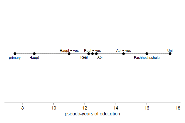
building a graph -- immediate commands
-------------------------------------------------------------------------------
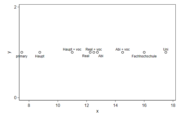
Immediate commands
With immediate commands you "type in the data" as part of the command.
Say we have developed a scale for educational levels and want to display
that.
.         graph drop _all

.         twoway scatteri 1 7.5 (6) "primary"          ///
>                         1 8.75 (6) "Haupt"           ///
>                         1 12.25 (7) "Real"           ///
>                         1 12.75 (5) "Abi"            ///
>                         1 11 (12) "Haupt + voc"      ///
>                         1 12.5 (12) "Real + voc"     ///
>                         1 14.5 (12) "Abi + voc"      ///
>                         1 16 (6) "Fachhochschule"    ///
>                         1 17.5 (12) "Uni",           ///
>             name(edscale1, replace)
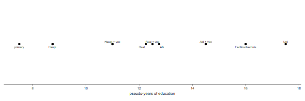
We can add a horizontal line on which the educational levels are located.
.         twoway function y = 1,                       ///
>             range(7.5 17.5)                          ///
>             lpattern(solid) lcolor(gs8)           || ///
>                scatteri 1 7.5 (6) "primary"          ///
>                         1 8.75 (6) "Haupt"           ///
>                         1 12.25 (7) "Real"           ///
>                         1 12.75 (5) "Abi"            ///
>                         1 11 (12) "Haupt + voc"      ///
>                         1 12.5 (12) "Real + voc"     ///
>                         1 14.5 (12) "Abi + voc"      ///
>                         1 16 (6) "Fachhochschule"    ///
>                         1 17.5 (12) "Uni",           ///
>             name(edscale2, replace)
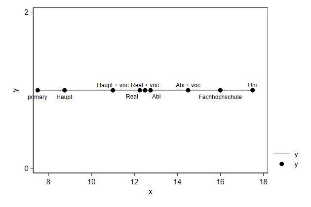
    The y-axis and the legend contain no information, so those need to be
    removed.

    It is more a diagram then a graph, so an outline around the graph makes
    less sense.
.         twoway function y = 1,                       ///
>             range(7.5 17.5)                          ///
>             lpattern(solid) lcolor(gs8)           || ///
>                scatteri 1 7.5 (6) "primary"          ///
>                         1 8.75 (6) "Haupt"           ///
>                         1 12.25 (7) "Real"           ///
>                         1 12.75 (5) "Abi"            ///
>                         1 11 (12) "Haupt + voc"      ///
>                         1 12.5 (12) "Real + voc"     ///
>                         1 14.5 (12) "Abi + voc"      ///
>                         1 16 (6) "Fachhochschule"    ///
>                         1 17.5 (12) "Uni",           ///
>             name(edscale3, replace)                  ///
>             yscale(off) plotregion(lstyle(none))     ///
>             xtitle("pseudo-years of education")      ///
>             xscale(range(7 18)) legend(off)
We can make the graph flatter with the ysize() option
.         twoway function y = 1,                       ///
>             range(7.5 17.5)                          ///
>             lpattern(solid) lcolor(gs8)           || ///
>                scatteri 1 7.5 (6) "primary"          ///
>                         1 8.75 (6) "Haupt"           ///
>                         1 12.25 (7) "Real"           ///
>                         1 12.75 (5) "Abi"            ///
>                         1 11 (12) "Haupt + voc"      ///
>                         1 12.5 (12) "Real + voc"     ///
>                         1 14.5 (12) "Abi + voc"      ///
>                         1 16 (6) "Fachhochschule"    ///
>                         1 17.5 (12) "Uni",           ///
>             name(edscale4, replace)                  ///
>             yscale(off) plotregion(lstyle(none))     ///
>             xtitle("pseudo-years of education")      ///
>             xscale(range(7 18)) legend(off)          ///
>             ysize(2)
    But now the symbols and fonts are too small, which we can fix with the
    scale option
.         twoway function y = 1,                       ///
>             range(7.5 17.5)                          ///
>             lpattern(solid) lcolor(gs8)           || ///
>                scatteri 1 7.5 (6) "primary"          ///
>                         1 8.75 (6) "Haupt"           ///
>                         1 12.25 (7) "Real"           ///
>                         1 12.75 (5) "Abi"            ///
>                         1 11 (12) "Haupt + voc"      ///
>                         1 12.5 (12) "Real + voc"     ///
>                         1 14.5 (12) "Abi + voc"      ///
>                         1 16 (6) "Fachhochschule"    ///
>                         1 17.5 (12) "Uni",           ///
>             name(edscale5, replace)                  ///
>             yscale(off) plotregion(lstyle(none))     ///
>             xtitle("pseudo-years of education")      ///
>             xscale(range(7 18)) legend(off)          ///
>             ysize(2) scale(2.5)
-------------------------------------------------------------------------------
<< index >>
-------------------------------------------------------------------------------
-------------------------------------------------------------------------------
building a graph -- immediate commands
-------------------------------------------------------------------------------
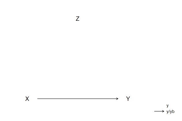
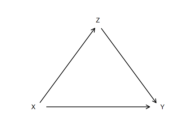
Immediate commands with arrows
Say we want to create a diagram showing that the effect of X on Y is
mediated by Z.
We can start with putting X Y and Z on a graph
.         graph drop _all

.
.         twoway scatteri 0 0   (0)  "X"  ///
>                         0 1   (0)  "Y"  ///
>                         1 0.5 (12) "Z", ///
>             name(indir1, replace)
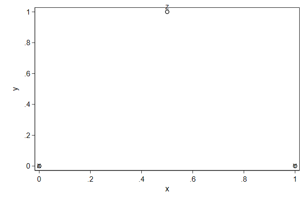
We can remove the markers and make the labels larger
.         twoway scatteri 0 0   (0)  "X"  ///
>                         0 1   (0)  "Y"  ///
>                         1 0.5 (12) "Z", ///
>             msymbol(i) mlabsize(large)  ///
>             name(indir2, replace)
We don't need the axes and the plot outline
.         twoway scatteri 0 0   (0)  "X"     ///
>                         0 1   (0)  "Y"     ///
>                         1 0.5 (12) "Z",    ///
>             msymbol(i) mlabsize(large)     ///
>             yscale(range(-.2 1.2) off)     ///
>             ylab(0 1,nolabels noticks)     ///
>             xscale(range(-.2 1.2) off)     ///
>             ytitle("") xtitle("")          ///
>             plotregion(lstyle(none))       ///
>             name(indir3, replace)
We can draw the first arrow
.         twoway scatteri 0 0   (0)  "X"     ///
>                         0 1   (0)  "Y"     ///
>                         1 0.5 (12) "Z",    ///
>             msymbol(i) mlabsize(large)     ///
>             msymbol(i) mlabsize(large)     ///
>             yscale(range(-.2 1.2) off)     ///
>             ylab(0 1,nolabels noticks)     ///
>             xscale(range(-.2 1.2) off)     ///
>             ytitle("") xtitle("")          ///
>             plotregion(lstyle(none))       ///
>             name(indir4, replace)       || ///
>                pcarrowi 0 .1 0 .9
Make sure it looks right
.         twoway scatteri 0 0   (0)  "X"              ///
>                         0 1   (0)  "Y"              ///
>                         1 0.5 (12) "Z",             ///
>             msymbol(i) mlabsize(large)              ///
>             msymbol(i) mlabsize(large)              ///
>             yscale(range(-.2 1.2) off)              ///
>             ylab(0 1,nolabels noticks)              ///
>             xscale(range(-.2 1.2) off)              ///
>             ytitle("") xtitle("")                   ///
>             plotregion(lstyle(none))                ///
>             name(indir5, replace)                || ///
>                pcarrowi 0 .1 0 .9,                  ///
>             legend(off)                             ///
>             msize(*2) lwidth(*1.8) mlwidth(*1.8)
Than add the remaining arrows
.         twoway scatteri 0 0   (0)  "X"              ///
>                         0 1   (0)  "Y"              ///
>                         1 0.5 (12) "Z",             ///
>             msymbol(i) mlabsize(large)              ///
>             msymbol(i) mlabsize(large)              ///
>             yscale(range(-.2 1.2) off)              ///
>             ylab(0 1,nolabels noticks)              ///
>             xscale(range(-.2 1.2) off)              ///
>             ytitle("") xtitle("")                   ///
>             plotregion(lstyle(none))                ///
>             name(indir6, replace)                || ///
>                pcarrowi 0 .1 0 .9,                  ///
>             legend(off)                             ///
>             msize(*2) lwidth(*1.8) mlwidth(*1.8) || ///
>                pcarrowi .95 .525 0.05 .95,          ///
>             legend(off)                             ///
>             msize(*2) lwidth(*1.8) mlwidth(*1.8) || ///
>                pcarrowi 0.05 .05 .95 .475,          ///
>             legend(off)                             ///
>             msize(*2) lwidth(*1.8) mlwidth(*1.8)
-------------------------------------------------------------------------------
<< index >>
-------------------------------------------------------------------------------
-------------------------------------------------------------------------------
building a graph -- data
-------------------------------------------------------------------------------

                          Preparing data for a graph

    Preparing data especially for graqphs is a powerful strategy for creating
    graphs
.         sysuse nlsw88, clear
(NLSW, 1988 extract)

.         graph drop _all

.         bys industry : egen mwage = mean(wage)

.         twoway scatter industry mwage, ///
>            ylab(1/12, valuelabel)      ///
>            name(mwage1, replace)
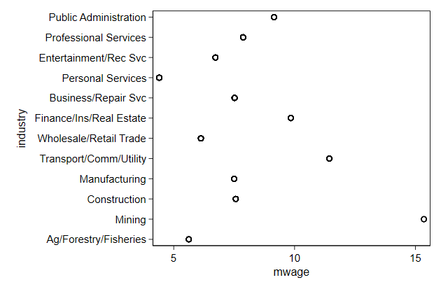
    The graph would be clearer if the industries were sorted by mean wage

    We can do so witht he axis user written egen function, which is part of
    {egenmore}

    You can get egenmore by typing ssc install egenmore
.         egen Industry = axis(mwage industry) , label(industry)
(14 missing values generated)

.         twoway scatter Industry mwage, ///
>             ylab(1/12, valuelabel)     ///
>             ytitle("")                 ///
>             xtitle("mean wage")        ///
>             name(mwage2, replace)

.         graph save gr1, replace
(file gr1.gph saved)
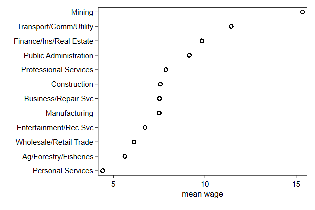
    Each observation in the data appears in this graph, but we need only one
    observation per industry. By plotting only one point per industry we can
    safe some memory
.         bys industry : gen byte mark = _n == 1

.
.         twoway scatter Industry mwage if mark, ///
>             ylab(1/12, valuelabel)             ///
>             ytitle("")                         ///
>             xtitle("mean wage")                ///
>             name(mwage3, replace)

.         graph save gr2, replace
(file gr2.gph saved)

.
.         dir *.gph
  24.0k   6/20/18 20:31  gr1.gph
   6.7k   6/20/18 20:31  gr2.gph
   6.2k   6/20/18 20:30  uni.gph
-------------------------------------------------------------------------------
<< index >>
-------------------------------------------------------------------------------
-------------------------------------------------------------------------------
building a graph -- nontwoway
-------------------------------------------------------------------------------

                               Non-twoway graphs

    Not all graphs in Stata are twoway, for example graph bar, histogram, and
    graph pie

    They are usually less flexible and it is harder to stack graphs, though
    some have the addplot() option.
-------------------------------------------------------------------------------
<< index >>
-------------------------------------------------------------------------------
-------------------------------------------------------------------------------
Graphs side by side -- combine
-------------------------------------------------------------------------------

                               Combining graphs

    We can use graph combine to put two or more graphs next to one another
.         sysuse uslifeexp, clear
(U.S. life expectancy, 1900-1999)

.         line le_male   year, name(male, replace)

.         line le_female year, name(female, replace)

.         graph combine male female, name(comb1, replace)
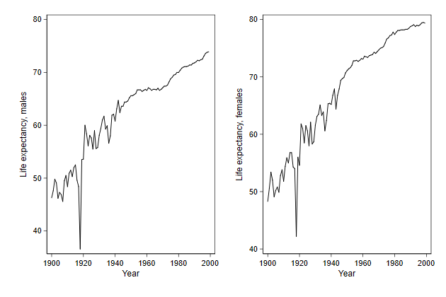
Notice that the y-axes of the two graphs are not alligned
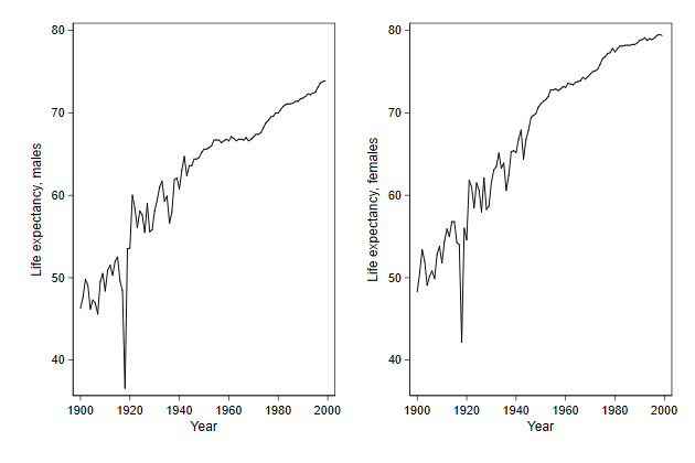
.         graph combine male female, ///
>             name(comb2, replace)   ///
>             ycommon
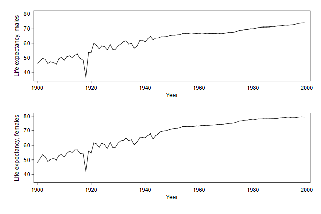
We can also put the graphs underneath one another.
.         graph combine male female, ///
>             name(comb3, replace)   ///
>             ycommon cols(1)
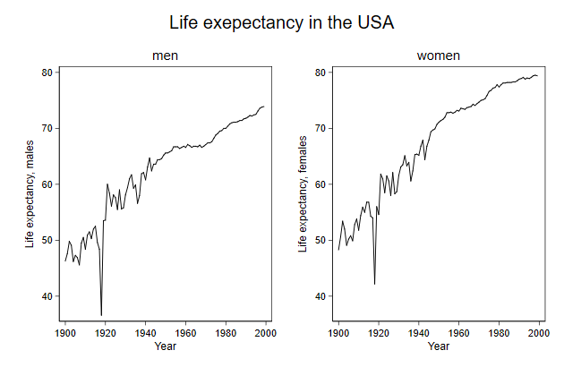
We can add titles
.         line le_male   year, ///
>             title(men) name(male, replace)

.         line le_female year, ///
>             title(women) name(female, replace)

.         graph combine male female, ///
>             name(comb4, replace) ///
>             title(Life exepectancy in the USA) ///
>             ycommon
-------------------------------------------------------------------------------
<< index >>
-------------------------------------------------------------------------------
-------------------------------------------------------------------------------
Graphs side by side -- combine
-------------------------------------------------------------------------------

                          Legends in a combined graph

    If we are legends part of the graphs that are combined, then these will
    be repeated. Which will give the same information twice (or more)
.         graph drop _all

.         use ecassess, clear
(ALLBUS 1980-2012)

.
.         twoway line brd_h own_h year,          ///
>             legend(order(1 "Germany" 2 "Own")) ///
>             title(high income)                 ///
>             name(high, replace)

.
.         twoway line brd_l own_l year,          ///
>             legend(order(1 "Germany" 2 "Own")) ///
>             title(low income)                  ///
>             name(low, replace)

.
.         graph combine high low,                     ///
>             title(Assessment of economic situation) ///
>             ycommon name(combine, replace)
You can use the user written command grc1leg, to use just one of these
legends after combining graphs.
. grc1leg high low, ///
> title(Assessment of economic situation) ///
> ycommon name(grc1leg, replace)
-------------------------------------------------------------------------------
<< index >>
-------------------------------------------------------------------------------
-------------------------------------------------------------------------------
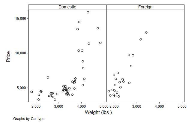
Graphs side by side -- by
-------------------------------------------------------------------------------
By
We can also use the by option to put multiple graphs next to one another.
. graph drop _all
. sysuse auto, clear
(1978 Automobile Data)
. scatter price weight, ///
> by(foreign) ///
> name(by1, replace)
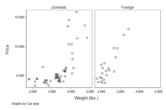
Notice that there is less double information in this graph, e.g. the axis
titles are not repeated
We can move the graphs closer together, so there is more room for the
actual graphs, by using the compact sub-option.
. scatter price weight, ///
> by(foreign, compact) ///
> name(by2, replace)
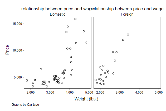
Adding titles is a bit tricky
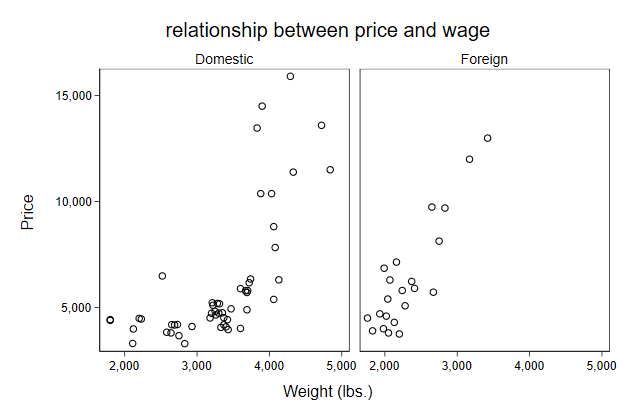
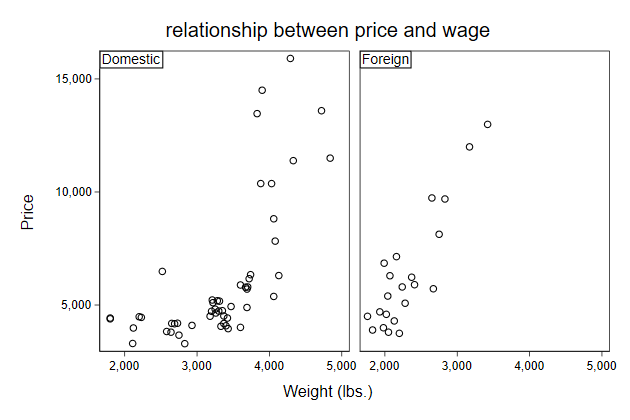
. scatter price weight, ///
> by(foreign) ///
> title(relationship between price and wage) ///
> name(by3,replace)
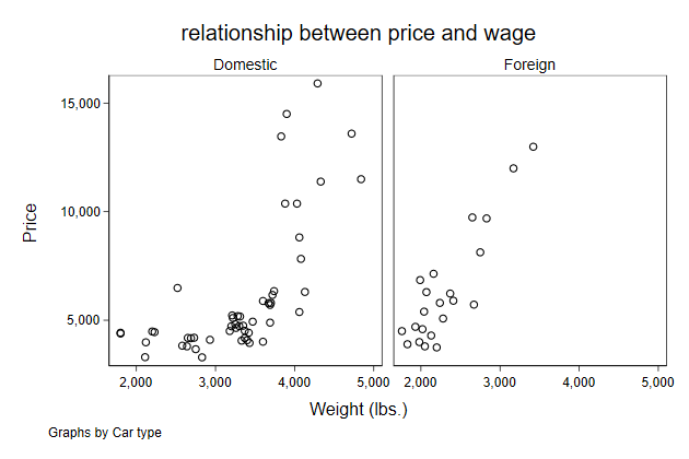
The title() options must actually be a sub-option of the by() option.
. scatter price weight, ///
> by(foreign, ///
> title(relationship between price and wage)) ///
> name(by4,replace)
Within the by() option we can also remove the note.
. scatter price weight, ///
> by(foreign, ///
> title(relationship between price and wage) ///
> note("") ) ///
> name(by5,replace)
We can move the sub-titles inside the graph
. scatter price weight, ///
> by(foreign, ///
> title(relationship between price and wage) ///
> note("") ) ///
> subtitle(, ring(0) pos(11) nobexpand lstyle(solid)) ///
> name(by6,replace)
The sub-titles come from the value labels, so it is good to have those
With the by() option you automatically get only one legend, so that is
good
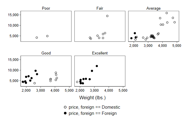
. label define rep78 1 "Poor" ///
> 2 "Fair" ///
> 3 "Average" ///
> 4 "Good" ///
> 5 "Excellent"
. label value rep78 rep78
. separate price, by(foreign)
storage display value
variable name type format label variable label
-------------------------------------------------------------------------------
price0 int %8.0gc price, foreign == Domestic
price1 int %8.0gc price, foreign == Foreign
. scatter price? weight, ///
> by(rep78, note("")) ///
> name(by7)
Though the content of the legend could be prettier. Fortunately, changing
the legend works just as before
. scatter price? weight, ///
> by(rep78, note("")) ///
> legend(order(1 "Domestic" ///
> 2 "Foreign")) ///
> name(by8)
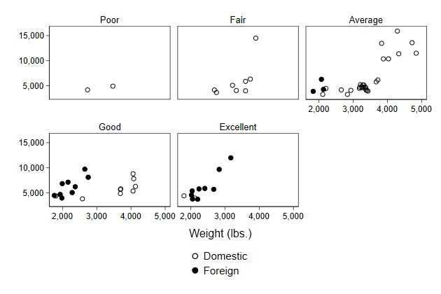
However, changing the position of the legend does not seem to work
. scatter price? weight, ///
> by(rep78, note("")) ///
> legend(order(1 "Domestic" ///
> 2 "Foreign") ///
> pos(3) ) ///
> name(by9)

For that you need use a sub-option within the by() options.
. scatter price? weight, ///
> by(rep78, note("") ///
> legend(pos(3)) ) ///
> legend(order(1 "Domestic" ///
> 2 "Foreign")) ///
> name(by10)
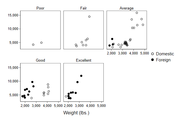
There is some empty space at the 6th plot position, can't we use that for
the legend?
. scatter price? weight, ///
> by(rep78, note("") ///
> legend(at(6) pos(0)) ) ///
> legend(order(1 "Domestic" ///
> 2 "Foreign")) ///
> name(by11)
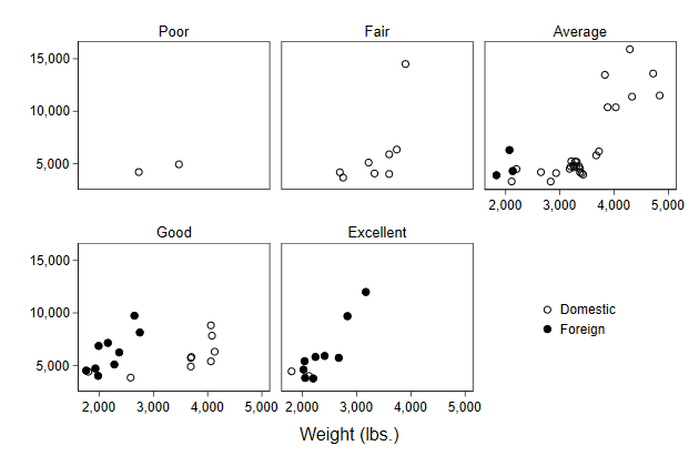
-------------------------------------------------------------------------------
<< index >>
-------------------------------------------------------------------------------
-------------------------------------------------------------------------------
Graphs side by side -- by
-------------------------------------------------------------------------------
Using by() as an alternative to graph combine
We can use the by() option as an alternative to graph combine
To repeat the example from before
. graph drop _all
. sysuse uslifeexp, clear
(U.S. life expectancy, 1900-1999)
. line le_male year, name(male, replace)
. line le_female year, name(female, replace)
. graph combine male female, name(bycombine1, replace)

We need to reshape the data to use the by() option.
. sysuse uslifeexp, clear
(U.S. life expectancy, 1900-1999)
. keep year le_male le_female
. rename le_male le0
. rename le_female le1
. reshape long le, i(year) j(female)
(note: j = 0 1)
Data wide -> long
-----------------------------------------------------------------------------
Number of obs. 100 -> 200
Number of variables 3 -> 3
j variable (2 values) -> female
xij variables:
le0 le1 -> le
-----------------------------------------------------------------------------
. label define female 0 "male" 1 "female"
. label variable le "life expectancy"
. label value female female
. line le year, by(female, note("")) name(bycombine2, replace)
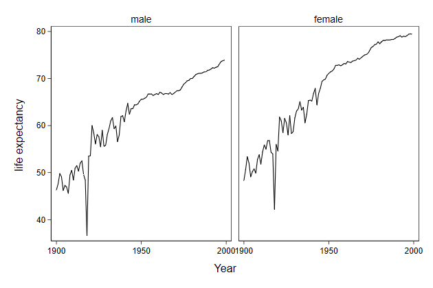
Try it yourself
The economic assessment example can also be done with he by option
Use ecassess.dta to set the two graphs side by side using the by option.
by_sol.do
-------------------------------------------------------------------------------
<< index >>
-------------------------------------------------------------------------------
-------------------------------------------------------------------------------
Graphs in the background -- histograms and bar graphs
-------------------------------------------------------------------------------
Highlighting sub-populations in a histogram
We can compare distributions using histogram with the by() option.
. sysuse nlsw88, clear
(NLSW, 1988 extract)
. twoway histogram wage, ///
> width(1) freq ///
> by(collgrad, note("")) ///
> name(hist1, replace)
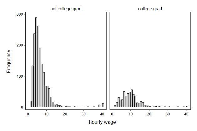
We can also highlight the part of the histogram that are college
graduates
. twoway histogram wage, ///
> width(1) freq ///
> bcolor(gs14) blw(*.4) blcolor(black) || ///
> histogram wage if collgrad, ///
> width(1) freq legend(off) ///
> bcolor(gs6) blw(*.4) blcolor(black) ///
> title(distribution of hourly wage) ///
> subtitle(college graduates highlighted) ///
> name(hist2, replace)
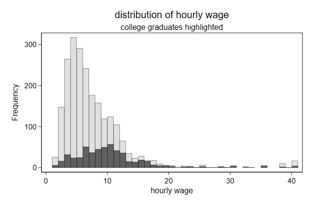
-------------------------------------------------------------------------------
<< index >>
-------------------------------------------------------------------------------
-------------------------------------------------------------------------------
Graphs in the background -- histograms and bar graphs
-------------------------------------------------------------------------------
Highlighting bars
We can graph hbar to display the mean wage by industry.
. sysuse nlsw88, clear
(NLSW, 1988 extract)
. graph hbar (mean) wage, ///
> over(industry, descending sort(1)) ///
> name(bar4, replace)
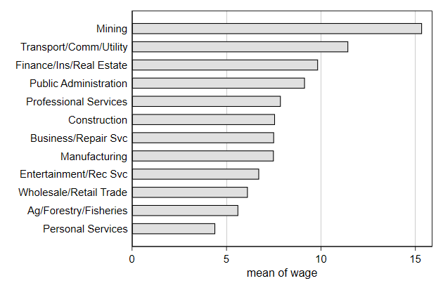
Sometimes we want to highlight one bar.
This is particularly common for presentations.
. collapse (mean) wage, by(industry)
. separate wage, by(industry == 12)
storage display value
variable name type format label variable label
-------------------------------------------------------------------------------
wage0 float %9.0g wage, !(industry == 12)
wage1 float %9.0g wage, industry == 12
. graph hbar (asis) wage0 wage1, ///
> over(industry, descending sort(wage)) nofill ///
> bar(1, bfcolor(none)) legend(off) ///
> ytitle(mean wage) ///
> name(bar5, replace)
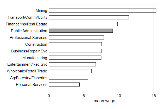
-------------------------------------------------------------------------------
<< index >>
-------------------------------------------------------------------------------
-------------------------------------------------------------------------------
Graphs in the background -- scatterplots
-------------------------------------------------------------------------------
Highlighting sub-populations in a scatter plot
We may want to highlight a certain sub-polation in a scatter plot
We start with a simple scatter plot
. sysuse nlsw88, clear
(NLSW, 1988 extract)
. graph drop _all
. scatter wage grade, ///
> name(scatter1, replace)
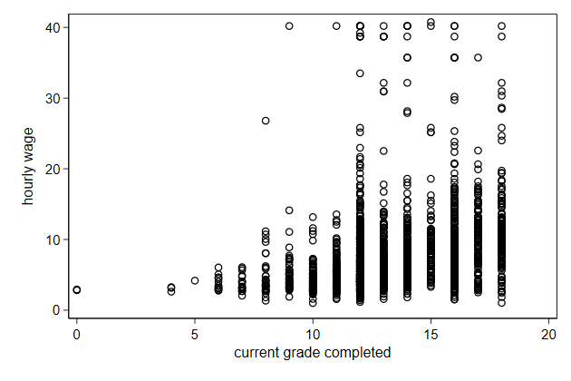
Grade is discrete, but we can show the individual values by adding the
jitter() option.
. scatter wage grade, jitter(2) ///
> name(scatter2, replace)
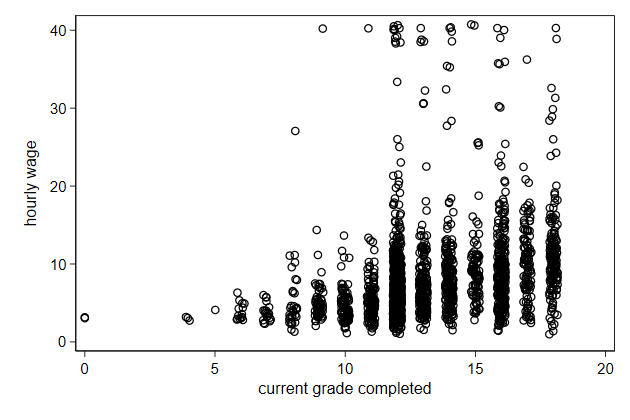
The jitter() option adds random noise in both the x and y direction, but
we only need a jitter in the x-direction
. gen grade2 = grade + .5*runiform()
(2 missing values generated)
. scatter wage grade2, ///
> name(scatter3, replace)

It would be nice if we could copy the variable label from grade
. label var grade2 "`: var label grade'"
. scatter wage grade2, ///
> name(scatter4, replace)
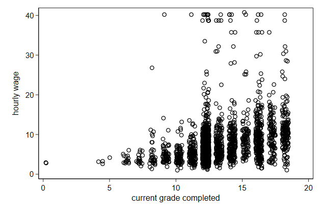
Alternatively, you can make the symbols "see through", so they are grey
when one symbol is plotted, but become darker if multiple symbols are
plotted on top of one another.
. scatter wage grade, mcolor(%25) ///
> name(scatter5, replace)
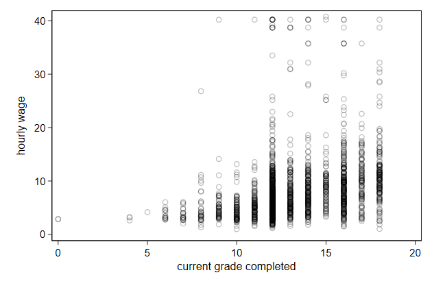
It makes more sense to display wage on a log scal
. scatter wage grade2, yscale(log) ///
> name(scatter6, replace)
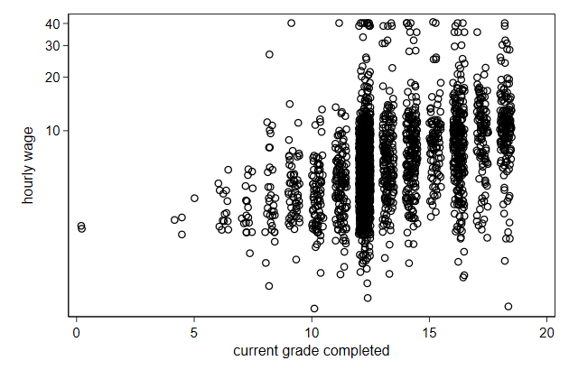
But we need to adjust the axis labels a bit.
. scatter wage grade2, yscale(log) ///
> ylab(1.25 2.5 5 10 20 40) ///
> name(scatter7, replace)
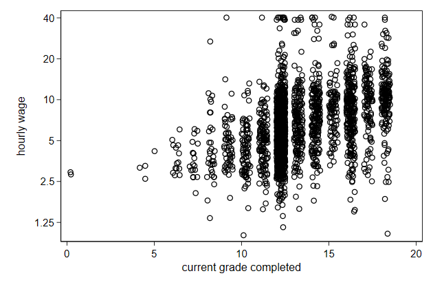
Now we can highlight the blacks
. scatter wage grade2, yscale(log) ///
> msymbol(Oh) mcolor(gs10) || ///
> scatter wage grade2 if race == 2 , ///
> msymbol(O) mcolor(gs2) ///
> yscale(log) legend(off) ///
> ylab(1.25 2.5 5 10 20 40) ///
> name(scatter8, replace)
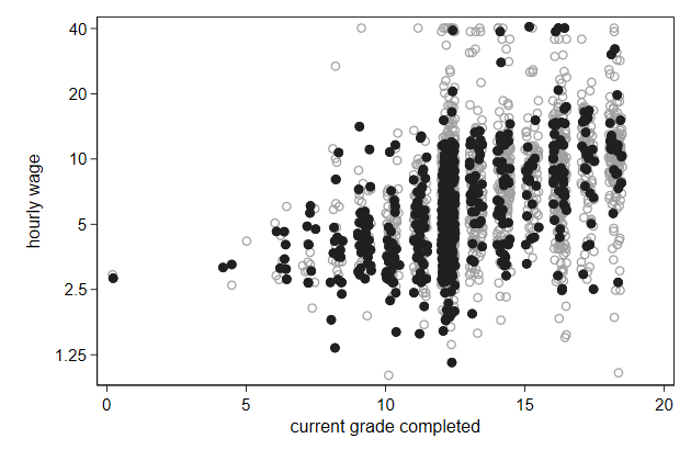
-------------------------------------------------------------------------------
<< index >>
-------------------------------------------------------------------------------
-------------------------------------------------------------------------------
Graphs in the background -- scatterplots
-------------------------------------------------------------------------------
Line on top of a scatter plot
We can plot a line on top of a scatter plot
. graph drop _all
. sysuse nlsw88, clear
(NLSW, 1988 extract)
.
. gen grade2 = grade + .5*runiform()
(2 missing values generated)
. label var grade2 "`: var label grade'"
.
. fp <grade> , scale: poisson wage <grade>
(fitting 44 models)
(....10%....20%....30%....40%....50%....60%....70%....80%....90%....100%)
Fractional polynomial comparisons:
--------------------------------------------------------------------
grade | df Deviance Dev. dif. P(*) Powers
-------------+------------------------------------------------------
omitted | 0 15353.13 1025.547 0.000
linear | 1 14345.16 17.577 0.001 1
m = 1 | 2 14345.16 17.577 0.000 1
m = 2 | 4 14327.59 0.000 -- 3 3
--------------------------------------------------------------------
(*) P = sig. level of model with m = 2 based on chi^2 of dev. dif.
Poisson regression Number of obs = 2,244
LR chi2(2) = 1025.55
Prob > chi2 = 0.0000
Log likelihood = -7163.793 Pseudo R2 = 0.0668
------------------------------------------------------------------------------
wage | Coef. Std. Err. z P>|z| [95% Conf. Interval]
-------------+----------------------------------------------------------------
grade_1 | .5388408 .0445881 12.08 0.000 .4514496 .6262319
grade_2 | -.5224457 .0572099 -9.13 0.000 -.634575 -.4103163
_cons | 1.035362 .0659192 15.71 0.000 .9061632 1.164562
------------------------------------------------------------------------------
. predict wagehat
(option n assumed; predicted number of events)
(2 missing values generated)
. twoway scatter wage grade2, ///
> yscale(log) ylab(1.25 2.5 5 10 20 40) || ///
> line wagehat grade, sort legend(off) ///
> name(fit1, replace)
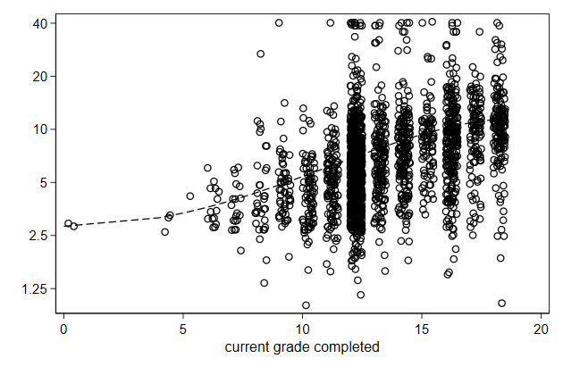
The scatter plot is a bit too dominant
. twoway scatter wage grade2, mcolor(gs10) ///
> yscale(log) ylab(1.25 2.5 5 10 20 40) || ///
> line wagehat grade, sort legend(off) ///
> name(fit2, replace)

The line can be made solid
. twoway scatter wage grade2, mcolor(gs10) ///
> yscale(log) ylab(1.25 2.5 5 10 20 40) || ///
> line wagehat grade, sort legend(off) ///
> lpattern(solid) ///
> name(fit3, replace)
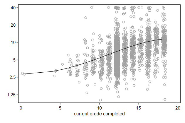
We can also make the line thicker
. twoway scatter wage grade2, mcolor(gs10) ///
> yscale(log) ylab(1.25 2.5 5 10 20 40) || ///
> line wagehat grade, sort legend(off) ///
> lpattern(solid) lwidth(*3) ///
> name(fit4, replace)
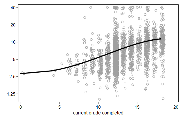
-------------------------------------------------------------------------------
<< index >>
-------------------------------------------------------------------------------
-------------------------------------------------------------------------------
Graphs in the background -- by
-------------------------------------------------------------------------------
By graph
Lets look at the relationship between GDP per capita and child mortality
by country
. use infmort, clear
(East-Asia & Pacific infant mortality)
.
. sort countryname year
. line infmort gdppc, ///
> yscale(log) xscale(log) ///
> name(byscatter1, replace) ///
> ylab( 2 5 10 20 50 100 200) ///
> xlab(1e3 1e4 1e5, format(%9.0gc)) ///
> by(countryname, compact note(""))
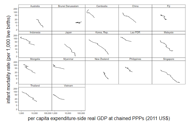
We can sort the sub graphs by the initial child mortality
. gen mis = missing(infmort)
. bys countryname mis (year) : gen initmort = infmort[1]
(94 missing values generated)
. bys countryname (initmort) : replace initmort = initmort[1]
(94 real changes made)
. replace initmort = -initmort
(935 real changes made)
. egen Country = axis(initmort), label(countryname)
. sort Country year
. line infmort gdppc, ///
> yscale(log) xscale(log) ///
> name(byscatter2, replace) ///
> ylab( 2 5 10 20 50 100 200) ///
> xlab(1e3 1e4 1e5, format(%9.0gc)) ///
> by(Country, compact note(""))
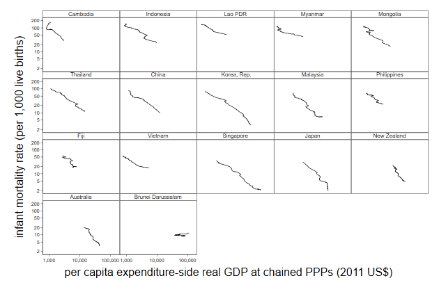
We can display the entire sample as a background graph
. use infmort, clear
(East-Asia & Pacific infant mortality)
.
. gen mis = missing(infmort, gdppc)
. bys countryname mis (year) : gen initmort = infmort[1]
(102 missing values generated)
. bys countryname (initmort) : replace initmort = initmort[1]
(102 real changes made)
. replace initmort = -initmort
(935 real changes made)
. egen Country = axis(initmort), label(countryname)
.
. tempfile temp
. save `temp'
file C:\Users\MAARTE~1.BUI\AppData\Local\Temp\ST_27a0_000008.tmp saved
.
. keep infmort Country gdppc year
. reshape wide infmort gdppc, j(Country) i(year)
(note: j = 1 2 3 4 5 6 7 8 9 10 11 12 13 14 15 16 17)
Data long -> wide
-----------------------------------------------------------------------------
Number of obs. 935 -> 55
Number of variables 4 -> 35
j variable (17 values) Country -> (dropped)
xij variables:
infmort -> infmort1 infmort2 ... infmort17
gdppc -> gdppc1 gdppc2 ... gdppc17
-----------------------------------------------------------------------------
. merge 1:m year using `temp'
Result # of obs.
-----------------------------------------
not matched 0
matched 935 (_merge==3)
-----------------------------------------
.
. forvalues i = 1/17 {
2. local backgr `backgr' line infmort`i' gdppc`i', ///
> lcolor(gs12) lpattern(solid) ||
3. }
.
. sort Country year
. twoway `backgr' ///
> line infmort gdppc, ///
> lcolor(black) lwidth(*1.5) lpattern(solid) ///
> yscale(log) xscale(log) ///
> ylab( 2 5 10 20 50 100 200) ///
> xlab(1e3 1e4 1e5, format(%9.0gc)) ///
> by(Country, compact note("") legend(off)) ///
> name(byscatter3, replace)
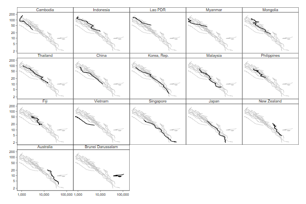
We can add labels in the graph indicating the starting and ending year of
the series and axis titles.
. forvalues i = 1/17 {
2. local backgr `backgr' line infmort`i' gdppc`i', ///
> lcolor(gs12) lpattern(solid) ||
3. }
.
. bys Country mis (year) : gen xmark = gdppc if (_n == 1 | _n == _N)
(895 missing values generated)
. bys Country mis (year) : gen ymark = infmort if (_n == 1 | _n == _N)
(899 missing values generated)
. bys Country mis (year) : gen byte labpos = cond(_n==1,12,3)
. bys Country mis (year) : replace labpos = 3 if inlist(Country, 1, 2) & _n ==
> 1
(3 real changes made)
. bys Country mis (year) : replace labpos = 1 if inlist(Country, 4, 12) & _n ==
> 1
(4 real changes made)
. bys Country mis (year) : replace labpos = 6 if Country == 17 & _n==_N
(2 real changes made)
.
. sort Country year
. twoway `backgr' ///
> line infmort gdppc, ///
> lcolor(black) lwidth(*1.5) lpattern(solid) ///
> yscale(log) xscale(log) ///
> ylab( 2 5 10 20 50 100 200) ///
> xlab(1e3 1e4 1e5, format(%9.0gc)) ///
> by(Country, compact note("") legend(off)) ///
> name(byscatter4, replace) || ///
> scatter ymark xmark, msymbol(i) ///
> mlabel(year) mlabvpos(labpos) ///
> ytitle("infant mortality (per 1,000 live births)", size(*.75)) ///
> xtitle("GDP per capita (PPPs, 2011 US {c S|})", size(*.75))
-------------------------------------------------------------------------------
<< index >>
-------------------------------------------------------------------------------
-------------------------------------------------------------------------------
Graphing model results
-------------------------------------------------------------------------------
Factor variable notation
factor variables will create dummy variables from a categorical variables
. sysuse auto, clear
(1978 Automobile Data)
. reg price i.rep78
Source | SS df MS Number of obs = 69
-------------+---------------------------------- F(4, 64) = 0.24
Model | 8360542.63 4 2090135.66 Prob > F = 0.9174
Residual | 568436416 64 8881819 R-squared = 0.0145
-------------+---------------------------------- Adj R-squared = -0.0471
Total | 576796959 68 8482308.22 Root MSE = 2980.2
------------------------------------------------------------------------------
price | Coef. Std. Err. t P>|t| [95% Conf. Interval]
-------------+----------------------------------------------------------------
rep78 |
2 | 1403.125 2356.085 0.60 0.554 -3303.696 6109.946
3 | 1864.733 2176.458 0.86 0.395 -2483.242 6212.708
4 | 1507 2221.338 0.68 0.500 -2930.633 5944.633
5 | 1348.5 2290.927 0.59 0.558 -3228.153 5925.153
|
_cons | 4564.5 2107.347 2.17 0.034 354.5913 8774.409
------------------------------------------------------------------------------
.
. tab rep78, gen(d)
Repair |
Record 1978 | Freq. Percent Cum.
------------+-----------------------------------
1 | 2 2.90 2.90
2 | 8 11.59 14.49
3 | 30 43.48 57.97
4 | 18 26.09 84.06
5 | 11 15.94 100.00
------------+-----------------------------------
Total | 69 100.00
. drop d1
. reg price d?
Source | SS df MS Number of obs = 69
-------------+---------------------------------- F(4, 64) = 0.24
Model | 8360542.63 4 2090135.66 Prob > F = 0.9174
Residual | 568436416 64 8881819 R-squared = 0.0145
-------------+---------------------------------- Adj R-squared = -0.0471
Total | 576796959 68 8482308.22 Root MSE = 2980.2
------------------------------------------------------------------------------
price | Coef. Std. Err. t P>|t| [95% Conf. Interval]
-------------+----------------------------------------------------------------
d2 | 1403.125 2356.085 0.60 0.554 -3303.696 6109.946
d3 | 1864.733 2176.458 0.86 0.395 -2483.242 6212.708
d4 | 1507 2221.338 0.68 0.500 -2930.633 5944.633
d5 | 1348.5 2290.927 0.59 0.558 -3228.153 5925.153
_cons | 4564.5 2107.347 2.17 0.034 354.5913 8774.409
------------------------------------------------------------------------------
By default the reference category is the one with the smallest value, but
you can change that: e.g. reg price ib3.rep78
You can also use factor variables to create interactions
The ## add the main effects and the interaction(s) to you your model
If one or more of the interacted variables is continuous, then you must
add c. in front of those, otherwise it will be treated as categorical.
. reg price i.foreign##c.weight
Source | SS df MS Number of obs = 74
-------------+---------------------------------- F(3, 70) = 26.20
Model | 335885357 3 111961786 Prob > F = 0.0000
Residual | 299180039 70 4274000.55 R-squared = 0.5289
-------------+---------------------------------- Adj R-squared = 0.5087
Total | 635065396 73 8699525.97 Root MSE = 2067.4
------------------------------------------------------------------------------
price | Coef. Std. Err. t P>|t| [95% Conf. Interval]
-------------+----------------------------------------------------------------
foreign |
Foreign | -2171.597 2829.409 -0.77 0.445 -7814.676 3471.482
weight | 2.994814 .4163132 7.19 0.000 2.164503 3.825124
|
foreign#|
c.weight |
Foreign | 2.367227 1.121973 2.11 0.038 .129522 4.604931
|
_cons | -3861.719 1410.404 -2.74 0.008 -6674.681 -1048.757
------------------------------------------------------------------------------
. gen forXweight = foreign*weight
. reg price foreign weight forXweight
Source | SS df MS Number of obs = 74
-------------+---------------------------------- F(3, 70) = 26.20
Model | 335885357 3 111961786 Prob > F = 0.0000
Residual | 299180039 70 4274000.55 R-squared = 0.5289
-------------+---------------------------------- Adj R-squared = 0.5087
Total | 635065396 73 8699525.97 Root MSE = 2067.4
------------------------------------------------------------------------------
price | Coef. Std. Err. t P>|t| [95% Conf. Interval]
-------------+----------------------------------------------------------------
foreign | -2171.597 2829.409 -0.77 0.445 -7814.676 3471.482
weight | 2.994814 .4163132 7.19 0.000 2.164503 3.825124
forXweight | 2.367227 1.121973 2.11 0.038 .129522 4.604931
_cons | -3861.719 1410.404 -2.74 0.008 -6674.681 -1048.757
------------------------------------------------------------------------------
The main advantage of factor variables is that now Stata knows wich
variables "belong" together, and can use that information in margins
Factor variables are documented in fvvarlist
-------------------------------------------------------------------------------
<< index >>
-------------------------------------------------------------------------------
-------------------------------------------------------------------------------
Graphing model results
-------------------------------------------------------------------------------
Plotting predicted outcome
We have a model with a different parabola for foreign and domestic cars
The easiest way to interpret this model is to look at the predictions
. graph drop _all
. sysuse auto, clear
(1978 Automobile Data)
. reg price c.weight##c.weight##i.foreign
Source | SS df MS Number of obs = 74
-------------+---------------------------------- F(5, 68) = 26.58
Model | 420102093 5 84020418.6 Prob > F = 0.0000
Residual | 214963303 68 3161225.05 R-squared = 0.6615
-------------+---------------------------------- Adj R-squared = 0.6366
Total | 635065396 73 8699525.97 Root MSE = 1778
------------------------------------------------------------------------------
price | Coef. Std. Err. t P>|t| [95% Conf. Interval]
-------------+----------------------------------------------------------------
weight | -9.841423 2.584497 -3.81 0.000 -14.99871 -4.684139
|
c.weight#|
c.weight | .0019851 .0003958 5.01 0.000 .0011952 .0027749
|
foreign |
Foreign | -7591.759 12655.18 -0.60 0.551 -32844.77 17661.25
|
foreign#|
c.weight |
Foreign | 3.464758 9.99671 0.35 0.730 -16.48337 23.41288
|
foreign#|
c.weight#|
c.weight |
Foreign | .0003262 .0019341 0.17 0.867 -.0035333 .0041858
|
_cons | 15933.98 4129.479 3.86 0.000 7693.739 24174.23
------------------------------------------------------------------------------
. margins, at(weight=(1800(200)4800)) over(foreign)
Predictive margins Number of obs = 74
Model VCE : OLS
Expression : Linear prediction, predict()
over : foreign
1._at : 0.foreign
weight = 1800
1.foreign
weight = 1800
2._at : 0.foreign
weight = 2000
1.foreign
weight = 2000
3._at : 0.foreign
weight = 2200
1.foreign
weight = 2200
4._at : 0.foreign
weight = 2400
1.foreign
weight = 2400
5._at : 0.foreign
weight = 2600
1.foreign
weight = 2600
6._at : 0.foreign
weight = 2800
1.foreign
weight = 2800
7._at : 0.foreign
weight = 3000
1.foreign
weight = 3000
8._at : 0.foreign
weight = 3200
1.foreign
weight = 3200
9._at : 0.foreign
weight = 3400
1.foreign
weight = 3400
10._at : 0.foreign
weight = 3600
1.foreign
weight = 3600
11._at : 0.foreign
weight = 3800
1.foreign
weight = 3800
12._at : 0.foreign
weight = 4000
1.foreign
weight = 4000
13._at : 0.foreign
weight = 4200
1.foreign
weight = 4200
14._at : 0.foreign
weight = 4400
1.foreign
weight = 4400
15._at : 0.foreign
weight = 4600
1.foreign
weight = 4600
16._at : 0.foreign
weight = 4800
1.foreign
weight = 4800
------------------------------------------------------------------------------
| Delta-method
| Margin Std. Err. t P>|t| [95% Conf. Interval]
-------------+----------------------------------------------------------------
_at#foreign |
1#Domestic | 4651.038 862.2163 5.39 0.000 2930.513 6371.564
1#Foreign | 4352.883 848.1591 5.13 0.000 2660.408 6045.358
2#Domestic | 4191.404 672.6693 6.23 0.000 2849.114 5533.695
2#Foreign | 4834.148 487.4549 9.92 0.000 3861.447 5806.849
3#Domestic | 3890.576 524.037 7.42 0.000 2844.876 4936.275
3#Foreign | 5500.318 448.1457 12.27 0.000 4606.057 6394.579
4#Domestic | 3748.552 419.19 8.94 0.000 2912.072 4585.033
4#Foreign | 6351.393 553.7684 11.47 0.000 5246.366 7456.421
5#Domestic | 3765.334 357.3894 10.54 0.000 3052.175 4478.494
5#Foreign | 7387.374 624.7709 11.82 0.000 6140.663 8634.085
6#Domestic | 3940.921 329.5138 11.96 0.000 3283.387 4598.456
6#Foreign | 8608.259 651.7342 13.21 0.000 7307.744 9908.774
7#Domestic | 4275.314 319.7447 13.37 0.000 3637.273 4913.355
7#Foreign | 10014.05 721.4113 13.88 0.000 8574.496 11453.6
8#Domestic | 4768.512 314.127 15.18 0.000 4141.681 5395.343
8#Foreign | 11604.74 962.0398 12.06 0.000 9685.024 13524.47
9#Domestic | 5420.515 306.4141 17.69 0.000 4809.075 6031.955
9#Foreign | 13380.35 1423.307 9.40 0.000 10540.18 16220.51
10#Domestic | 6231.324 299.8127 20.78 0.000 5633.057 6829.591
10#Foreign | 15340.85 2084.393 7.36 0.000 11181.51 19500.19
11#Domestic | 7200.938 307.727 23.40 0.000 6586.878 7814.997
11#Foreign | 17486.26 2922.884 5.98 0.000 11653.74 23318.79
12#Domestic | 8329.357 349.7954 23.81 0.000 7631.351 9027.363
12#Foreign | 19816.58 3926.851 5.05 0.000 11980.67 27652.49
13#Domestic | 9616.582 439.2372 21.89 0.000 8740.097 10493.07
13#Foreign | 22331.8 5090.357 4.39 0.000 12174.15 32489.45
14#Domestic | 11062.61 576.6184 19.19 0.000 9911.987 12213.24
14#Foreign | 25031.92 6410.298 3.90 0.000 12240.37 37823.47
15#Domestic | 12667.45 757.0515 16.73 0.000 11156.77 14178.12
15#Foreign | 27916.96 7884.942 3.54 0.001 12182.8 43651.11
16#Domestic | 14431.09 976.1929 14.78 0.000 12483.12 16379.05
16#Foreign | 30986.89 9513.26 3.26 0.002 12003.48 49970.31
------------------------------------------------------------------------------
. marginsplot , ///
> name(margins1, replace)
Variables that uniquely identify margins: weight foreign

It woud be nicer to display the confidence interval as a area
. qui margins, at(weight=(1800(200)4800)) over(foreign)
. marginsplot, ///
> recastci(rarea) ///
> name(margins2, replace)
Variables that uniquely identify margins: weight foreign
We need to change the look of the area
. qui margins, at(weight=(1800(200)4800)) over(foreign)
. marginsplot, ///
> recastci(rarea) ///
> ciopts(astyle(ci)) ///
> name(margins3, replace)
Variables that uniquely identify margins: weight foreign
The confidence intervals overlap, we can make all visibile by making them
opaque.
. qui margins, at(weight=(1800(200)4800)) over(foreign)
. marginsplot, ///
> recastci(rarea) ///
> ciopts(astyle(ci) ///
> acolor(%50)) ///
> name(margins4, replace)
Variables that uniquely identify margins: weight foreign
We can suppress the symbols
. qui margins, at(weight=(1800(200)4800)) over(foreign)
. marginsplot, ///
> recastci(rarea) ///
> ciopts(astyle(ci) ///
> acolor(%50)) ///
> plotopts(msymbol(i)) ///
> name(margins5,replace)
Variables that uniquely identify margins: weight foreign
But now we need to distinguish between the groups by changing the looks
of the lines
. qui margins, at(weight=(1800(200)4800)) over(foreign)
. marginsplot, ///
> recastci(rarea) ///
> ciopts(astyle(ci) ///
> acolor(%50)) ///
> plotopts(msymbol(i)) ///
> plot1opt(lpattern(dash)) ///
> name(margins6, replace)
Variables that uniquely identify margins: weight foreign
We can add axis labels
. qui margins, at(weight=(1800(200)4800)) over(foreign)
. marginsplot, ///
> recastci(rarea) ///
> ciopts(astyle(ci) ///
> acolor(%50)) ///
> plotopts(msymbol(i)) ///
> plot1opt(lpattern(dash)) ///
> xlab(2000(500)4500) ///
> name(margins7, replace)
Variables that uniquely identify margins: weight foreign

and change their format
. qui margins, at(weight=(1800(200)4800)) over(foreign)
. marginsplot, ///
> recastci(rarea) ///
> ciopts(astyle(ci) ///
> acolor(%50)) ///
> plotopts(msymbol(i)) ///
> plot1opt(lpattern(dash)) ///
> xlab(2000(500)4500) ///
> ylab(, format(%9.0gc)) ///
> name(margins8, replace)
Variables that uniquely identify margins: weight foreign
We don't have to plot the predictions, we can also plot the effects
. sysuse nlsw88, clear
(NLSW, 1988 extract)
. gen byte black = race == 2 if race < .
. reg wage c.ttl_exp##c.ttl_exp i.black grade i.south
Source | SS df MS Number of obs = 2,244
-------------+---------------------------------- F(5, 2238) = 85.13
Model | 11881.996 5 2376.39921 Prob > F = 0.0000
Residual | 62472.3345 2,238 27.9143586 R-squared = 0.1598
-------------+---------------------------------- Adj R-squared = 0.1579
Total | 74354.3305 2,243 33.1495009 Root MSE = 5.2834
------------------------------------------------------------------------------
wage | Coef. Std. Err. t P>|t| [95% Conf. Interval]
-------------+----------------------------------------------------------------
ttl_exp | .3438651 .1056914 3.25 0.001 .1366015 .5511286
|
c.ttl_exp#|
c.ttl_exp | -.0032617 .0042586 -0.77 0.444 -.0116128 .0050895
|
1.black | -.4568322 .2667157 -1.71 0.087 -.9798683 .0662039
grade | .6109805 .046144 13.24 0.000 .5204909 .7014701
1.south | -1.099983 .2349458 -4.68 0.000 -1.560718 -.6392491
_cons | -3.382319 .7876164 -4.29 0.000 -4.926854 -1.837784
------------------------------------------------------------------------------
. margins, dydx(ttl_exp) ///
> at(ttl_exp=(0(2)28))
Average marginal effects Number of obs = 2,244
Model VCE : OLS
Expression : Linear prediction, predict()
dy/dx w.r.t. : ttl_exp
1._at : ttl_exp = 0
2._at : ttl_exp = 2
3._at : ttl_exp = 4
4._at : ttl_exp = 6
5._at : ttl_exp = 8
6._at : ttl_exp = 10
7._at : ttl_exp = 12
8._at : ttl_exp = 14
9._at : ttl_exp = 16
10._at : ttl_exp = 18
11._at : ttl_exp = 20
12._at : ttl_exp = 22
13._at : ttl_exp = 24
14._at : ttl_exp = 26
15._at : ttl_exp = 28
------------------------------------------------------------------------------
| Delta-method
| dy/dx Std. Err. t P>|t| [95% Conf. Interval]
-------------+----------------------------------------------------------------
ttl_exp |
_at |
1 | .3438651 .1056914 3.25 0.001 .1366015 .5511286
2 | .3308184 .0892186 3.71 0.000 .1558585 .5057783
3 | .3177718 .073004 4.35 0.000 .1746092 .4609344
4 | .3047251 .0572672 5.32 0.000 .1924228 .4170275
5 | .2916785 .0425419 6.86 0.000 .2082528 .3751041
6 | .2786318 .0303385 9.18 0.000 .2191373 .3381264
7 | .2655852 .024726 10.74 0.000 .217097 .3140734
8 | .2525386 .0297095 8.50 0.000 .1942775 .3107996
9 | .2394919 .0416445 5.75 0.000 .157826 .3211579
10 | .2264453 .0562691 4.02 0.000 .1161002 .3367904
11 | .2133986 .0719617 2.97 0.003 .0722799 .3545174
12 | .200352 .0881539 2.27 0.023 .0274801 .3732239
13 | .1873054 .1046138 1.79 0.074 -.0178449 .3924556
14 | .1742587 .1212325 1.44 0.151 -.0634813 .4119987
15 | .1612121 .1379527 1.17 0.243 -.1093165 .4317406
------------------------------------------------------------------------------
. marginsplot , yline(0) ///
> name(margins9, replace)
Variables that uniquely identify margins: ttl_exp
-------------------------------------------------------------------------------
<< index >>
-------------------------------------------------------------------------------
-------------------------------------------------------------------------------
Graphing model results
-------------------------------------------------------------------------------
What can go wrong?
Sometimes the wrong variable appears on the x-axis and the graph looks
terrible
. graph drop _all
. sysuse auto, clear
(1978 Automobile Data)
. reg price c.weight##c.weight##i.foreign
Source | SS df MS Number of obs = 74
-------------+---------------------------------- F(5, 68) = 26.58
Model | 420102093 5 84020418.6 Prob > F = 0.0000
Residual | 214963303 68 3161225.05 R-squared = 0.6615
-------------+---------------------------------- Adj R-squared = 0.6366
Total | 635065396 73 8699525.97 Root MSE = 1778
------------------------------------------------------------------------------
price | Coef. Std. Err. t P>|t| [95% Conf. Interval]
-------------+----------------------------------------------------------------
weight | -9.841423 2.584497 -3.81 0.000 -14.99871 -4.684139
|
c.weight#|
c.weight | .0019851 .0003958 5.01 0.000 .0011952 .0027749
|
foreign |
Foreign | -7591.759 12655.18 -0.60 0.551 -32844.77 17661.25
|
foreign#|
c.weight |
Foreign | 3.464758 9.99671 0.35 0.730 -16.48337 23.41288
|
foreign#|
c.weight#|
c.weight |
Foreign | .0003262 .0019341 0.17 0.867 -.0035333 .0041858
|
_cons | 15933.98 4129.479 3.86 0.000 7693.739 24174.23
------------------------------------------------------------------------------
. margins, at(foreign=(0/1) weight=(1800(200)4800))
Adjusted predictions Number of obs = 74
Model VCE : OLS
Expression : Linear prediction, predict()
1._at : weight = 1800
foreign = 0
2._at : weight = 1800
foreign = 1
3._at : weight = 2000
foreign = 0
4._at : weight = 2000
foreign = 1
5._at : weight = 2200
foreign = 0
6._at : weight = 2200
foreign = 1
7._at : weight = 2400
foreign = 0
8._at : weight = 2400
foreign = 1
9._at : weight = 2600
foreign = 0
10._at : weight = 2600
foreign = 1
11._at : weight = 2800
foreign = 0
12._at : weight = 2800
foreign = 1
13._at : weight = 3000
foreign = 0
14._at : weight = 3000
foreign = 1
15._at : weight = 3200
foreign = 0
16._at : weight = 3200
foreign = 1
17._at : weight = 3400
foreign = 0
18._at : weight = 3400
foreign = 1
19._at : weight = 3600
foreign = 0
20._at : weight = 3600
foreign = 1
21._at : weight = 3800
foreign = 0
22._at : weight = 3800
foreign = 1
23._at : weight = 4000
foreign = 0
24._at : weight = 4000
foreign = 1
25._at : weight = 4200
foreign = 0
26._at : weight = 4200
foreign = 1
27._at : weight = 4400
foreign = 0
28._at : weight = 4400
foreign = 1
29._at : weight = 4600
foreign = 0
30._at : weight = 4600
foreign = 1
31._at : weight = 4800
foreign = 0
32._at : weight = 4800
foreign = 1
------------------------------------------------------------------------------
| Delta-method
| Margin Std. Err. t P>|t| [95% Conf. Interval]
-------------+----------------------------------------------------------------
_at |
1 | 4651.038 862.2163 5.39 0.000 2930.513 6371.564
2 | 4352.883 848.1591 5.13 0.000 2660.408 6045.358
3 | 4191.404 672.6693 6.23 0.000 2849.114 5533.695
4 | 4834.148 487.4549 9.92 0.000 3861.447 5806.849
5 | 3890.576 524.037 7.42 0.000 2844.876 4936.275
6 | 5500.318 448.1457 12.27 0.000 4606.057 6394.579
7 | 3748.552 419.19 8.94 0.000 2912.072 4585.033
8 | 6351.393 553.7684 11.47 0.000 5246.366 7456.421
9 | 3765.334 357.3894 10.54 0.000 3052.175 4478.494
10 | 7387.374 624.7709 11.82 0.000 6140.663 8634.085
11 | 3940.921 329.5138 11.96 0.000 3283.387 4598.456
12 | 8608.259 651.7342 13.21 0.000 7307.744 9908.774
13 | 4275.314 319.7447 13.37 0.000 3637.273 4913.355
14 | 10014.05 721.4113 13.88 0.000 8574.496 11453.6
15 | 4768.512 314.127 15.18 0.000 4141.681 5395.343
16 | 11604.74 962.0398 12.06 0.000 9685.024 13524.47
17 | 5420.515 306.4141 17.69 0.000 4809.075 6031.955
18 | 13380.35 1423.307 9.40 0.000 10540.18 16220.51
19 | 6231.324 299.8127 20.78 0.000 5633.057 6829.591
20 | 15340.85 2084.393 7.36 0.000 11181.51 19500.19
21 | 7200.938 307.727 23.40 0.000 6586.878 7814.997
22 | 17486.26 2922.884 5.98 0.000 11653.74 23318.79
23 | 8329.357 349.7954 23.81 0.000 7631.351 9027.363
24 | 19816.58 3926.851 5.05 0.000 11980.67 27652.49
25 | 9616.582 439.2372 21.89 0.000 8740.097 10493.07
26 | 22331.8 5090.357 4.39 0.000 12174.15 32489.45
27 | 11062.61 576.6184 19.19 0.000 9911.987 12213.24
28 | 25031.92 6410.298 3.90 0.000 12240.37 37823.47
29 | 12667.45 757.0515 16.73 0.000 11156.77 14178.12
30 | 27916.96 7884.942 3.54 0.001 12182.8 43651.11
31 | 14431.09 976.1929 14.78 0.000 12483.12 16379.05
32 | 30986.89 9513.26 3.26 0.002 12003.48 49970.31
------------------------------------------------------------------------------
. marginsplot, name(wrong1, replace)
Variables that uniquely identify margins: foreign weight
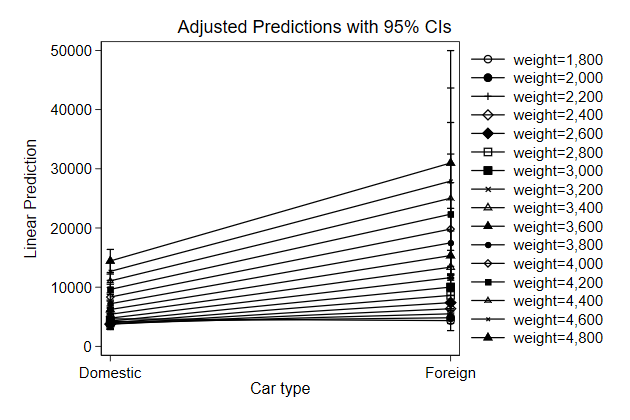
You can control which variable is on the x-axis using the xdim() option
. qui margins, at(foreign=(0/1) weight=(1800(200)4800))
. marginsplot, xdim(weight) name(corr1, replace)
Variables that uniquely identify margins: foreign weight
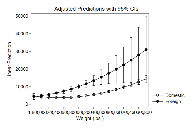
With the over() option the average predicted wage is computed in each
group.
So differences between union and non-union members can occur due to their
membership status or because unionmembers differ with respect to their
race, where they live and their experience.
So the graph represents both the effect of union and grade but also
composition effects
You can see that because the lines are not as straight as you would
expect from a regression line
. sysuse nlsw88, clear
(NLSW, 1988 extract)
. reg wage grade ttl_exp tenure i.union i.south i.race
Source | SS df MS Number of obs = 1,866
-------------+---------------------------------- F(7, 1858) = 114.07
Model | 9748.01591 7 1392.5737 Prob > F = 0.0000
Residual | 22682.0108 1,858 12.2077561 R-squared = 0.3006
-------------+---------------------------------- Adj R-squared = 0.2980
Total | 32430.0267 1,865 17.3887542 Root MSE = 3.494
------------------------------------------------------------------------------
wage | Coef. Std. Err. t P>|t| [95% Conf. Interval]
-------------+----------------------------------------------------------------
grade | .5796379 .0328769 17.63 0.000 .5151584 .6441173
ttl_exp | .2353337 .0219527 10.72 0.000 .1922791 .2783884
tenure | .0438223 .0178856 2.45 0.014 .0087442 .0789004
|
union |
union | .8173721 .1937471 4.22 0.000 .4373872 1.197357
1.south | -.8777307 .1733027 -5.06 0.000 -1.217619 -.5378422
|
race |
black | -.4304629 .1948766 -2.21 0.027 -.812663 -.0482628
other | .8265951 .721231 1.15 0.252 -.5879131 2.241103
|
_cons | -3.07849 .4752437 -6.48 0.000 -4.010558 -2.146423
------------------------------------------------------------------------------
. margins, over(grade union)
Predictive margins Number of obs = 1,866
Model VCE : OLS
Expression : Linear prediction, predict()
over : grade union
------------------------------------------------------------------------------
| Delta-method
| Margin Std. Err. t P>|t| [95% Conf. Interval]
-------------+----------------------------------------------------------------
grade#union |
0#nonunion | -2.446199 .5593938 -4.37 0.000 -3.543305 -1.349092
4#nonunion | 1.099149 .3038755 3.62 0.000 .5031762 1.695123
6#nonunion | 2.570497 .254477 10.10 0.000 2.071406 3.069588
6#union | 2.73568 .3406391 8.03 0.000 2.067605 3.403756
7#nonunion | 3.076438 .2230962 13.79 0.000 2.638892 3.513983
7#union | 3.075927 .2849351 10.80 0.000 2.517101 3.634754
8#nonunion | 3.121683 .1959074 15.93 0.000 2.737462 3.505905
8#union | 4.54094 .2425037 18.73 0.000 4.065331 5.016548
9#nonunion | 3.927878 .168612 23.30 0.000 3.597189 4.258567
9#union | 6.053974 .2305373 26.26 0.000 5.601834 6.506113
10#nonunion | 4.431363 .1415913 31.30 0.000 4.153668 4.709057
10#union | 5.670173 .2071302 27.37 0.000 5.26394 6.076405
11#nonunion | 5.541324 .1180032 46.96 0.000 5.309891 5.772757
11#union | 6.687596 .1841285 36.32 0.000 6.326475 7.048716
12#nonunion | 6.621442 .0994056 66.61 0.000 6.426484 6.816401
12#union | 7.825187 .1726828 45.32 0.000 7.486514 8.16386
13#nonunion | 7.471028 .0964075 77.49 0.000 7.281949 7.660106
13#union | 8.383761 .1731496 48.42 0.000 8.044173 8.723349
14#nonunion | 8.080529 .100747 80.21 0.000 7.88294 8.278118
14#union | 8.864977 .1697499 52.22 0.000 8.532057 9.197898
15#nonunion | 8.898854 .1184485 75.13 0.000 8.666548 9.131161
15#union | 9.939156 .1732614 57.37 0.000 9.599349 10.27896
16#nonunion | 9.084623 .1335145 68.04 0.000 8.822769 9.346478
16#union | 10.12766 .1810118 55.95 0.000 9.772649 10.48266
17#nonunion | 9.902343 .1617057 61.24 0.000 9.585199 10.21949
17#union | 10.7932 .1971935 54.73 0.000 10.40646 11.17994
18#nonunion | 10.45895 .184869 56.57 0.000 10.09637 10.82152
18#union | 11.63716 .215879 53.91 0.000 11.21377 12.06055
------------------------------------------------------------------------------
. marginsplot, name(wrong2, replace)
Variables that uniquely identify margins: grade union
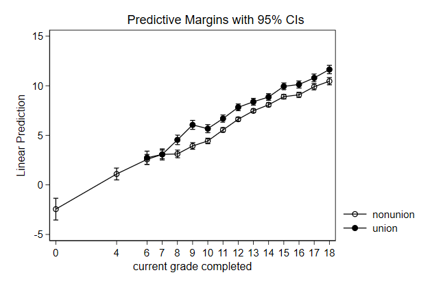
Here is how you avoid showing the composition effect:
. margins, over(grade union) ///
> at(ttl_exp=12 tenure=10 south=0 race=1)
Predictive margins Number of obs = 1,866
Model VCE : OLS
Expression : Linear prediction, predict()
over : grade union
at : 0.grade#0.union
ttl_exp = 12
tenure = 10
south = 0
race = 1
4.grade#0.union
ttl_exp = 12
tenure = 10
south = 0
race = 1
6.grade#0.union
ttl_exp = 12
tenure = 10
south = 0
race = 1
6.grade#1.union
ttl_exp = 12
tenure = 10
south = 0
race = 1
7.grade#0.union
ttl_exp = 12
tenure = 10
south = 0
race = 1
7.grade#1.union
ttl_exp = 12
tenure = 10
south = 0
race = 1
8.grade#0.union
ttl_exp = 12
tenure = 10
south = 0
race = 1
8.grade#1.union
ttl_exp = 12
tenure = 10
south = 0
race = 1
9.grade#0.union
ttl_exp = 12
tenure = 10
south = 0
race = 1
9.grade#1.union
ttl_exp = 12
tenure = 10
south = 0
race = 1
10.grade#0.union
ttl_exp = 12
tenure = 10
south = 0
race = 1
10.grade#1.union
ttl_exp = 12
tenure = 10
south = 0
race = 1
11.grade#0.union
ttl_exp = 12
tenure = 10
south = 0
race = 1
11.grade#1.union
ttl_exp = 12
tenure = 10
south = 0
race = 1
12.grade#0.union
ttl_exp = 12
tenure = 10
south = 0
race = 1
12.grade#1.union
ttl_exp = 12
tenure = 10
south = 0
race = 1
13.grade#0.union
ttl_exp = 12
tenure = 10
south = 0
race = 1
13.grade#1.union
ttl_exp = 12
tenure = 10
south = 0
race = 1
14.grade#0.union
ttl_exp = 12
tenure = 10
south = 0
race = 1
14.grade#1.union
ttl_exp = 12
tenure = 10
south = 0
race = 1
15.grade#0.union
ttl_exp = 12
tenure = 10
south = 0
race = 1
15.grade#1.union
ttl_exp = 12
tenure = 10
south = 0
race = 1
16.grade#0.union
ttl_exp = 12
tenure = 10
south = 0
race = 1
16.grade#1.union
ttl_exp = 12
tenure = 10
south = 0
race = 1
17.grade#0.union
ttl_exp = 12
tenure = 10
south = 0
race = 1
17.grade#1.union
ttl_exp = 12
tenure = 10
south = 0
race = 1
18.grade#0.union
ttl_exp = 12
tenure = 10
south = 0
race = 1
18.grade#1.union
ttl_exp = 12
tenure = 10
south = 0
race = 1
------------------------------------------------------------------------------
| Delta-method
| Margin Std. Err. t P>|t| [95% Conf. Interval]
-------------+----------------------------------------------------------------
grade#union |
0#nonunion | .1837376 .4619913 0.40 0.691 -.722339 1.089814
4#nonunion | 2.502289 .3397832 7.36 0.000 1.835892 3.168686
6#nonunion | 3.661565 .2818362 12.99 0.000 3.108816 4.214314
6#union | 4.478937 .3187634 14.05 0.000 3.853765 5.104109
7#nonunion | 4.241203 .2542907 16.68 0.000 3.742477 4.739928
7#union | 5.058575 .292769 17.28 0.000 4.484384 5.632766
8#nonunion | 4.820841 .2281616 21.13 0.000 4.373361 5.26832
8#union | 5.638213 .2682891 21.02 0.000 5.112033 6.164392
9#nonunion | 5.400478 .2039936 26.47 0.000 5.000398 5.800559
9#union | 6.21785 .2457767 25.30 0.000 5.735823 6.699878
10#nonunion | 5.980116 .1825675 32.76 0.000 5.622057 6.338175
10#union | 6.797488 .225821 30.10 0.000 6.354599 7.240378
11#nonunion | 6.559754 .164955 39.77 0.000 6.236238 6.883271
11#union | 7.377126 .2091549 35.27 0.000 6.966923 7.78733
12#nonunion | 7.139392 .1524834 46.82 0.000 6.840335 7.438449
12#union | 7.956764 .196617 40.47 0.000 7.571151 8.342377
13#nonunion | 7.71903 .1464718 52.70 0.000 7.431763 8.006296
13#union | 8.536402 .1890303 45.16 0.000 8.165668 8.907136
14#nonunion | 8.298668 .1477111 56.18 0.000 8.008971 8.588365
14#union | 9.11604 .1869986 48.75 0.000 8.74929 9.482789
15#nonunion | 8.878306 .1560286 56.90 0.000 8.572296 9.184315
15#union | 9.695678 .1906994 50.84 0.000 9.32167 10.06969
16#nonunion | 9.457943 .1703908 55.51 0.000 9.123766 9.792121
16#union | 10.27532 .1998144 51.42 0.000 9.883431 10.6672
17#nonunion | 10.03758 .1894279 52.99 0.000 9.666067 10.4091
17#union | 10.85495 .2136519 50.81 0.000 10.43593 11.27398
18#nonunion | 10.61722 .2118835 50.11 0.000 10.20166 11.03277
18#union | 11.43459 .231366 49.42 0.000 10.98083 11.88836
------------------------------------------------------------------------------
. marginsplot, name(corr2, replace)
Variables that uniquely identify margins: grade union
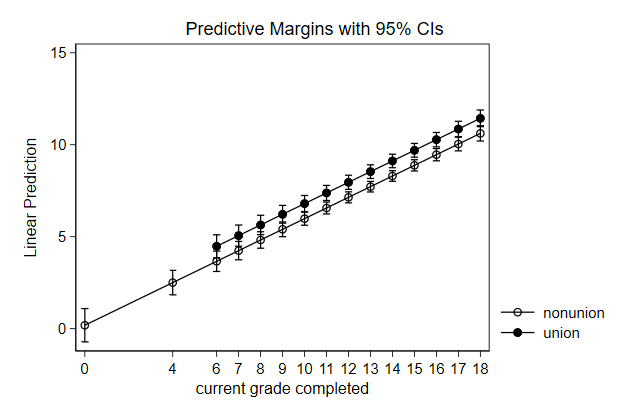
Try it yourself
Previously we used predictnl to create predicted wage for different
values of ttl_exp, while keeping race, grade, and union constant, and the
95% confidence interval around it. Use margins and marginsplot to create
that same graph
. sysuse nlsw88, clear
(NLSW, 1988 extract)
. poisson wage c.ttl_exp##c.ttl_exp i.race grade i.union, vce(robust) irr
note: you are responsible for interpretation of noncount dep. variable
Iteration 0: log pseudolikelihood = -4770.3616
Iteration 1: log pseudolikelihood = -4770.3504
Iteration 2: log pseudolikelihood = -4770.3504
Poisson regression Number of obs = 1,876
Wald chi2(6) = 1050.65
Prob > chi2 = 0.0000
Log pseudolikelihood = -4770.3504 Pseudo R2 = 0.1196
------------------------------------------------------------------------------
| Robust
wage | IRR Std. Err. z P>|z| [95% Conf. Interval]
-------------+----------------------------------------------------------------
ttl_exp | 1.078365 .0105077 7.74 0.000 1.057966 1.099158
|
c.ttl_exp#|
c.ttl_exp | .9985742 .0003766 -3.78 0.000 .9978364 .9993125
|
race |
black | .8986486 .0216837 -4.43 0.000 .8571386 .9421688
other | 1.099973 .0981455 1.07 0.286 .9234919 1.310179
|
grade | 1.079068 .0047658 17.23 0.000 1.069767 1.088449
|
union |
union | 1.135983 .0277442 5.22 0.000 1.082886 1.191683
_cons | 1.307377 .097865 3.58 0.000 1.128972 1.513974
------------------------------------------------------------------------------
Note: _cons estimates baseline incidence rate.
marginsplot_sol.do
-------------------------------------------------------------------------------
<< index >>
-------------------------------------------------------------------------------
-------------------------------------------------------------------------------
Graphing model results
-------------------------------------------------------------------------------
Logit
margins and marginsplot are most useful when dealing with non-linear
models
. graph drop _all
. sysuse nlsw88, clear
(NLSW, 1988 extract)
. gen high = occupation < 3 if occupation < .
(9 missing values generated)
. logit union grade i.high i.south i.race
Iteration 0: log likelihood = -1041.2794
Iteration 1: log likelihood = -982.361
Iteration 2: log likelihood = -980.83357
Iteration 3: log likelihood = -980.83045
Iteration 4: log likelihood = -980.83045
Logistic regression Number of obs = 1,867
LR chi2(5) = 120.90
Prob > chi2 = 0.0000
Log likelihood = -980.83045 Pseudo R2 = 0.0581
------------------------------------------------------------------------------
union | Coef. Std. Err. z P>|z| [95% Conf. Interval]
-------------+----------------------------------------------------------------
grade | .1238482 .0230342 5.38 0.000 .078702 .1689944
1.high | -.7571848 .1416813 -5.34 0.000 -1.034875 -.4794946
1.south | -.9180047 .1248425 -7.35 0.000 -1.162692 -.6733178
|
race |
black | .7091784 .1301499 5.45 0.000 .4540893 .9642675
other | .4357138 .4536733 0.96 0.337 -.4534695 1.324897
|
_cons | -2.451428 .3178244 -7.71 0.000 -3.074352 -1.828503
------------------------------------------------------------------------------
. margins, at(grade=(0 4 6/18)) over(high)
Predictive margins Number of obs = 1,867
Model VCE : OIM
Expression : Pr(union), predict()
over : high
1._at : 0.high
grade = 0
1.high
grade = 0
2._at : 0.high
grade = 4
1.high
grade = 4
3._at : 0.high
grade = 6
1.high
grade = 6
4._at : 0.high
grade = 7
1.high
grade = 7
5._at : 0.high
grade = 8
1.high
grade = 8
6._at : 0.high
grade = 9
1.high
grade = 9
7._at : 0.high
grade = 10
1.high
grade = 10
8._at : 0.high
grade = 11
1.high
grade = 11
9._at : 0.high
grade = 12
1.high
grade = 12
10._at : 0.high
grade = 13
1.high
grade = 13
11._at : 0.high
grade = 14
1.high
grade = 14
12._at : 0.high
grade = 15
1.high
grade = 15
13._at : 0.high
grade = 16
1.high
grade = 16
14._at : 0.high
grade = 17
1.high
grade = 17
15._at : 0.high
grade = 18
1.high
grade = 18
------------------------------------------------------------------------------
| Delta-method
| Margin Std. Err. z P>|z| [95% Conf. Interval]
-------------+----------------------------------------------------------------
_at#high |
1 0 | .0731499 .0205262 3.56 0.000 .0329193 .1133805
1 1 | .0344055 .0117971 2.92 0.004 .0112836 .0575274
2 0 | .1137396 .0215054 5.29 0.000 .0715899 .1558894
2 1 | .0550225 .0140325 3.92 0.000 .0275193 .0825257
3 0 | .140468 .0205303 6.84 0.000 .1002293 .1807067
3 1 | .0692244 .0147838 4.68 0.000 .0402488 .0982001
4 0 | .1556505 .0195856 7.95 0.000 .1172634 .1940376
4 1 | .07752 .0150265 5.16 0.000 .0480686 .1069713
5 0 | .1721068 .0183323 9.39 0.000 .136176 .2080375
5 1 | .0867027 .0151755 5.71 0.000 .0569592 .1164461
6 0 | .189869 .0168054 11.30 0.000 .156931 .2228069
6 1 | .0968419 .0152401 6.35 0.000 .0669718 .126712
7 0 | .2089554 .0150999 13.84 0.000 .1793602 .2385506
7 1 | .1080065 .0152478 7.08 0.000 .0781214 .1378916
8 0 | .2293678 .0134221 17.09 0.000 .2030609 .2556747
8 1 | .1202635 .0152524 7.88 0.000 .0903693 .1501576
9 0 | .2510895 .0121656 20.64 0.000 .2272454 .2749337
9 1 | .1336757 .0153434 8.71 0.000 .1036032 .1637483
10 0 | .2740833 .0119209 22.99 0.000 .2507188 .2974478
10 1 | .1483005 .0156504 9.48 0.000 .1176262 .1789747
11 0 | .2982901 .0131825 22.63 0.000 .272453 .3241273
11 1 | .1641868 .0163345 10.05 0.000 .1321717 .1962018
12 0 | .3236287 .0159413 20.30 0.000 .2923843 .354873
12 1 | .1813729 .0175603 10.33 0.000 .1469553 .2157906
13 0 | .349995 .0198228 17.66 0.000 .311143 .3888471
13 1 | .1998842 .0194555 10.27 0.000 .161752 .2380163
14 0 | .3772639 .0244437 15.43 0.000 .3293552 .4251726
14 1 | .2197301 .0220816 9.95 0.000 .1764509 .2630093
15 0 | .4052902 .0295183 13.73 0.000 .3474354 .463145
15 1 | .2409022 .025433 9.47 0.000 .1910543 .29075
------------------------------------------------------------------------------
. marginsplot, name(prob, replace)
Variables that uniquely identify margins: grade high
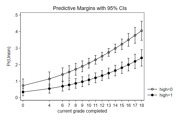
With a bit of trickery we can also show the effect of on the odds of
union membership
. margins, at(grade=(0 4 6/18)) ///
> over(high) expression(exp(xb()))
Predictive margins Number of obs = 1,867
Model VCE : OIM
Expression : exp(xb())
over : high
1._at : 0.high
grade = 0
1.high
grade = 0
2._at : 0.high
grade = 4
1.high
grade = 4
3._at : 0.high
grade = 6
1.high
grade = 6
4._at : 0.high
grade = 7
1.high
grade = 7
5._at : 0.high
grade = 8
1.high
grade = 8
6._at : 0.high
grade = 9
1.high
grade = 9
7._at : 0.high
grade = 10
1.high
grade = 10
8._at : 0.high
grade = 11
1.high
grade = 11
9._at : 0.high
grade = 12
1.high
grade = 12
10._at : 0.high
grade = 13
1.high
grade = 13
11._at : 0.high
grade = 14
1.high
grade = 14
12._at : 0.high
grade = 15
1.high
grade = 15
13._at : 0.high
grade = 16
1.high
grade = 16
14._at : 0.high
grade = 17
1.high
grade = 17
15._at : 0.high
grade = 18
1.high
grade = 18
------------------------------------------------------------------------------
| Delta-method
| Margin Std. Err. z P>|z| [95% Conf. Interval]
-------------+----------------------------------------------------------------
_at#high |
1 0 | .0802709 .0246644 3.25 0.001 .0319296 .1286122
1 1 | .0358889 .0128286 2.80 0.005 .0107453 .0610325
2 0 | .131736 .0287228 4.59 0.000 .0754404 .1880316
2 1 | .0588989 .0160589 3.67 0.000 .0274241 .0903736
3 0 | .1687631 .0294581 5.73 0.000 .1110263 .2264999
3 1 | .0754536 .017532 4.30 0.000 .0410915 .1098157
4 0 | .1910136 .0292978 6.52 0.000 .133591 .2484361
4 1 | .0854017 .0181979 4.69 0.000 .0497345 .1210689
5 0 | .2161975 .0287174 7.53 0.000 .1599125 .2724826
5 1 | .0966614 .0188138 5.14 0.000 .059787 .1335359
6 0 | .2447019 .0277096 8.83 0.000 .1903922 .2990116
6 1 | .1094057 .0193936 5.64 0.000 .0713948 .1474165
7 0 | .2769644 .0263672 10.50 0.000 .2252856 .3286432
7 1 | .1238302 .0199757 6.20 0.000 .0846786 .1629817
8 0 | .3134805 .0250091 12.53 0.000 .2644635 .3624975
8 1 | .1401564 .0206386 6.79 0.000 .0997054 .1806074
9 0 | .354811 .0243952 14.54 0.000 .3069974 .4026247
9 1 | .1586352 .021522 7.37 0.000 .1164529 .2008175
10 0 | .4015908 .025874 15.52 0.000 .3508786 .452303
10 1 | .1795503 .0228459 7.86 0.000 .1347732 .2243274
11 0 | .4545381 .0309487 14.69 0.000 .3938798 .5151965
11 1 | .203223 .0249183 8.16 0.000 .1543839 .252062
12 0 | .5144662 .0404505 12.72 0.000 .4351846 .5937479
12 1 | .2300167 .0281153 8.18 0.000 .1749118 .2851216
13 0 | .5822956 .054591 10.67 0.000 .4752992 .6892919
13 1 | .260343 .0328358 7.93 0.000 .195986 .3247
14 0 | .6590678 .0735612 8.96 0.000 .5148905 .803245
14 1 | .2946677 .0394632 7.47 0.000 .2173213 .3720142
15 0 | .7459619 .0977956 7.63 0.000 .5542861 .9376377
15 1 | .3335179 .0483602 6.90 0.000 .2387336 .4283021
------------------------------------------------------------------------------
.
. marginsplot, ///
> yscale(log) ///
> ylab(.01 .05 .1 .5 1) ///
> ytitle("odds (log scale)") ///
> name(odds, replace)
Variables that uniquely identify margins: grade high
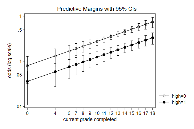
-------------------------------------------------------------------------------
<< index >>
-------------------------------------------------------------------------------
-------------------------------------------------------------------------------
Graphing model results
-------------------------------------------------------------------------------
Interactions
margins and marginsplot are also useful to make sense of interactions
. graph drop _all
. sysuse nlsw88, clear
(NLSW, 1988 extract)
. reg wage c.grade##c.ttl_exp tenure i.union i.south i.race
Source | SS df MS Number of obs = 1,866
-------------+---------------------------------- F(8, 1857) = 101.73
Model | 9881.79474 8 1235.22434 Prob > F = 0.0000
Residual | 22548.2319 1,857 12.1422897 R-squared = 0.3047
-------------+---------------------------------- Adj R-squared = 0.3017
Total | 32430.0267 1,865 17.3887542 Root MSE = 3.4846
------------------------------------------------------------------------------
wage | Coef. Std. Err. t P>|t| [95% Conf. Interval]
-------------+----------------------------------------------------------------
grade | .2794937 .0961857 2.91 0.004 .0908501 .4681372
ttl_exp | -.0615194 .092074 -0.67 0.504 -.2420987 .11906
|
c.grade#|
c.ttl_exp | .0237794 .007164 3.32 0.001 .009729 .0378298
|
tenure | .0384898 .0179098 2.15 0.032 .0033643 .0736153
|
union |
union | .8199778 .1932285 4.24 0.000 .44101 1.198946
1.south | -.8790391 .1728379 -5.09 0.000 -1.218016 -.5400621
|
race |
black | -.4496963 .1944397 -2.31 0.021 -.8310398 -.0683529
other | .7458523 .7197057 1.04 0.300 -.665665 2.15737
|
_cons | .6551388 1.220612 0.54 0.592 -1.738777 3.049054
------------------------------------------------------------------------------
.
. margins, ///
> at(grade=(0 4 6/18) ttl_exp=(0 5 10 20) ///
> tenure=10 south=0 race=1)
Predictive margins Number of obs = 1,866
Model VCE : OLS
Expression : Linear prediction, predict()
1._at : grade = 0
ttl_exp = 0
tenure = 10
south = 0
race = 1
2._at : grade = 0
ttl_exp = 5
tenure = 10
south = 0
race = 1
3._at : grade = 0
ttl_exp = 10
tenure = 10
south = 0
race = 1
4._at : grade = 0
ttl_exp = 20
tenure = 10
south = 0
race = 1
5._at : grade = 4
ttl_exp = 0
tenure = 10
south = 0
race = 1
6._at : grade = 4
ttl_exp = 5
tenure = 10
south = 0
race = 1
7._at : grade = 4
ttl_exp = 10
tenure = 10
south = 0
race = 1
8._at : grade = 4
ttl_exp = 20
tenure = 10
south = 0
race = 1
9._at : grade = 6
ttl_exp = 0
tenure = 10
south = 0
race = 1
10._at : grade = 6
ttl_exp = 5
tenure = 10
south = 0
race = 1
11._at : grade = 6
ttl_exp = 10
tenure = 10
south = 0
race = 1
12._at : grade = 6
ttl_exp = 20
tenure = 10
south = 0
race = 1
13._at : grade = 7
ttl_exp = 0
tenure = 10
south = 0
race = 1
14._at : grade = 7
ttl_exp = 5
tenure = 10
south = 0
race = 1
15._at : grade = 7
ttl_exp = 10
tenure = 10
south = 0
race = 1
16._at : grade = 7
ttl_exp = 20
tenure = 10
south = 0
race = 1
17._at : grade = 8
ttl_exp = 0
tenure = 10
south = 0
race = 1
18._at : grade = 8
ttl_exp = 5
tenure = 10
south = 0
race = 1
19._at : grade = 8
ttl_exp = 10
tenure = 10
south = 0
race = 1
20._at : grade = 8
ttl_exp = 20
tenure = 10
south = 0
race = 1
21._at : grade = 9
ttl_exp = 0
tenure = 10
south = 0
race = 1
22._at : grade = 9
ttl_exp = 5
tenure = 10
south = 0
race = 1
23._at : grade = 9
ttl_exp = 10
tenure = 10
south = 0
race = 1
24._at : grade = 9
ttl_exp = 20
tenure = 10
south = 0
race = 1
25._at : grade = 10
ttl_exp = 0
tenure = 10
south = 0
race = 1
26._at : grade = 10
ttl_exp = 5
tenure = 10
south = 0
race = 1
27._at : grade = 10
ttl_exp = 10
tenure = 10
south = 0
race = 1
28._at : grade = 10
ttl_exp = 20
tenure = 10
south = 0
race = 1
29._at : grade = 11
ttl_exp = 0
tenure = 10
south = 0
race = 1
30._at : grade = 11
ttl_exp = 5
tenure = 10
south = 0
race = 1
31._at : grade = 11
ttl_exp = 10
tenure = 10
south = 0
race = 1
32._at : grade = 11
ttl_exp = 20
tenure = 10
south = 0
race = 1
33._at : grade = 12
ttl_exp = 0
tenure = 10
south = 0
race = 1
34._at : grade = 12
ttl_exp = 5
tenure = 10
south = 0
race = 1
35._at : grade = 12
ttl_exp = 10
tenure = 10
south = 0
race = 1
36._at : grade = 12
ttl_exp = 20
tenure = 10
south = 0
race = 1
37._at : grade = 13
ttl_exp = 0
tenure = 10
south = 0
race = 1
38._at : grade = 13
ttl_exp = 5
tenure = 10
south = 0
race = 1
39._at : grade = 13
ttl_exp = 10
tenure = 10
south = 0
race = 1
40._at : grade = 13
ttl_exp = 20
tenure = 10
south = 0
race = 1
41._at : grade = 14
ttl_exp = 0
tenure = 10
south = 0
race = 1
42._at : grade = 14
ttl_exp = 5
tenure = 10
south = 0
race = 1
43._at : grade = 14
ttl_exp = 10
tenure = 10
south = 0
race = 1
44._at : grade = 14
ttl_exp = 20
tenure = 10
south = 0
race = 1
45._at : grade = 15
ttl_exp = 0
tenure = 10
south = 0
race = 1
46._at : grade = 15
ttl_exp = 5
tenure = 10
south = 0
race = 1
47._at : grade = 15
ttl_exp = 10
tenure = 10
south = 0
race = 1
48._at : grade = 15
ttl_exp = 20
tenure = 10
south = 0
race = 1
49._at : grade = 16
ttl_exp = 0
tenure = 10
south = 0
race = 1
50._at : grade = 16
ttl_exp = 5
tenure = 10
south = 0
race = 1
51._at : grade = 16
ttl_exp = 10
tenure = 10
south = 0
race = 1
52._at : grade = 16
ttl_exp = 20
tenure = 10
south = 0
race = 1
53._at : grade = 17
ttl_exp = 0
tenure = 10
south = 0
race = 1
54._at : grade = 17
ttl_exp = 5
tenure = 10
south = 0
race = 1
55._at : grade = 17
ttl_exp = 10
tenure = 10
south = 0
race = 1
56._at : grade = 17
ttl_exp = 20
tenure = 10
south = 0
race = 1
57._at : grade = 18
ttl_exp = 0
tenure = 10
south = 0
race = 1
58._at : grade = 18
ttl_exp = 5
tenure = 10
south = 0
race = 1
59._at : grade = 18
ttl_exp = 10
tenure = 10
south = 0
race = 1
60._at : grade = 18
ttl_exp = 20
tenure = 10
south = 0
race = 1
------------------------------------------------------------------------------
| Delta-method
| Margin Std. Err. t P>|t| [95% Conf. Interval]
-------------+----------------------------------------------------------------
_at |
1 | 1.241735 1.226661 1.01 0.312 -1.164045 3.647516
2 | .9341385 .8185826 1.14 0.254 -.6713004 2.539577
3 | .6265415 .5092521 1.23 0.219 -.3722252 1.625308
4 | .0113476 .8423183 0.01 0.989 -1.640643 1.663338
5 | 2.35971 .862979 2.73 0.006 .6671991 4.052221
6 | 2.5277 .5796146 4.36 0.000 1.390936 3.664465
7 | 2.695691 .3685545 7.31 0.000 1.972866 3.418516
8 | 3.031672 .6013057 5.04 0.000 1.852366 4.210978
9 | 2.918697 .6897611 4.23 0.000 1.565909 4.271486
10 | 3.324481 .4664458 7.13 0.000 2.409668 4.239295
11 | 3.730266 .3020185 12.35 0.000 3.137934 4.322597
12 | 4.541834 .4837651 9.39 0.000 3.593053 5.490614
13 | 3.198191 .6074902 5.26 0.000 2.006756 4.389626
14 | 3.722872 .4129785 9.01 0.000 2.912921 4.532823
15 | 4.247553 .2705371 15.70 0.000 3.716964 4.778142
16 | 5.296915 .4264566 12.42 0.000 4.46053 6.133299
17 | 3.477685 .5299261 6.56 0.000 2.438371 4.516998
18 | 4.121262 .3628281 11.36 0.000 3.409669 4.832856
19 | 4.76484 .2408764 19.78 0.000 4.292423 5.237257
20 | 6.051996 .3707282 16.32 0.000 5.324908 6.779084
21 | 3.757178 .4594588 8.18 0.000 2.856068 4.658288
22 | 4.519653 .3175701 14.23 0.000 3.896821 5.142485
23 | 5.282128 .2137952 24.71 0.000 4.862823 5.701432
24 | 6.807077 .3174135 21.45 0.000 6.184552 7.429602
25 | 4.036672 .3998581 10.10 0.000 3.252453 4.820891
26 | 4.918043 .2795903 17.59 0.000 4.369699 5.466388
27 | 5.799415 .1903976 30.46 0.000 5.425999 6.172831
28 | 7.562158 .2679568 28.22 0.000 7.03663 8.087686
29 | 4.316166 .3566147 12.10 0.000 3.616758 5.015573
30 | 5.316434 .2521988 21.08 0.000 4.821811 5.811057
31 | 6.316702 .1721917 36.68 0.000 5.978993 6.654412
32 | 8.317239 .2249179 36.98 0.000 7.87612 8.758357
33 | 4.595659 .3361026 13.67 0.000 3.936481 5.254838
34 | 5.714824 .2390631 23.91 0.000 5.245964 6.183685
35 | 6.83399 .160949 42.46 0.000 6.51833 7.14965
36 | 9.07232 .1926472 47.09 0.000 8.694492 9.450148
37 | 4.875153 .3424314 14.24 0.000 4.203562 5.546744
38 | 6.113215 .242511 25.21 0.000 5.637592 6.588838
39 | 7.351277 .1581616 46.48 0.000 7.041084 7.66147
40 | 9.827401 .1771313 55.48 0.000 9.480004 10.1748
41 | 5.154647 .3742418 13.77 0.000 4.420668 5.888625
42 | 6.511605 .2618884 24.86 0.000 5.997979 7.025232
43 | 7.868564 .1642605 47.90 0.000 7.54641 8.190719
44 | 10.58248 .1826902 57.93 0.000 10.22418 10.94078
45 | 5.43414 .4258615 12.76 0.000 4.598923 6.269358
46 | 6.909996 .2940628 23.50 0.000 6.333268 7.486724
47 | 8.385852 .1783362 47.02 0.000 8.036091 8.735612
48 | 11.33756 .2076381 54.60 0.000 10.93033 11.74479
49 | 5.713634 .491083 11.63 0.000 4.750501 6.676767
50 | 7.308386 .3353711 21.79 0.000 6.650642 7.96613
51 | 8.903139 .1987007 44.81 0.000 8.513439 9.292839
52 | 12.09264 .2461485 49.13 0.000 11.60989 12.5754
53 | 5.993128 .5652171 10.60 0.000 4.8846 7.101655
54 | 7.706777 .3828683 20.13 0.000 6.955879 8.457674
55 | 9.420426 .2236426 42.12 0.000 8.981809 9.859044
56 | 12.84772 .2929203 43.86 0.000 12.27324 13.42221
57 | 6.272621 .6451989 9.72 0.000 5.00723 7.538013
58 | 8.105167 .4345296 18.65 0.000 7.25295 8.957385
59 | 9.937714 .2518054 39.47 0.000 9.443862 10.43157
60 | 13.60281 .3446058 39.47 0.000 12.92695 14.27866
------------------------------------------------------------------------------
. marginsplot, xdim(grade) name(pred, replace)
Variables that uniquely identify margins: grade ttl_exp
.
. margins, dydx(grade) ///
> at(ttl_exp=(0(2)28) ///
> tenure=10 south=0 race=1)
Average marginal effects Number of obs = 1,866
Model VCE : OLS
Expression : Linear prediction, predict()
dy/dx w.r.t. : grade
1._at : ttl_exp = 0
tenure = 10
south = 0
race = 1
2._at : ttl_exp = 2
tenure = 10
south = 0
race = 1
3._at : ttl_exp = 4
tenure = 10
south = 0
race = 1
4._at : ttl_exp = 6
tenure = 10
south = 0
race = 1
5._at : ttl_exp = 8
tenure = 10
south = 0
race = 1
6._at : ttl_exp = 10
tenure = 10
south = 0
race = 1
7._at : ttl_exp = 12
tenure = 10
south = 0
race = 1
8._at : ttl_exp = 14
tenure = 10
south = 0
race = 1
9._at : ttl_exp = 16
tenure = 10
south = 0
race = 1
10._at : ttl_exp = 18
tenure = 10
south = 0
race = 1
11._at : ttl_exp = 20
tenure = 10
south = 0
race = 1
12._at : ttl_exp = 22
tenure = 10
south = 0
race = 1
13._at : ttl_exp = 24
tenure = 10
south = 0
race = 1
14._at : ttl_exp = 26
tenure = 10
south = 0
race = 1
15._at : ttl_exp = 28
tenure = 10
south = 0
race = 1
------------------------------------------------------------------------------
| Delta-method
| dy/dx Std. Err. t P>|t| [95% Conf. Interval]
-------------+----------------------------------------------------------------
grade |
_at |
1 | .2794937 .0961857 2.91 0.004 .0908501 .4681372
2 | .3270524 .08286 3.95 0.000 .1645439 .4895609
3 | .3746111 .0699317 5.36 0.000 .2374582 .5117641
4 | .4221699 .0576688 7.32 0.000 .3090674 .5352723
5 | .4697286 .0465996 10.08 0.000 .3783355 .5611217
6 | .5172873 .0377881 13.69 0.000 .4431756 .591399
7 | .5648461 .03309 17.07 0.000 .4999485 .6297436
8 | .6124048 .0342424 17.88 0.000 .5452472 .6795624
9 | .6599635 .0407519 16.19 0.000 .5800392 .7398879
10 | .7075223 .0505913 13.99 0.000 .6083004 .8067441
11 | .755081 .0621999 12.14 0.000 .6330919 .8770702
12 | .8026398 .074758 10.74 0.000 .6560211 .9492584
13 | .8501985 .0878595 9.68 0.000 .6778848 1.022512
14 | .8977572 .1012936 8.86 0.000 .699096 1.096419
15 | .945316 .1149438 8.22 0.000 .7198833 1.170749
------------------------------------------------------------------------------
. marginsplot, name(eff, replace)
Variables that uniquely identify margins: ttl_exp
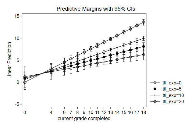
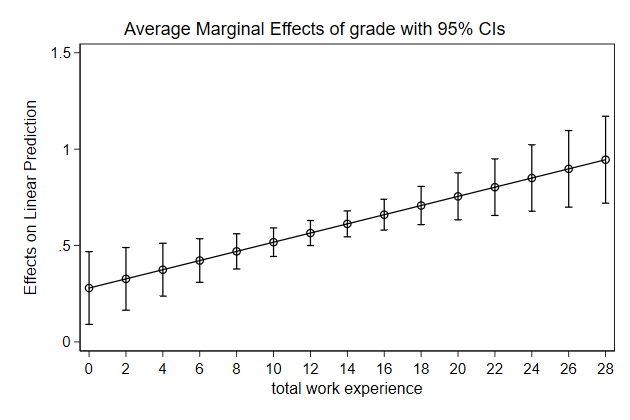
-------------------------------------------------------------------------------
<< index >>
-------------------------------------------------------------------------------
-------------------------------------------------------------------------------
Graphing model results
-------------------------------------------------------------------------------
3D margins
We can use the _marg_save command to store the results from the margins
command in a seperate dataset.
We can then use that dataset to plot the results in any way we like
For higher order interactions you quickly end up wanting a 3D graph
. graph drop _all
. sysuse nlsw88, clear
(NLSW, 1988 extract)
. gen black = race == 2 if race < 3
(26 missing values generated)
. reg wage c.ttl_exp##c.grade##i.black
Source | SS df MS Number of obs = 2,218
-------------+---------------------------------- F(7, 2210) = 57.62
Model | 11367.8381 7 1623.97688 Prob > F = 0.0000
Residual | 62291.9566 2,210 28.1864057 R-squared = 0.1543
-------------+---------------------------------- Adj R-squared = 0.1517
Total | 73659.7947 2,217 33.2249863 Root MSE = 5.3091
------------------------------------------------------------------------------
wage | Coef. Std. Err. t P>|t| [95% Conf. Interval]
-------------+----------------------------------------------------------------
ttl_exp | -.0732715 .1622669 -0.45 0.652 -.3914831 .24494
grade | .2149618 .1649723 1.30 0.193 -.1085552 .5384788
|
c.ttl_exp#|
c.grade | .0283846 .0124273 2.28 0.022 .0040143 .052755
|
1.black | -1.658608 3.630023 -0.46 0.648 -8.777222 5.460005
|
black#|
c.ttl_exp |
1 | -.1251747 .281409 -0.44 0.656 -.6770285 .426679
|
black#|
c.grade |
1 | .1398155 .2966267 0.47 0.637 -.4418807 .7215118
|
black#|
c.ttl_exp#|
c.grade |
1 | .0042121 .0224406 0.19 0.851 -.0397947 .048219
|
_cons | 1.357252 2.113085 0.64 0.521 -2.786589 5.501092
------------------------------------------------------------------------------
. margins, dydx(black) at(grade=(0(2)18) ttl_exp=(0(4)28))
Conditional marginal effects Number of obs = 2,218
Model VCE : OLS
Expression : Linear prediction, predict()
dy/dx w.r.t. : 1.black
1._at : ttl_exp = 0
grade = 0
2._at : ttl_exp = 0
grade = 2
3._at : ttl_exp = 0
grade = 4
4._at : ttl_exp = 0
grade = 6
5._at : ttl_exp = 0
grade = 8
6._at : ttl_exp = 0
grade = 10
7._at : ttl_exp = 0
grade = 12
8._at : ttl_exp = 0
grade = 14
9._at : ttl_exp = 0
grade = 16
10._at : ttl_exp = 0
grade = 18
11._at : ttl_exp = 4
grade = 0
12._at : ttl_exp = 4
grade = 2
13._at : ttl_exp = 4
grade = 4
14._at : ttl_exp = 4
grade = 6
15._at : ttl_exp = 4
grade = 8
16._at : ttl_exp = 4
grade = 10
17._at : ttl_exp = 4
grade = 12
18._at : ttl_exp = 4
grade = 14
19._at : ttl_exp = 4
grade = 16
20._at : ttl_exp = 4
grade = 18
21._at : ttl_exp = 8
grade = 0
22._at : ttl_exp = 8
grade = 2
23._at : ttl_exp = 8
grade = 4
24._at : ttl_exp = 8
grade = 6
25._at : ttl_exp = 8
grade = 8
26._at : ttl_exp = 8
grade = 10
27._at : ttl_exp = 8
grade = 12
28._at : ttl_exp = 8
grade = 14
29._at : ttl_exp = 8
grade = 16
30._at : ttl_exp = 8
grade = 18
31._at : ttl_exp = 12
grade = 0
32._at : ttl_exp = 12
grade = 2
33._at : ttl_exp = 12
grade = 4
34._at : ttl_exp = 12
grade = 6
35._at : ttl_exp = 12
grade = 8
36._at : ttl_exp = 12
grade = 10
37._at : ttl_exp = 12
grade = 12
38._at : ttl_exp = 12
grade = 14
39._at : ttl_exp = 12
grade = 16
40._at : ttl_exp = 12
grade = 18
41._at : ttl_exp = 16
grade = 0
42._at : ttl_exp = 16
grade = 2
43._at : ttl_exp = 16
grade = 4
44._at : ttl_exp = 16
grade = 6
45._at : ttl_exp = 16
grade = 8
46._at : ttl_exp = 16
grade = 10
47._at : ttl_exp = 16
grade = 12
48._at : ttl_exp = 16
grade = 14
49._at : ttl_exp = 16
grade = 16
50._at : ttl_exp = 16
grade = 18
51._at : ttl_exp = 20
grade = 0
52._at : ttl_exp = 20
grade = 2
53._at : ttl_exp = 20
grade = 4
54._at : ttl_exp = 20
grade = 6
55._at : ttl_exp = 20
grade = 8
56._at : ttl_exp = 20
grade = 10
57._at : ttl_exp = 20
grade = 12
58._at : ttl_exp = 20
grade = 14
59._at : ttl_exp = 20
grade = 16
60._at : ttl_exp = 20
grade = 18
61._at : ttl_exp = 24
grade = 0
62._at : ttl_exp = 24
grade = 2
63._at : ttl_exp = 24
grade = 4
64._at : ttl_exp = 24
grade = 6
65._at : ttl_exp = 24
grade = 8
66._at : ttl_exp = 24
grade = 10
67._at : ttl_exp = 24
grade = 12
68._at : ttl_exp = 24
grade = 14
69._at : ttl_exp = 24
grade = 16
70._at : ttl_exp = 24
grade = 18
71._at : ttl_exp = 28
grade = 0
72._at : ttl_exp = 28
grade = 2
73._at : ttl_exp = 28
grade = 4
74._at : ttl_exp = 28
grade = 6
75._at : ttl_exp = 28
grade = 8
76._at : ttl_exp = 28
grade = 10
77._at : ttl_exp = 28
grade = 12
78._at : ttl_exp = 28
grade = 14
79._at : ttl_exp = 28
grade = 16
80._at : ttl_exp = 28
grade = 18
------------------------------------------------------------------------------
| Delta-method
| dy/dx Std. Err. t P>|t| [95% Conf. Interval]
-------------+----------------------------------------------------------------
0.black | (base outcome)
-------------+----------------------------------------------------------------
1.black |
_at |
1 | -1.658608 3.630023 -0.46 0.648 -8.777222 5.460005
2 | -1.378977 3.052919 -0.45 0.652 -7.365868 4.607913
3 | -1.099346 2.483438 -0.44 0.658 -5.969462 3.77077
4 | -.8197152 1.928344 -0.43 0.671 -4.601271 2.96184
5 | -.5400842 1.404797 -0.38 0.701 -3.294945 2.214777
6 | -.2604531 .9655569 -0.27 0.787 -2.153947 1.633041
7 | .0191779 .7713909 0.02 0.980 -1.493549 1.531905
8 | .2988089 .9806565 0.30 0.761 -1.624296 2.221914
9 | .57844 1.425563 0.41 0.685 -2.217143 3.374023
10 | .858071 1.951069 0.44 0.660 -2.96805 4.684192
11 | -2.159307 2.61266 -0.83 0.409 -7.282833 2.964219
12 | -1.845979 2.195434 -0.84 0.401 -6.151309 2.459351
13 | -1.532651 1.783833 -0.86 0.390 -5.030816 1.965514
14 | -1.219323 1.38289 -0.88 0.378 -3.931222 1.492576
15 | -.9059946 1.005434 -0.90 0.368 -2.877689 1.0657
16 | -.5926664 .6910897 -0.86 0.391 -1.947919 .7625867
17 | -.2793382 .5590207 -0.50 0.617 -1.375599 .8169226
18 | .0339899 .71805 0.05 0.962 -1.374133 1.442113
19 | .3473181 1.042535 0.33 0.739 -1.697133 2.391769
20 | .6606463 1.423501 0.46 0.643 -2.130894 3.452186
21 | -2.660006 1.734656 -1.53 0.125 -6.061733 .7417202
22 | -2.312981 1.458521 -1.59 0.113 -5.173197 .5472348
23 | -1.965956 1.186145 -1.66 0.098 -4.292031 .3601193
24 | -1.61893 .9208673 -1.76 0.079 -3.424786 .1869254
25 | -1.271905 .67116 -1.90 0.058 -2.588075 .0442653
26 | -.9248797 .4629441 -2.00 0.046 -1.832731 -.0170287
27 | -.5778544 .3736052 -1.55 0.122 -1.310508 .1547996
28 | -.230829 .4756539 -0.49 0.628 -1.163604 .7019463
29 | .1161963 .688705 0.17 0.866 -1.23438 1.466773
30 | .4632216 .9400982 0.49 0.622 -1.380347 2.30679
31 | -3.160705 1.313843 -2.41 0.016 -5.737201 -.5842098
32 | -2.779983 1.114619 -2.49 0.013 -4.965794 -.5941721
33 | -2.39926 .9176591 -2.61 0.009 -4.198825 -.5996959
34 | -2.018538 .7248097 -2.78 0.005 -3.439917 -.5971585
35 | -1.637815 .5404893 -3.03 0.002 -2.697736 -.5778953
36 | -1.257093 .3774083 -3.33 0.001 -1.997205 -.516981
37 | -.8763705 .2761775 -3.17 0.002 -1.417965 -.334776
38 | -.495648 .306006 -1.62 0.105 -1.095737 .1044414
39 | -.1149256 .4410602 -0.26 0.794 -.9798613 .7500102
40 | .2657969 .615595 0.43 0.666 -.9414083 1.473002
41 | -3.661404 1.725528 -2.12 0.034 -7.04523 -.2775785
42 | -3.246985 1.471464 -2.21 0.027 -6.132581 -.361388
43 | -2.832565 1.219647 -2.32 0.020 -5.224338 -.4407918
44 | -2.418145 .9718237 -2.49 0.013 -4.323929 -.5123623
45 | -2.003726 .7320634 -2.74 0.006 -3.43933 -.5681218
46 | -1.589306 .5118244 -3.11 0.002 -2.593013 -.5855991
47 | -1.174887 .3501194 -3.36 0.001 -1.861484 -.4882891
48 | -.760467 .3431836 -2.22 0.027 -1.433463 -.087471
49 | -.3460474 .4975322 -0.70 0.487 -1.321727 .629632
50 | .0683722 .7154533 0.10 0.924 -1.334659 1.471403
51 | -4.162103 2.600543 -1.60 0.110 -9.261867 .9376601
52 | -3.713987 2.21264 -1.68 0.093 -8.053057 .6250841
53 | -3.26587 1.828458 -1.79 0.074 -6.851545 .3198054
54 | -2.817753 1.450956 -1.94 0.052 -5.663133 .0276266
55 | -2.369636 1.087115 -2.18 0.029 -4.501511 -.2377616
56 | -1.92152 .7569008 -2.54 0.011 -3.405831 -.4372082
57 | -1.473403 .5277402 -2.79 0.005 -2.508321 -.4384842
58 | -1.025286 .546491 -1.88 0.061 -2.096976 .0464036
59 | -.5771693 .7958185 -0.73 0.468 -2.1378 .983461
60 | -.1290525 1.13249 -0.11 0.909 -2.349908 2.091803
61 | -4.662802 3.616948 -1.29 0.197 -11.75577 2.43017
62 | -4.180988 3.071495 -1.36 0.174 -10.20431 1.84233
63 | -3.699174 2.531651 -1.46 0.144 -8.663839 1.26549
64 | -3.217361 2.00196 -1.61 0.108 -7.14328 .7085592
65 | -2.735547 1.493264 -1.83 0.067 -5.663895 .1928013
66 | -2.253733 1.036938 -2.17 0.030 -4.287208 -.2202574
67 | -1.771919 .737599 -2.40 0.016 -3.218378 -.3254593
68 | -1.290105 .7976666 -1.62 0.106 -2.85436 .2741496
69 | -.8082911 1.162713 -0.70 0.487 -3.088415 1.471832
70 | -.3264772 1.640408 -0.20 0.842 -3.543379 2.890425
71 | -5.163501 4.683579 -1.10 0.270 -14.34818 4.021176
72 | -4.64799 3.972421 -1.17 0.242 -12.43806 3.142078
73 | -4.132479 3.268874 -1.26 0.206 -10.54287 2.277908
74 | -3.616968 2.579177 -1.40 0.161 -8.674833 1.440896
75 | -3.101457 1.918325 -1.62 0.106 -6.863366 .6604516
76 | -2.585946 1.330034 -1.94 0.052 -5.194193 .0223012
77 | -2.070435 .9587551 -2.16 0.031 -3.95059 -.1902799
78 | -1.554924 1.063313 -1.46 0.144 -3.640121 .5302726
79 | -1.039413 1.550245 -0.67 0.503 -4.079502 2.000676
80 | -.5239019 2.176485 -0.24 0.810 -4.792071 3.744267
------------------------------------------------------------------------------
Note: dy/dx for factor levels is the discrete change from the base level.
. _marg_save, saving(temp, replace)
. use temp, clear
(Created by command margins; also see char list)
. twoway contour _margin _at1 _at2, ccut(-6(.5)1) ///
> ztitle(effect of black) name(margins3d, replace)
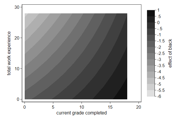
-------------------------------------------------------------------------------
<< index >>
-------------------------------------------------------------------------------
-------------------------------------------------------------------------------
Graphing model results
-------------------------------------------------------------------------------
More complex interactions
We could look at the effect of the mother being a homemaker on the
children's education
This effect will likely
increase when the father has a better job
decrease if the mother could get a better job
increase if the mother has a higher level of education
. use ieo, replace
. replace misei = 0 if home == 1
(4,920 real changes made)
.
. reg edyears i.home##c.medyears fedyears misei i.home##c.fisei
Source | SS df MS Number of obs = 7,130
-------------+---------------------------------- F(7, 7122) = 400.16
Model | 12503.5412 7 1786.22017 Prob > F = 0.0000
Residual | 31790.9131 7,122 4.46376202 R-squared = 0.2823
-------------+---------------------------------- Adj R-squared = 0.2816
Total | 44294.4543 7,129 6.21327736 Root MSE = 2.1128
------------------------------------------------------------------------------
edyears | Coef. Std. Err. t P>|t| [95% Conf. Interval]
-------------+----------------------------------------------------------------
home |
homemaker | -.4034695 .1098392 -3.67 0.000 -.6187869 -.1881521
medyears | .1054033 .0214866 4.91 0.000 .0632833 .1475233
|
home#|
c.medyears |
homemaker | .1401848 .0295078 4.75 0.000 .0823408 .1980289
|
fedyears | .2077609 .0169364 12.27 0.000 .1745606 .2409612
misei | .0271324 .0032841 8.26 0.000 .0206946 .0335702
fisei | .0192777 .0030381 6.35 0.000 .0133221 .0252334
|
home#c.fisei |
homemaker | .0210508 .0038313 5.49 0.000 .0135403 .0285612
|
_cons | 10.66949 .0799379 133.47 0.000 10.51278 10.82619
------------------------------------------------------------------------------
The main effect of homemaker refers to
a mother with the lowest level of education
if she works, she would get the lowest status job
the father has the lowest status job
The effect of homemaker increases as the father gets a higher status job
The effect of homemaker increases as the mother gets a level of education
The effect of homemaker decreases as the mother can get a higher status
job
Lets plot the effect of homemake for all combinations of fahter's and
mother's occupation for two different educational levels
Notice that the relationship between home and misei is not captured by
the factor variables, so now we cannot use margins
These are two contour plots side by side
It is convenient to start with a new dataset that contains only those
observations.
. drop _all
. set obs 17
number of observations (_N) was 0, now 17
. gen misei = cond(_n<17,(_n-1)*5, 77)
. expand 17
(272 observations created)
. bys misei : gen fisei = cond(_n<17,(_n-1)*5, 77)
. expand 2
(289 observations created)
. bys misei fisei : gen medyears = cond(_n==1, 1.25, 10)
. by misei fisei : gen meduc = _n // notice no sort
. label define meduc 1 "Realschule" 2 "University"
. label val meduc meduc
.
. gen double eff = _b[1.home] + ///
> medyears*_b[1.home#c.medyears] + ///
> fisei*_b[1.home#c.fisei] - ///
> misei*_b[misei]
We can now return the occupational status to their original scale, in
case there are members in the audience who are familiar with ISEI
. //return to original scale
. replace misei = misei + 13
(578 real changes made)
. replace fisei = fisei + 13
(578 real changes made)
. twoway contour eff misei fisei, by(meduc) name(home1, replace)
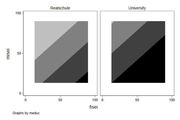
What do those colors mean?
. twoway contour eff misei fisei, ///
> by(meduc, clegend(on)) name(home2, replace)
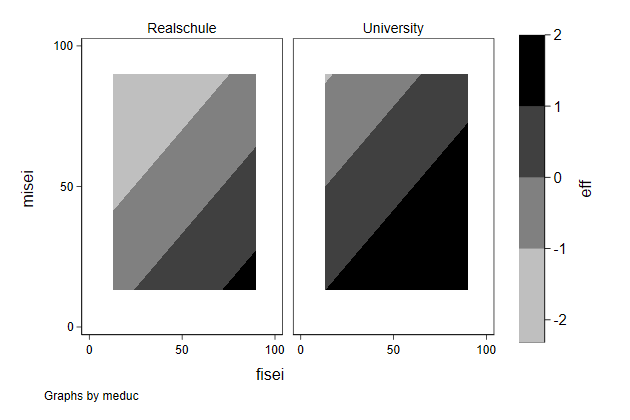
Lets get rid of the white space around the graphs, and the note
. twoway contour eff misei fisei, ///
> by(meduc, clegend(on) note("")) ///
> xlab(20(20)80) ///
> ylab(20(20)80) ///
> name(home3, replace)
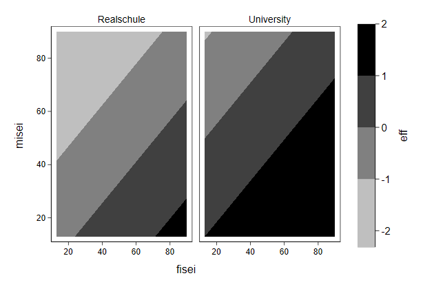
Better, but there is still a bit more white than needed
. twoway contour eff misei fisei, ///
> by(meduc, clegend(on) note("")) ///
> xlab(20(20)80) ///
> ylab(20(20)80) ///
> plotregion(margin(zero)) ///
> name(home4)
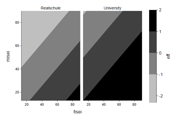
Mother's and father's occupational status are measured on the same scale,
so it would be nice if the graphs were square
. twoway contour eff misei fisei, ///
> by(meduc, clegend(on) note("")) ///
> xlab(20(20)80) ///
> ylab(20(20)80) ///
> aspect(1) ///
> plotregion(margin(zero)) ///
> name(home5, replace)
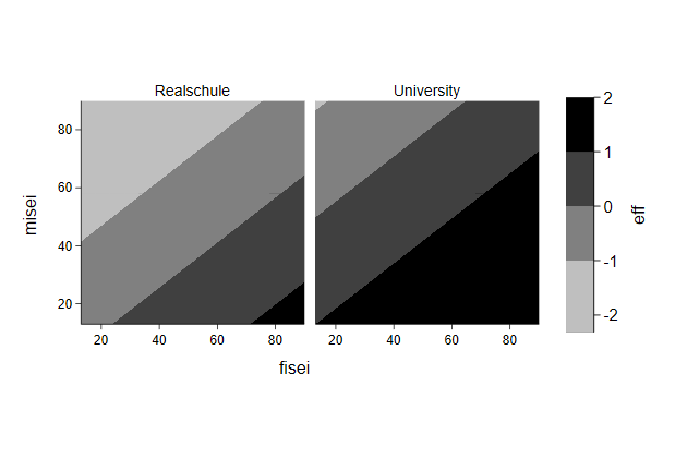
Can't we show a bit more detail and use different shades of blue for
negative effects and different shades of red for positive effects?
. twoway contour eff misei fisei, ///
> by(meduc, clegend(on) note("")) ///
> ccuts(-2(.5)2) ///
> scolor(blue) ecolor(red) crule(hue) ///
> xlab(20(20)80) ///
> ylab(20(20)80) ///
> aspect(1) ///
> plotregion(margin(zero)) scheme(s2color) ///
> name(home6, replace)
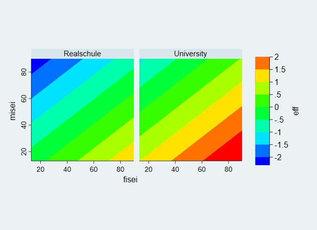
You can also explicitly choose the colors. I find
www.http://colorbrewer2.org a useful resource for that.
However, it seems that this does not play well with the by() option,
especially if one of the colors does not appear in the first graph.
Something that seems to work is first create a graph in which you specify
only the colors for the first graph, and than create a graph that
specifies all colors.
. twoway contour eff misei fisei, ///
> by(meduc, clegend(on) note("")) ///
> ccuts(-2(.5)2) ///
> cc(" 5, 48, 97" " 33,102,172" " 67,147,195" ///
> "146,197,222" "209,229,240" "253,219,199" ///
> "244,165,130" "214, 96, 77" "178, 24, 43" ///
> ) ///
> xlab(20(20)80) ///
> ylab(20(20)80) ///
> aspect(1) ///
> plotregion(margin(zero))
.
. twoway contour eff misei fisei, ///
> by(meduc, clegend(on) note("")) ///
> ccuts(-2(.5)2) ///
> cc(" 5, 48, 97" " 33,102,172" " 67,147,195" ///
> "146,197,222" "209,229,240" "253,219,199" ///
> "244,165,130" "214, 96, 77" "178, 24, 43" ///
> "103, 0, 31") ///
> xlab(20(20)80) ///
> ylab(20(20)80) ///
> aspect(1) ///
> plotregion(margin(zero)) ///
> name(home7, replace)

Lets add axis titles
. twoway contour eff misei fisei, ///
> by(meduc, clegend(on) note("")) ///
> ccuts(-2(.5)2) ///
> cc(" 5, 48, 97" " 33,102,172" " 67,147,195" ///
> "146,197,222" "209,229,240" "253,219,199" ///
> "244,165,130" "214, 96, 77" "178, 24, 43" ///
> "103, 0, 31") ///
> xtitle(Father's occupational status) ///
> ytitle(Mother's occupational status) ///
> ztitle(effect of homemaker) ///
> xlab(20(20)80) ///
> ylab(20(20)80) ///
> aspect(1) ///
> plotregion(margin(zero)) ///
> name(home8, replace)
Lets add some cominations of occupations as a reference
. twoway contour eff misei fisei, ///
> by(meduc, clegend(on) note("")) ///
> ccuts(-2(.5)2) ///
> cc(" 5, 48, 97" " 33,102,172" " 67,147,195" ///
> "146,197,222" "209,229,240" "253,219,199" ///
> "244,165,130" "214, 96, 77" "178, 24, 43" ///
> "103, 0, 31") ///
> xtitle(Father's occupational status) ///
> ytitle(Mother's occupational status) ///
> ztitle(effect of homemaker) ///
> xlab(20(20)80) ///
> ylab(20(20)80) ///
> aspect(1) ///
> plotregion(margin(zero)) || ///
> scatteri 38 88 (11) "nurse, doctor" ///
> 29 30 (12) "hairdresser, cook" ///
> 77 77 (6) "prof, prof", ///
> name(home9, replace)
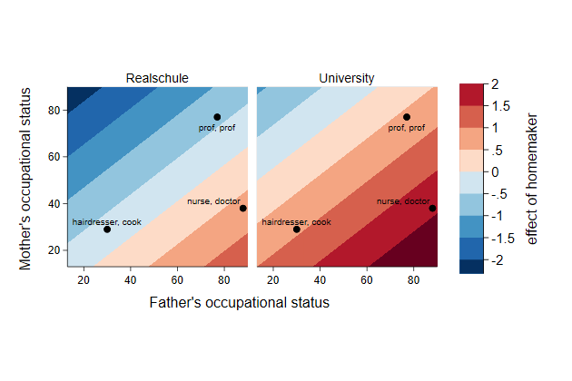
The font of the axis title and the labels on the z-axis seem a bit too
large
. twoway contour eff misei fisei, ///
> by(meduc, clegend(on) note("")) ///
> ccuts(-2(.5)2) ///
> cc(" 5, 48, 97" " 33,102,172" " 67,147,195" ///
> "146,197,222" "209,229,240" "253,219,199" ///
> "244,165,130" "214, 96, 77" "178, 24, 43" ///
> "103, 0, 31") ///
> xtitle(Father's occupational status, size(*.8)) ///
> ytitle(Mother's occupational status, size(*.8)) ///
> ztitle(effect of homemaker, size(*.8)) ///
> zlabel(,labsize(*.8)) ///
> xlab(20(20)80) ///
> ylab(20(20)80) ///
> aspect(1) ///
> plotregion(margin(zero)) || ///
> scatteri 38 88 (11) "nurse, doctor" ///
> 29 30 (12) "hairdresser, cook" ///
> 77 77 (6) "prof, prof" , ///
> name(home10, replace)
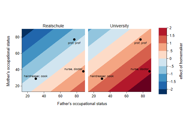
-------------------------------------------------------------------------------
<< index
-------------------------------------------------------------------------------
-------------------------------------------------------------------------------
ancillary
-------------------------------------------------------------------------------
Combine with one legend from first principle
A graph file is a set of instructions that tells Stata what to draw where
It is a text-file and we can look at it
We can use this to change our graphs
Normally you would never do this, but the trick below is sometimes useful
when grc1leg does not exactly do what you want
You start by combining the two graphs, but without any legends
. use ecassess, clear
(ALLBUS 1980-2012)
. twoway line brd_h own_h year, ///
> legend(off) ///
> title(high income) ///
> name(high2, replace)
.
. twoway line brd_l own_l year, ///
> legend(off) ///
> title(low income) ///
> name(low2, replace)
.
. graph combine high2 low2, cols(1) name(two, replace)
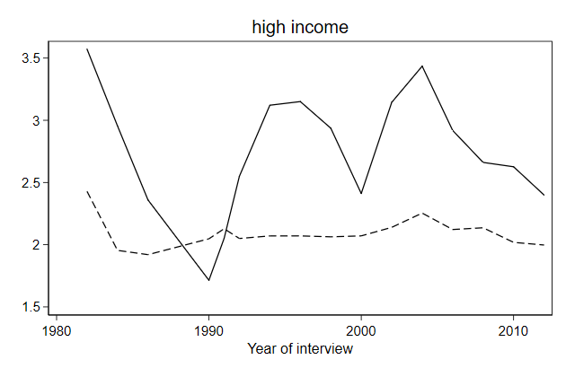

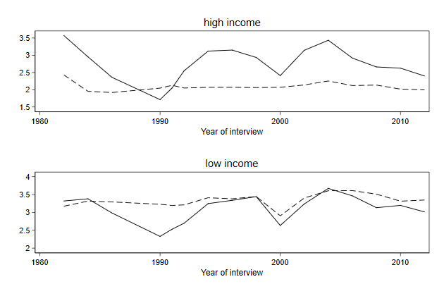
We then want to create a new graph that is only a legend.
We start with creating a regular graph with legend, but turn off as much
as we can using yscale(off) and xscale(off)
. twoway line brd_h own_h year, ///
> legend(order(1 "Germany" 2 "Own") ///
> cols(1) pos(3) ) ///
> yscale(off) xscale(off) ///
> name(leg, replace)
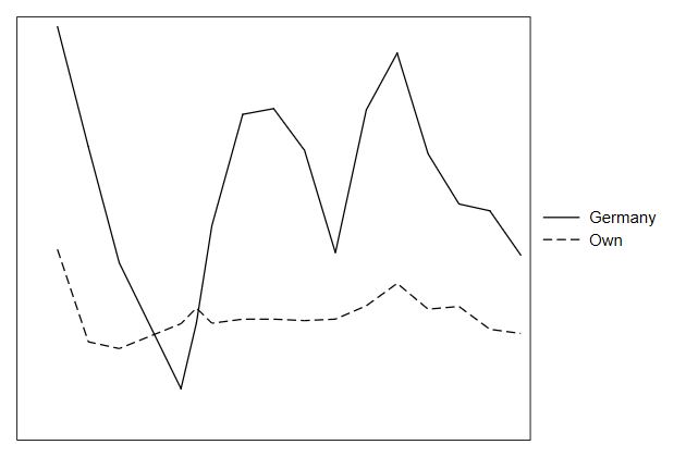
We then suppress the graph, so that the legend is all that is left
. _gm_edit .leg.plotregion1.draw_view.set_false
. graph display
The command below prevents the legend graph to take just as much room as
the main graph.
. . _gm_edit .leg.xstretch.set fixed
. . graph display
All we need to do is combine the legend graph with combined graph
. graph combine two leg , cols(2) name(mancomb1)
We add the legend to the side, but we can also add it underneath.
. twoway line brd_h own_h year, ///
> legend(off) ///
> title(high income) ///
> name(high3, replace)
.
. twoway line brd_l own_l year, ///
> legend(off) ///
> title(low income) ///
> name(low3, replace)
.
. graph combine high3 low3, cols(2) name(two3, replace)
.
. twoway line brd_h own_h year, ///
> legend(order(1 "Germany" 2 "Own") ///
> cols(2) pos(6) ) ///
> yscale(off) xscale(off) ///
> name(leg3, replace)
.
. _gm_edit .leg.plotregion1.draw_view.set_false
. graph display
.
. . _gm_edit .leg.ystretch.set fixed
. . graph display
.
. graph combine two leg , cols(1) name(mancomb2, replace)

-------------------------------------------------------------------------------
index
-------------------------------------------------------------------------------
function_sol.do
// the variable on the x-axis has to be called x, but the y-axis can have any
// legal name
// the default range of p is good here, as the possible values of p are 0 to 1.
twoway function var = x*(1-x), xtitle(p)
-------------------------------------------------------------------------------
<<
-------------------------------------------------------------------------------
dropline_sol.do
sysuse nlsw88, clear
collapse (mean) wage, by(industry)
egen Industry = axis(wage) if industry < ., label(industry)
list
list, nolabel
twoway dropline wage Industry, ///
horizontal ///
ylabel(1/12, val) ///
xlab(0(5)15) ytitle("")
-------------------------------------------------------------------------------
<<
-------------------------------------------------------------------------------
title_sol.do
use uni.dta, clear
twoway line total year, ///
title("Educational expansion in the Netherlands" ///
"in the 20{sup:th} and 21{sup:st} century")
-------------------------------------------------------------------------------
<<
-------------------------------------------------------------------------------
axis_sol.do
use uni.dta, clear
// year exist from 1900-1909, even though total is missing
// to cut of the x-axis we need to specify the if-condition
twoway line total year if total < . , ///
title("Educational expansion in the Netherlands" ///
"in the 20{sup:th} and 21{sup:st} century") ///
yscale(log) ///
ylab(5e2 1e3 5e3 1e4 5e4, format(%8.0gc)) ///
xlab(1925(25)2000)
-------------------------------------------------------------------------------
<<
-------------------------------------------------------------------------------
legend_sol.do
use uni.dta, clear
twoway line drs ba year if total < . , ///
title("Educational expansion in the Netherlands" ///
"in the 20{sup:th} and 21{sup:st} century") ///
yscale(log) ///
ylab(1e1 1e2 1e3 1e4, format(%8.0gc)) ///
xlab(1925(25)2000) ///
legend(order(1 "doctoraal" 2 "bachelor") ///
subtitle(diplomas)) ///
ytitle(number of diplomas per year)
-------------------------------------------------------------------------------
<<
-------------------------------------------------------------------------------
linestyle_sol.do
use uni.dta, clear
// if total == . is problematic for the cmissing() option
// so if year > 1909 is used intstead
twoway line total drs ba year if year > 1909 , ///
title("Educational expansion in the Netherlands" ///
"in the 20{sup:th} and 21{sup:st} century") ///
yscale(log) ///
ylab(1e1 1e2 1e3 1e4, format(%8.0gc)) ///
xlab(1925(25)2000) ///
legend(order(1 "total" ///
2 "doctoraal" ///
3 "bachelor") ///
subtitle(diplomas)) ///
ytitle(number of diplomas per year) ///
lpattern(solid shortdash longdash) ///
lcolor(gs12 black black ) ///
lwidth(*1.5 ..) cmissing(n n n)
-------------------------------------------------------------------------------
<<
-------------------------------------------------------------------------------
stack_sol.do
sysuse nlsw88, clear
poisson wage c.ttl_exp##c.ttl_exp i.race grade i.union, vce(robust) irr
replace race = 1 if race < .
replace grade = 12 if grade < .
replace union = 0 if union < .
predictnl wagehat = exp(xb()), ci(lb ub)
twoway rarea lb ub ttl_exp, sort astyle(ci) || ///
line wagehat ttl_exp, sort ///
lpattern(solid) ///
legend(off) ///
ytitle(predicted hourly wage) ///
title("predict hourly wage and 95% Confidence interval") ///
subtitle("for white high school graduations who are not a member of a union")
-------------------------------------------------------------------------------
<<
-------------------------------------------------------------------------------
by_sol.do
use ecassess.dta, clear
drop brd own
rename brd_l brd1
rename brd_h brd2
rename own_l own1
rename own_h own2
reshape long brd own , i(year) j(inc)
label def inc 1 "low income" 2 "high income"
label val inc inc
twoway line brd own year, by(inc, note("")) legend(cols(2))
-------------------------------------------------------------------------------
<<
-------------------------------------------------------------------------------
marginsplot_sol.do
sysuse nlsw88, clear
poisson wage c.ttl_exp##c.ttl_exp i.race grade i.union, vce(robust) irr
margins, at(race=1 grade=12 union=0 ttl_exp=(0.1 1/29))
marginsplot, ///
ci(recast(rarea)) ciopts(astyle(ci)) ///
plotopts(msymbol(i)) xlab(0(5)30) ///
ytitle(predicted wage)
-------------------------------------------------------------------------------
<<
-------------------------------------------------------------------------------